Ananke’s Die

A simple study in visual perception—an exploration of how a plain hexagon can evolve into the illusion of a cube. Through precise geometry and controlled form blending, static lines awaken into rhythm and volume, giving rise to a subtle sense of depth and movement.

Constructing the Illusion

Fig. A — The Base Shape
Start with a regular hexagon. Divide it into three equal diamond shapes (rhombuses)—these represent the three visible faces of the cube. Each diamond has four equal sides: two acute angles (60°) and two obtuse angles (120°). Together, they form the geometric foundation of the cube.

Fig. B — Building Volume with Shape Blends
In Illustrator, or any other vector software, use the Blend Tool to create a shape blend inside each diamond. Start with a small central circle and blend it toward the outer edge of the diamond. Adjust the number of blend steps to control how smooth or tight the transition appears. This process builds the cube’s apparent volume and visual tension. You’ll notice that the distance from corner to corner in the nested, diamond-like shapes is slightly greater than from side to side, creating subtle gaps that lead the eye to perceive an X across the surface.

Fig. C — Perspective and Transformation
Distort slightly the hexagon to set the three diamonds in perspective. This step transforms the flat figure into a die-like cube, giving it spatial depth and presence.

ananke cube

Enhancing the Optical Effect
Next, add horizontal background lines and some color, as shown in the two examples in the image. You can also adjust the illusion by making the visible faces of the die appear slightly concave, as in the figure on the right. This effect is created by shifting the concentric, nested diamond shapes slightly off-center—the position of the central ellipse determines whether the die appears concave or convex.

 two Ananke dice

Below is the finished stage of the work. Curiously, the cube appears to hover, slide, and even emit a faint blue glow—though it remains entirely black and motionless.
Ananke’s Die is a study I began in 2010, a continuing exploration of how repetitive lines and geometric precision can trick the mind into sensing motion and color where none exist.

Ananke die

You can get Ananke’s Die as a fine art print or canvas, available in different sizes and finishes.
👉 Buy it here

Why Ananke’s Die

I titled this work Ananke’s Die after Ananke, the Greek goddess of necessity and fate.
The cube, a symbol of structure, represents order and control. Yet the three visible faces that seem to define its volume are an illusion—shifting and unstable.
Under the viewer’s gaze, the shape changes, its meaning shifts, yet the form remains.
This illusory die shows the balance between order, perception, and destiny, reminding us that what we think we control often exists within the unpredictable interplay of vision and inevitability.

This image also triggers multiple associations in a loop: hexagon, cube, die, chance, illusion, order, fate, contradiction. These connections show how perception mixes stability and randomness, revealing that what we see is shaped as much by the mind as by reality.
Moonlight Reflections on the Waters

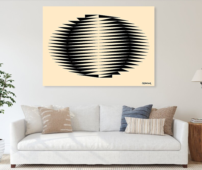
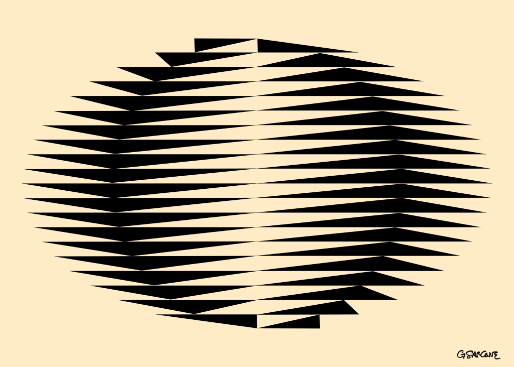
A memory from Japan, where I lived briefly in the 1980s. This piece recalls earthy colors, organic shapes, and fragments of that time. A circle emerges from a flowing field of triangles—like ripples of moonlight dancing on the sea near Kamakura.

Immersing in my Op Art is entering a space where opposing forces meet, interlock, and balance with precision and intensity. Each piece is a silent dialogue of form, line, color, perception, and mathematical structure, anchored in the language of symbols. Beneath the surface, it engages archetypes and ancient rites that still resonate in the collective unconscious.

This unique op art piece is available as fine art prints and canvases in my online gallery.

Rediscovering Flutex: Simple Glass, Complex Illusions

I’ve been toying with the idea of revisiting an old, low-key material for my art: Flutex.

If you haven’t heard of it, Flutex is a patterned industrial glass from the 1930s and ’40s, mostly used to give a bit of privacy in bathrooms and office partitions.

In the ’70s, Op artist Sydney Cash started playing with this glass and found that its ribbed surface works like a lenticular screen—showing different images depending on how you look at it. The effect? Hypnotic, shifting artworks that change as you move around them.

It’s just simple glass, but it tricks perception in a really cool way.

I’m seriously considering giving it a try myself—there’s something about that mix of humble material and complex visual play that feels worth exploring again.

The Art of Discovery Between a Question Mark and an Exclamation Point

Science — like art — doesn’t really speak in the indicative. It doesn’t say this is, it asks what if? It begins in the conditional, in the open-ended curiosity of what could be, and unfolds in the imperative, the bold call to look, try, observe.

Discovery doesn’t start with answers — it starts with a question. And when it arrives, it rarely comes wrapped in neat descriptions. It comes as a gesture, a provocation, a set of instructions that invite us to experience something for ourselves.

Think about it: no one learns to cook from a description of flavor. They follow a recipe — a list of directives. A musician doesn’t explain the music in his head; he writes a score. And when we follow it, sound becomes experience. The composer’s vision is reborn in the hands of another.

In my own work, I do much the same — though my instrument is perception, and my notes are lines, colors, forms. Each visual illusion, each image, is a kind of instructional code. Not a description of what’s there, but an opening. If you engage with it, something clicks — not because I told you what to see, but because the form guided your eyes to see it for yourself.

G. Spencer Brown wrote that the act of drawing a distinction is the first creative move — a way of bringing something into being. In that spirit, I don’t aim to define the world. I aim to make space for new ways of seeing it.

So perhaps the real language of both science and art isn’t declarative at all.

It’s performative. It doesn’t tell you what reality is — it dares you to experience it.
And in that challenge, something unexpected happens:
You discover not just what the world could be — but what you might be within it.

Title: Follow the Light
“Follow the Light” – A visual imperative that pulls the eye into the unknown. This piece doesn’t describe — it directs. It doesn’t tell you what to see — it invites you to find out. Available as a fine art print.

Julio Le Parc – Nihil novi sub sole…

Although I’ve been working in the field of Op Art since the mid-1980s, it’s important to recognize that the movement itself has a deeper history. It began to take shape in the 1960s, led by pioneering figures such as Victor Vasarely and Bridget Riley.

However, the artists who truly captivate me—the ones who expanded the language of perception—are often the outsiders. One such figure is Julio Le Parc (b. September 23, 1928), an Argentine-born artist whose practice bridges Op Art and kinetic art. Le Parc studied at the School of Fine Arts in Argentina and went on to co-found the Groupe de Recherche d’Art Visuel (GRAV). His work, honored with numerous awards, holds a prominent place in Latin American modernism.

Le Parc’s recurring themes—color, light, and movement—have always resonated with me. During the ’60s and ’70s, he explored light not just as a visual element but as a living, dynamic material. Yet by the late ’70s, his presence in the art world had faded; his output became sporadic, and for decades his work slipped quietly out of the international spotlight.

 Fortunately, recent years have witnessed a renewed appreciation of his explorations in light and movement, bringing his contributions once again to the attention of a wider public.

Artist’s Website: http://www.julioleparc.org

Book: Catalog of the artist’s first solo exhibition, Paris, November–December 1966. Text in French by Frank Popper.

Hypnotic Disc

Take a moment to focus on the circular pattern. How many spirals do you see? The surprising answer is none. There are no spirals here—just alternating black and yellow discs, slightly off-center and layered to create a striking illusion of swirling depth and motion.

© G. Sarcone, 1990

I began crafting pieces like this in the early ’90s, drawing inspiration from Duchamp’s Rotoreliefs. I was captivated by how simple rotation could deceive the eye, inviting the viewer into a world of optical illusions. It’s a unique experience—seeing motion and depth in something entirely flat, both puzzling and mesmerizing.

This op art pattern comes to life across various mediums and transforms into artistic expressions on different objects. In my online gallery, you’ll find art prints and everyday items featuring this work, all available for purchase.

Two Mind-Bending Aquariums

At first glance, they seem to be the same, but take a closer look… Can you spot what’s wrong?

I’ve always been fascinated by impossible figures, which psychologists call “undecidable figures”, meaning visual representations that challenge our perception and understanding of reality. Since the late 1980s, I’ve continued to explore this field and create new illusions, producing a series of drawings that play with the third dimension, manipulating perspectives and proportions to create original visual effects.

My work draws inspiration from two masters of optical art and impossible objects: Josef Albers and Oscar Reutersvärd. Their innovations and creations have always inspired and motivated me to continue my research in this field.

Duality in Motion

Explore a fascinating figure/ground effect in this op art piece, where 4 black illusive bangles appear to overlap with 4 white ones. The rotating patterns create a calming and hypnotic visual experience.

This design is now available as t-shirts and posters in my online gallery.

If you’re interested in creating your own op art, I also have a tutorial available on Behance.

I hope you enjoy this design, and I’d love to hear your thoughts on it!

Triangles of Beauty

Introducing my latest creation, Triangles of Beauty—a minimalist mosaic that blends geometric precision with visual intrigue. This op art piece showcases a striking arrangement of triangular shapes in sepia tones, merging rich shades of brown and beige. The triangle, a timeless symbol, embodies the balance of masculine and feminine energies, forming a harmonious third element that transcends duality. It represents strength, unity, and the divine—a visual echo of the trinity, where individual components unite into something greater.

Step back and let the patterns unfold to reveal the depth within this thought-provoking piece.

This thought-provoking op art piece is available in my online galleries:

· Redbubble

· Fine Art America