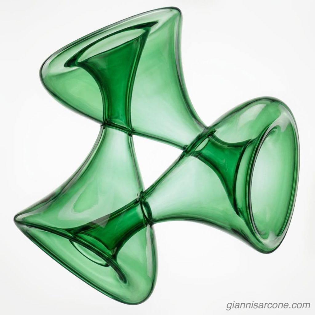
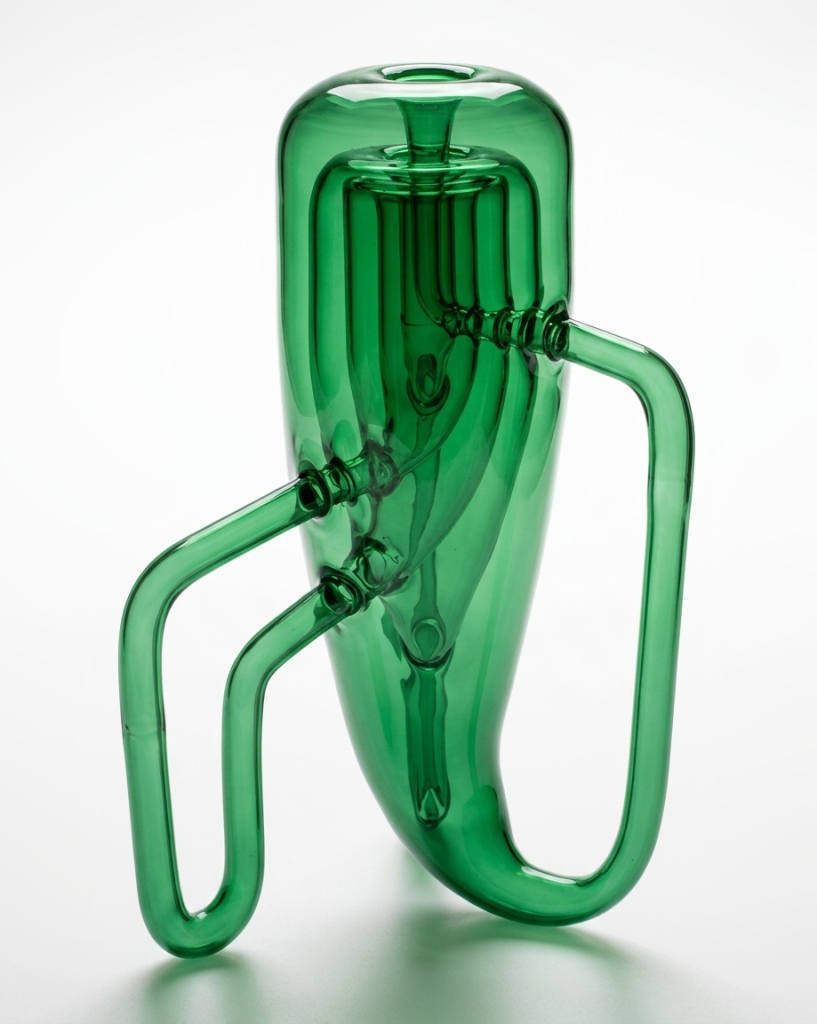
Τριαλάβαστρον (Trialábastron), a triple Klein bottle, is an artistic exploration of Klein bottle geometry. In topology, the Klein bottle is a non-orientable surface that cannot be embedded in three-dimensional Euclidean space without self-intersection, though it can be smoothly realized in four dimensions.
A close relative is the Möbius strip, another non-orientable surface in three-dimensional space. On such surfaces, a continuous path can return to its origin with reversed orientation, revealing how geometry can twist the notion of inside and outside.
Here is another representation of a triple Klein bottle—UK sculptor Alan Bennett’s striking construction of three Klein bottles nested within one another. Of course, “inside” only applies in the sense of their embedding in physical space; from a topological standpoint, they remain entirely separate, non-interacting surfaces.
I like building iconic portraits from the smallest possible palette—here, just five colors of Tic Tac mints plus white. A stripped-down system that still manages to flirt with something Mondrian-like, and, almost against its will, echoes a Renaissance portrait.
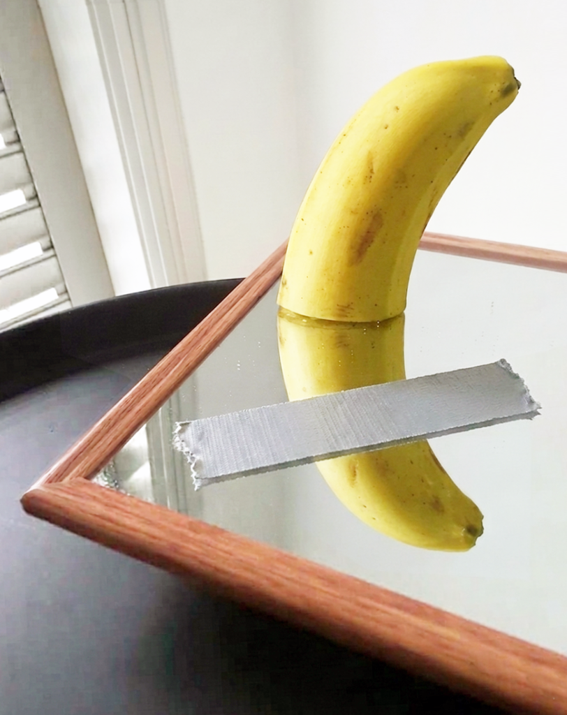
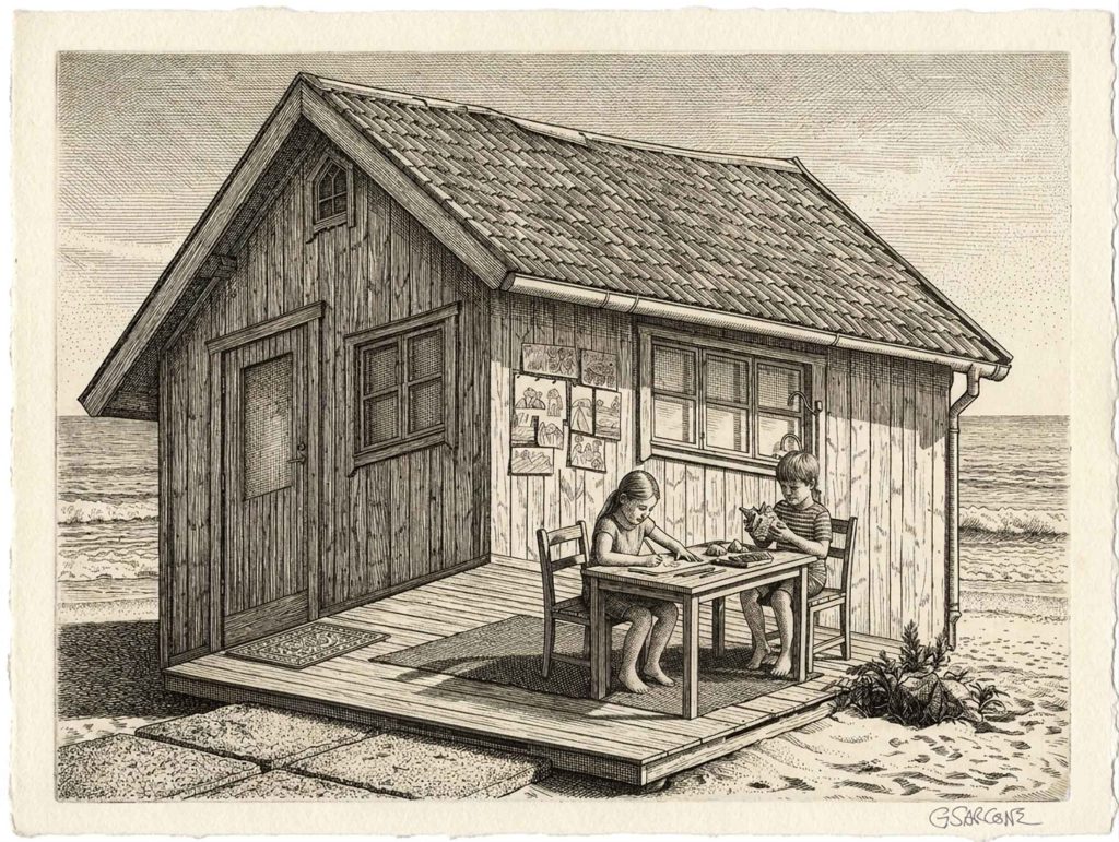
With summer just around the corner, I find myself drifting back to the shores of time, to this delightfully impossible little structure perched on the beach.
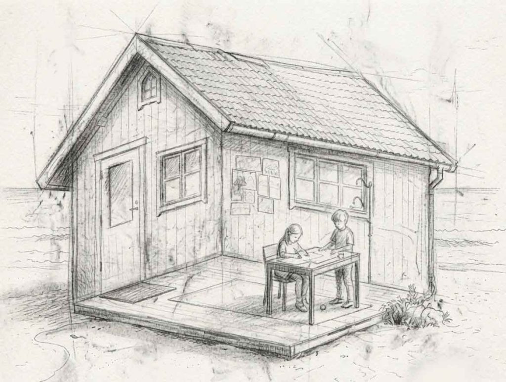
A drawing concept created for a children’s coloring book on optical illusions. Over the years, I’ve explored this theme through many curious and playful variations.
Are the kids engaging in creative activities inside the cabin or outside it?
The roof insists we’re looking at the exterior, while the floor pulls us firmly indoors. Both readings feel correct, yet they cancel each other out. So, there’s no clean resolution here—just a quiet visual paradox.
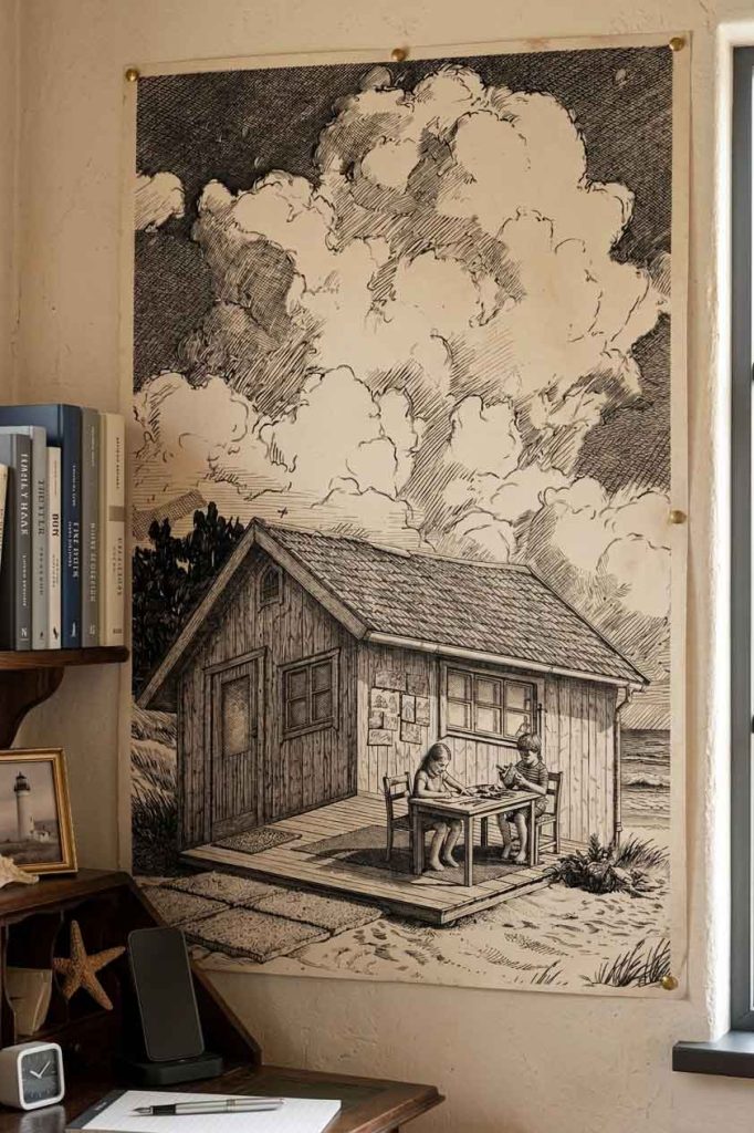
Curious to see more of my optical illusion book concepts, impossible worlds, and mind-bending creations? Take a stroll through my author page.
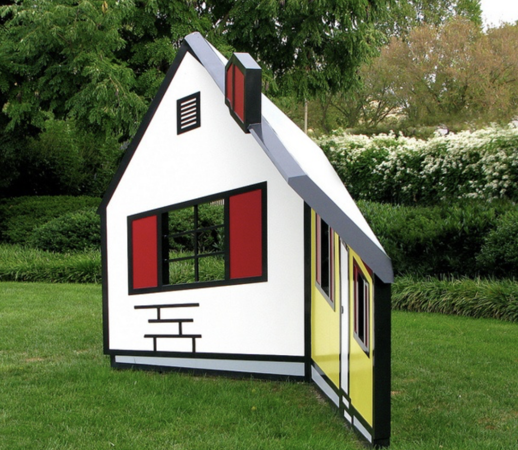
The idea itself is far from new and has inspired countless artists, architects, and photographers. It even exists in three dimensions. A notable example is Roy Lichtenstein‘s House I (1996), an ingenious sculpture that appears to be a solid house but is actually a concave construction made of angled steel planes. As viewers move around it, the structure seems to rotate and reshape itself, turning perception into part of the artwork.
In 1934, the Swedish artist Oscar Reutersvärd sketched a peculiar triangle made of small cubes, neatly aligned on an isometric grid. Everything looked geometrically sound—until the mind tried to assemble it in real space.
This triangular paradox has distant echoes in ancient Greek geometry, but Reutersvärd gave it a clear visual form: the impossible figure.
That’s the charm of impossible figures: every part looks right, yet the whole quietly breaks reality.
I began exploring these paradoxical structures in the 1980s. My interest grew naturally from the meeting point of two inclinations: a mathematical curiosity about spatial logic and a visual fascination with form. Over time I produced many variations—sometimes rediscovering ideas that others had already touched upon, occasionally arriving at configurations that felt genuinely new. In geometry, complete novelty is rare; most discoveries emerge as unexpected turns within an existing landscape.
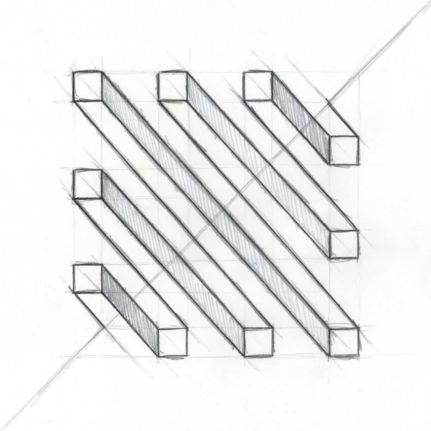
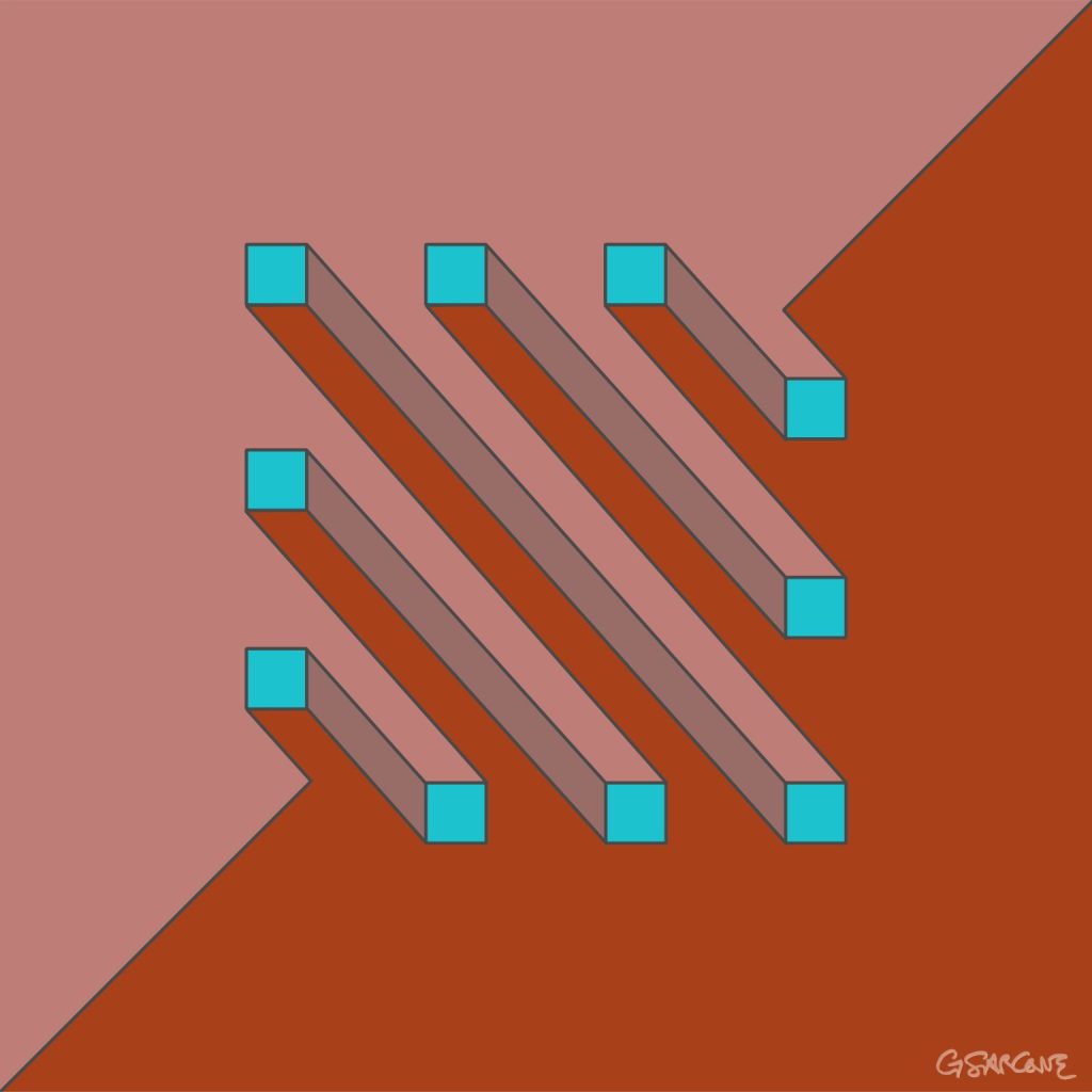
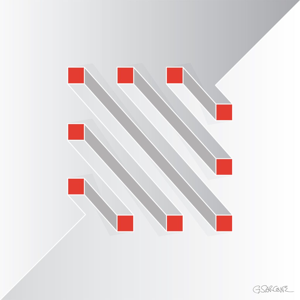
One example from that period is the study shown here, created in the late 1990s and titled Undecidable Bars.
Parallel bars appear to run calmly side by side, yet their connections quietly sabotage the logic of space. Perspective slips from one segment to another, forcing the eye to accept incompatible viewpoints at the same time.
Each element seems perfectly normal. Together, they form a structure that cannot exist.
Some bars appear to pass through others; some join where no joint should be possible. The geometry behaves as if the object were bending through space, while every line still respects the conventions of perspective drawing.
The result is an undecidable figure—a form the eye can follow effortlessly, but the mind cannot reconstruct.
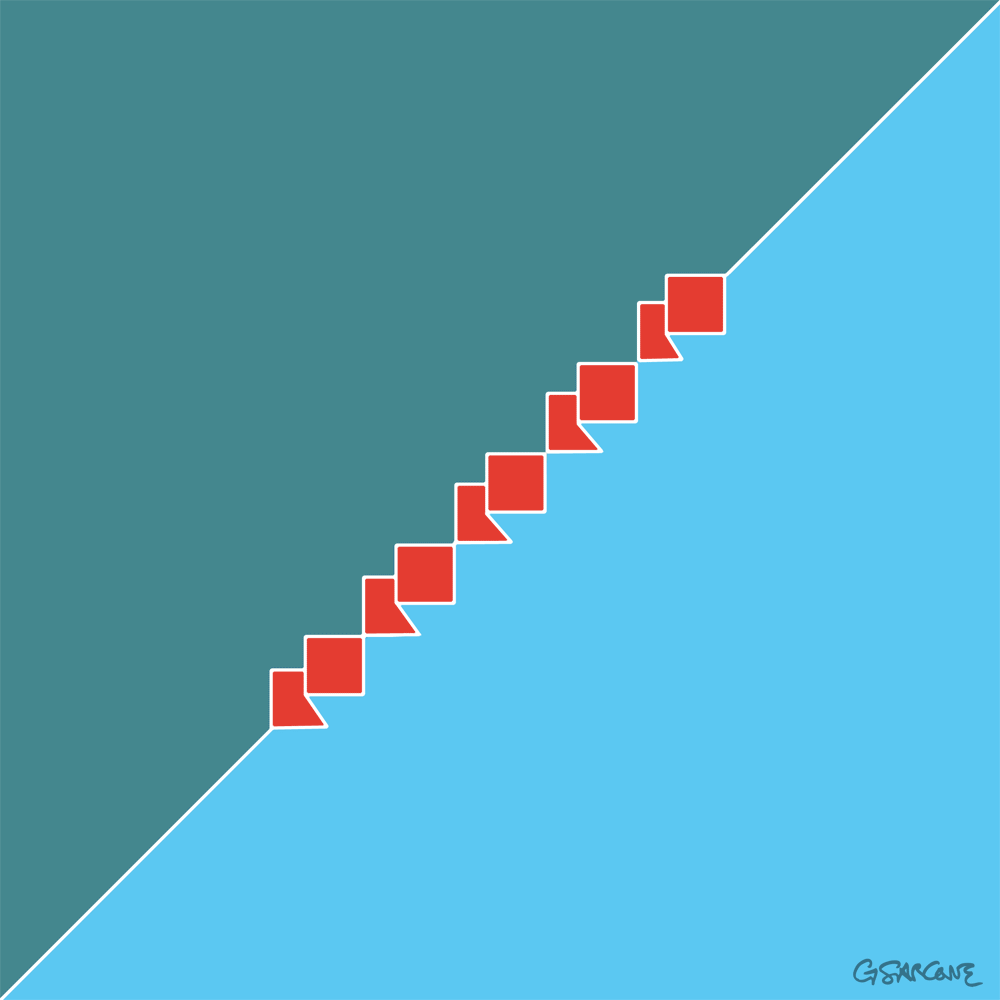
Over the years I have created hundreds of images built on similar principles, across different formats and media. If these works interest you for a book, exhibition, or monograph, feel free to contact me.
Here’s a simple 18-frame animation of my Op Art piece—work in progress.
Some say abstract art is non-representational—that it avoids visual reality and relies on color, shape, form, and gesture to trigger emotion or thought. I see it differently. Abstraction does not reject reality; it reframes it. It is a change of optics, not a disappearance of the world.
Take, for example, this video of goldfinches perched on swaying thistles. At first glance, does it not resemble an abstract painting? Rhythms, repetitions, subtle chromatic tensions, forms dissolving into movement. From there, one could push the abstraction further with the slightest shifts in shape or color—without betraying reality, only rephrasing it.
This idea is hardly new. From Cézanne’s insistence on treating nature through cylinder, sphere, and cone, to Kandinsky’s claim that abstraction reveals inner necessity rather than surface likeness, many artists and thinkers have argued that abstraction sharpens perception instead of diluting it. Even in cognitive science, perception is understood as an active construction, not a passive recording of facts.
Abstraction starts precisely there: with attention. Not with denial, not with decoration, but with the recognition that reality is already structured, already abstract, long before the artist intervenes.
We usually perceive lines and shapes as forming a figure, while the paper and surrounding white space recede into the background. Yet, under certain conditions, what we assume to be background can itself acquire form and meaning. In the illustrations shown here, a clear geometric figure emerges—even though no lines actually define it. These visual phenomena are known as illusory figures.
What kind of 3-dimensional shape do you see?
Illusory figures depend, in part, on the presence of regular gaps within a visual arrangement. When such gaps occur, the visual system instinctively tries to resolve them into coherent forms. These gaps can be created by simple elements, such as circles. When solid black circles and partially “chipped” ones are arranged carefully, they produce striking illusory shapes.
The most familiar example is the Kanizsa triangle. Here, an illusory contour is perceived when black disks with wedge-shaped sections removed are aligned so that their edges define a triangular form in the negative space. Remarkably, this illusory region appears brighter than the surrounding page, even though its physical luminance is identical.
Kanizsa triangle
Etherial Cross
A pattern of black dots forms a ghostly ‘X’ shape through negative space. The arrangement of dots creates a subtle sense of motion and depth. The piece combines the Ouchi effect—where contrast between figure and background generates apparent movement—with the Kanizsa illusion, where the mind completes shapes that aren’t actually drawn.
Fine art prints of this Op Art piece are available for purchase through my official gallery.
The effect becomes even more dramatic when the illusion is animated. Rotate the cross, for example, and the X-shaped form—with no explicit outline—appears to emerge from a rigid grid of black dots. The shape is defined solely by subtle local distortions: small asymmetric intrusions along the contours of the X disrupt the regularity of the dots, making the form pop into perception despite having no actual boundaries.
Etherial Circle
Using the same technique, we can replace the X with a large O. Now the regular arrangement of black circles is disrupted by a ghostly central shape that seems to lift off the background, almost floating. As above, this Op Art piece combines the Ouchi effect—where the contrast between figure and background creates apparent motion—with the Kanizsa effect, where the mind completes shapes that aren’t actually drawn.
Fine art prints of this Op Art piece are available for purchase through my official gallery.
It is also interesting to add a rotational motion to this Op Art piece. I experimented with different solutions, and this one is the simplest yet striking nonetheless.
To conclude this journey into the world of contour illusions, still using black disks as our starting point, here are a few further experiments. They explore negative superpositions, translucent effects, and the emergence of more complex forms—showing how simple elements can give rise to unexpected visual structures.
Fine art prints of this Op Art piece are available for purchase through my official gallery.
A simple study in visual perception—an exploration of how a plain hexagon can evolve into the illusion of a cube. Through precise geometry and controlled form blending, static lines awaken into rhythm and volume, giving rise to a subtle sense of depth and movement.
Constructing the Illusion
Fig. A — The Base Shape Start with a regular hexagon. Divide it into three equal diamond shapes (rhombuses)—these represent the three visible faces of the cube. Each diamond has four equal sides: two acute angles (60°) and two obtuse angles (120°). Together, they form the geometric foundation of the cube.
Fig. B — Building Volume with Shape Blends In Illustrator, or any other vector software, use the Blend Tool to create a shape blend inside each diamond. Start with a small central circle and blend it toward the outer edge of the diamond. Adjust the number of blend steps to control how smooth or tight the transition appears. This process builds the cube’s apparent volume and visual tension. You’ll notice that the distance from corner to corner in the nested, diamond-like shapes is slightly greater than from side to side, creating subtle gaps that lead the eye to perceive an X across the surface.
Fig. C — Perspective and Transformation Distort slightly the hexagon to set the three diamonds in perspective. This step transforms the flat figure into a die-like cube, giving it spatial depth and presence.
Enhancing the Optical Effect Next, add horizontal background lines and some color, as shown in the two examples in the image. You can also adjust the illusion by making the visible faces of the die appear slightly concave, as in the figure on the right. This effect is created by shifting the concentric, nested diamond shapes slightly off-center—the position of the central ellipse determines whether the die appears concave or convex.
Below is the finished stage of the work. Curiously, the cube appears to hover, slide, and even emit a faint blue glow—though it remains entirely black and motionless. Ananke’s Die is a study I began in 2010, a continuing exploration of how repetitive lines and geometric precision can trick the mind into sensing motion and color where none exist.
You can get Ananke’s Die as a fine art print or canvas, available in different sizes and finishes. 👉 Buy it here
Why Ananke’s Die
I titled this work Ananke’s Die after Ananke, the Greek goddess of necessity and fate. The cube, a symbol of structure, represents order and control. Yet the three visible faces that seem to define its volume are an illusion—shifting and unstable. Under the viewer’s gaze, the shape changes, its meaning shifts, yet the form remains. This illusory die shows the balance between order, perception, and destiny, reminding us that what we think we control often exists within the unpredictable interplay of vision and inevitability.
This image also triggers multiple associations in a loop: hexagon, cube, die, chance, illusion, order, fate, contradiction. These connections show how perception mixes stability and randomness, revealing that what we see is shaped as much by the mind as by reality.
In the 17th century, some of today’s most beloved drinks — coffee, tea, and chocolate — were once viewed with deep suspicion. When these “divine beverages” first arrived in Europe, civil and religious authorities saw them as exotic, even subversive. Their foreign origins and stimulating effects made them objects of fascination, controversy, and at times, prohibition.
Coffee traces its roots to the highlands of Ethiopia, where the Coffea arabica plant produces the precious beans that, once roasted and brewed, yield the dark, fragrant drink we know today. From Ethiopia, coffee spread to Yemen and across the Islamic world before reaching Europe. In 1672, an Armenian merchant named Pascal introduced the first coffee to Paris, setting up a small stand near the Saint-Germain fair — an event that marked the beginning of France’s enduring love affair with the drink.
Chocolate has an equally captivating story. It comes from the seeds of the Theobroma cacao tree, native to Central and South America. The Maya and Aztec peoples prepared it as a sacred, bitter beverage, often mixed with spices and chili — a divine elixir meant to awaken both body and spirit.
These exotic drinks, however, sparked strong reactions. Coffeehouses became lively meeting places where new ideas brewed alongside cups of steaming coffee — much to the concern of kings and clergy. Chocolate, too, stirred debate within the Church: some saw it as sinful indulgence, others as a heavenly pleasure.
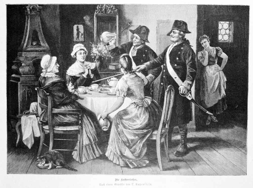
Even in the Age of Enlightenment, the story continued to brew with conflict. In 1777, Frederick the Great of Prussia tried to ban coffee altogether. He feared it would replace beer — the national drink and a source of tax revenue — and even claimed that beer made his soldiers strong, while coffee made them weak. To enforce his will, he appointed “coffee sniffers” (see picture) to hunt down those secretly roasting beans.
Despite resistance and regulation, these once-suspect beverages soon became powerful symbols of refinement, curiosity, and creative thought. Today, coffee, tea, and chocolate remain faithful companions of conversation, reflection, and imagination.
“Die Kaffeeriecher” (The Coffee Sniffers, 1892). After a painting by L. Katzenstein.
A Personal Reflection: Forbidden Pleasures and Creative Sparks
This history of suspicion and fascination mirrors the journey of modern art. Like coffee, tea, and chocolate, art has often been feared, censored, or condemned. Impressionists were mocked for daring brushstrokes; avant-garde movements were branded degenerate under totalitarian regimes. But prohibition, ridicule, or misunderstanding never extinguished their appeal — instead, it made them irresistible.
I see in these stories a reflection of human curiosity itself: the desire to taste, to see, to explore what lies beyond the accepted, the safe, the ordinary.
Explore My World of Art, Books, and Creative Concepts