Χρόνος and Καιρός

“The part of life we really live is small. For all the rest of existence is not life, but merely time.” — Seneca

Chronos measures time; Kairos gives it meaning.

The ancient Greeks had more than one word for time.

There was Χρόνος (Chrónos), the time that flows relentlessly, measured by clocks, calendars, and the ageing of our bodies. It is the time that runs, pushes us forward, and often makes us feel we are always late for something.

But the Greeks also spoke of Καιρός (Kairós): the right moment, the opportune moment, the instant when circumstances come together and something becomes possible. Unlike Chronos, Kairos cannot be measured in hours or minutes. It must be recognized.

Perhaps we spend too much of our lives chasing Chronos, when we should sometimes pause and listen for Kairos.

There is a time to sow, a time to harvest, and a time to let the earth rest. There is also a time to act, and a time to wait.

Interestingly, other ancient cultures developed similar ways of thinking about time. In Sanskrit, Kāla (काल) refers to time in its chronological and universal sense, while Ritu (ऋतु) describes time as a season or a qualitative moment—a period defined by its particular nature and significance.

The curious thing is that time does not pass at the same speed for everyone. A minute of anxiety can feel like an hour, while an entire afternoon of happiness may disappear in an instant. A child experiences summer as an eternity; an adult may wonder where the years have gone.

Chronos is the time we share. Kairos is the time we experience.

The deepest mystery of time, for me, is not how quickly it passes, but why it feels so different depending on who we are, what we are doing, and what we are waiting for. Two people can share the same hour, the same year, even the same lifetime, yet experience it in profoundly different ways. The distance between them is not measured in space, but in the way they inhabit time—as if they were living in different dimensions.

Which kind of time are you living in today?
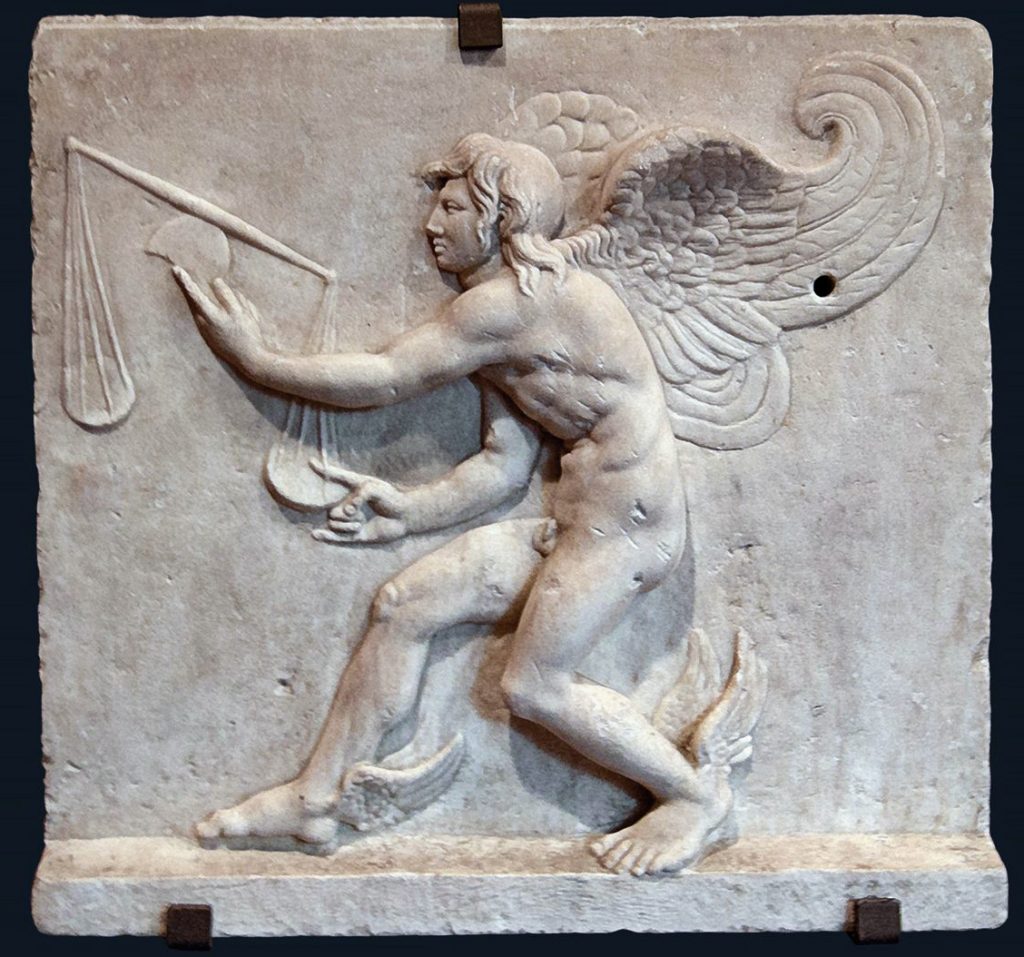
kairos, time experienced

Credit:

The image shows a relief of Kairos, the personification of the opportune moment. Why the long hair at the front and the bald back of his head?

The symbolism is brutally simple: when Kairos approaches, seize him by the hair. Once he has passed, there is nothing to hold on to. No amount of regret can bring the opportunity back.

The original reliefs associated with Kairos are preserved today at the Archaeological Museum of Trogir, Croatia, and the Kunsthistorisches Museum in Vienna.
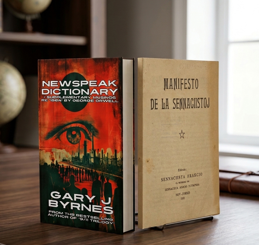
Newspeak and Esperanto: When Simplifying Language Simplifies Thought

At first glance, Orwell’s Newspeak in 1984 and Esperanto seem to have little in common. One is the fictional language of a totalitarian regime; the other was created by L. L. Zamenhof as an international language designed to make communication easier between people from different countries.

Yet they share an interesting structural principle: the simplification of language through regularity and word formation.

In Newspeak:

good → ungood → plusgood → doubleplusgood

Instead of good, bad, better, or excellent, one basic word does much of the work through prefixes and modifiers.

A surprisingly similar pattern exists in Esperanto:

bona → malbona → pli bona → bonega

good → bad → better → excellent.

The resemblance is structural, but the intentions are radically different. Esperanto uses regularity to make a language easier to learn and to generate words without memorizing endless irregular forms. Zamenhof’s aim was not to restrict thought, but to facilitate international communication.

Newspeak, by contrast, is designed to reduce the space in which thought can operate. Its ultimate purpose is not merely to simplify communication, but to make certain ideas increasingly difficult—or eventually impossible—to formulate.

There is, however, an intriguing historical footnote.

For decades, it has been speculated that Orwell’s antagonism toward his aunt’s husband, Eugène Lanti, a French socialist and prominent Esperanto speaker, may have influenced his conception of Newspeak. The claim remains speculative, not an established fact. But the story is fascinating in its own right because it leads back to the 1920s and 1930s, when many people on the political left regarded Esperanto as more than a neutral language: they saw it as a vehicle for international solidarity, social change, and working-class emancipation.

That makes the apparent linguistic connection even more intriguing—but it is important not to confuse historical speculation with evidence.

The deeper issue lies elsewhere.

A language does not merely describe thought. It also provides many of the distinctions through which we organize it.

Words do not correspond one-to-one with things or ideas. They exist within a network of synonyms, antonyms, associations, contrasts, and cultural practices. Meaning is therefore, in an important sense, holistic: a word cannot be fully understood in isolation from the larger linguistic system in which it lives.

If excellent, remarkable, magnificent, admirable, and exceptional are all reduced to variations of good, we have not merely simplified the dictionary. We have reduced the palette of distinctions available to us.

Of course, structural simplicity does not automatically produce impoverished thinking. Esperanto is a good example: a language can be highly regular and economical while remaining capable of expressing complex ideas. The danger begins when simplification stops removing unnecessary complexity and starts removing meaningful distinctions.

And that is perhaps the point worth remembering:

Distinctions matter.

So don’t be afraid of linguistic complexity. When you write, use a good thesaurus. Look at the synonyms and antonyms. Explore the neighboring words and the subtle differences between them. Then choose the word that says exactly what you mean.

Because language is not beautiful despite its complexity.

Language is beautiful because of it.

Why W Is Called “Double-U”

The letter W ultimately derives from the letter V, but its history is more layered than a simple invention after the Norman Conquest.

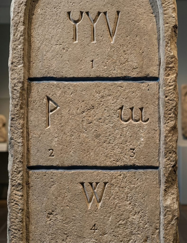
In classical Latin, inherited from the Greek and Phoenician alphabet traditions (Fig 1), the letter V served a dual function: it represented both the vowel /u/ and the consonantal sound /v/. There was no distinct symbol for /w/. In contrast, Old English (Anglo-Saxon) already had a need for this sound and used a separate rune, wynn” (ƿ, Fig. 2), to represent it.

After the Norman Conquest of England in 1066, scribal practices shifted toward continental Latin conventions. The rune wynn gradually fell out of use, and scribes began representing the /w/ sound by writing a doubled form of U (or V, since the two were not yet fully distinguished, Figs. 3-4). This “double u” convention eventually evolved graphically: two V-shaped characters were written side by side, then gradually joined.

From this duplication comes the modern name “double U,” which preserves the historical origin even though the visual form is closer to two V’s than two U’s. The lowercase w developed directly from this doubled form, simplifying over time into a continuous script shape.

In short, W is not a direct Roman invention, but a medieval solution: a hybrid born from Latin writing habits adapting to a sound already present in Old English.

Small Strokes, Big Meanings

Human writing systems are built from strokes. I’ve always been fascinated by how a simple line or mark can alter the sound or meaning of a letter, pictogram, ideogram, hieroglyph, or sinogram. Exploring scripts across the world—even from countries far apart—revealed surprising connections, almost like hidden equivalences between them. The true marvel is how our eyes can sense meaning, even when tiny, seemingly insignificant changes are made to the original sign.

In some writing systems—especially those built on characters rather than alphabets—a subtle visual change can completely shift meaning, much like how English plays with homonyms and homographs. But here, it is the visual structure itself that carries the transformation.

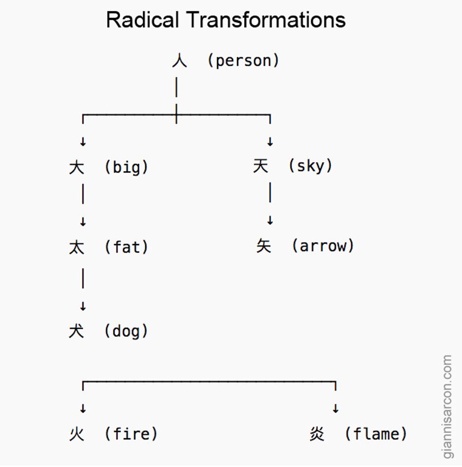
Take the Chinese character , meaning “person.” In Chinese and Japanese, this simple shape often acts as a base or radical. By adding a stroke, adjusting placement, or combining it with another element, you get entirely new words and concepts. A single alteration can lead to a dramatic change in meaning.

Here are a few examples showing how characters evolve from that shared visual root:

  • (dai, oo) — “big, large”
    Looks like a person with arms extended. One stroke changes the meaning from “person” to “large.”
  • (tai, futo) — “fat, thick”
    Add a small dot below , and the concept shifts from “big” to “overly big” or “thick.”
  • 犬 (ken, inu) — “dog”
    A short slanted stroke above the horizontal line of 大 turns the human figure into an animal.
  • (ten, ama) — “heaven, sky”
    By placing a stroke above the “big” shape, the idea rises upward—symbolically to the sky.
  • (shi, ya) — “arrow”
    Adding a vertical stroke that meets the upper horizontal line of turns it into a tool or weapon.
  • (ka, hi) — “fire”
    Here the strokes branch downward, evoking sparks or flames.
  • (en, honoo) — “flame”
    Double the fire element and you intensify the meaning: from fire to blazing flame.
radical transformations

What’s striking is how these changes don’t require entirely new symbols—just minimal visual tweaks. Where English relies on spelling or pronunciation shifts (like lead the metal vs. lead as in to guide), character-based languages often rely on visual logic. A dot, a stroke, or a slight rearrangement can redirect the meaning toward something bigger, higher, brighter, or more intense.

It’s a compact, elegant way to build vocabulary: meaning evolves visibly, not phonetically.

The Story of Blue

Sonne au comble de l'or
l'azur du jeune hiv
er
– Paul Valéry

For me, blue is air, wind, melancholy. It is like a Fellini film—always haunted by the whisper of the wind, the scent of things, and the fleeting moments of time we wish we could hold in an eternal present. Blue can carry regret; it is, in a way, a conservative principle. Blue has always held a strange duality: so immediate, yet once so elusive. Looking back to antiquity, it fascinates me that Homer never described the sea as blue, but as ‘wine-dark.’ In Greek, kyaneos evoked a dark, mineral depth, while glaukos hovered between gray, green, and blue. The Romans spoke of caeruleus, tied to the sky (caelum), and of lividus, the bruised, bluish tone of flesh. They never elevated blue; it was the color of outsiders, the hue of Celts painted in woad. Only the Egyptians seemed to truly revere it. They invented Egyptian blue, the first artificial pigment, and made it the shade of eternity and the divine.

In the Middle Ages, blue nearly vanished from prominence. Christian art turned to red, white, and black, leaving blue to the margins. Yet the word itself was evolving. The Germanic blāo—and its Vulgar Latin adoption, blavus—once meant something far less precise: shimmering, lustrous, dark, gray, even pale or yellowish. That ambiguity makes me realize how fluid color once was, before language fixed its boundaries. From blāo we inherited English blue and French bleu. Meanwhile, through Arabic lazaward came the words azure, azzurro, and azul, all born from lapis lazuli.

Then, in the 12th century, blue was transformed. Artists began clothing the Virgin Mary in ultramarine, ground from lapis lazuli more costly than gold. What had been humble became heavenly. Heraldry embraced azure as one of its noble tinctures, and kings like Louis IX made blue their emblem. A forgotten hue became a sacred, regal presence.

By the Renaissance, ultramarine shone as a color of prestige, truth, and constancy. Painters reserved it for the highest subjects, poets linked it to loyalty, and explorers carried its name across the seas as azul. Blue had finally claimed its place.

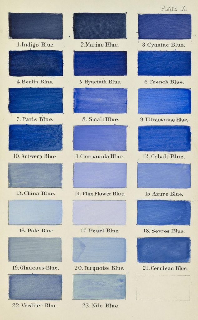
The modern era democratized it. Prussian blue appeared in 1704, followed by cobalt, cerulean, and synthetic ultramarine. Blue poured into uniforms, flags, and revolutions; it became the shade of liberty, of nations, of collective identity. Goethe called it spiritual, a color that retreats yet draws the soul inward.

In the 20th century, painters gave blue an entirely new destiny. The Expressionists used blue to conjure emotion, depth, and inner turbulence—think of Kandinsky, who saw blue as moving ‘toward the infinite,’ or Franz Marc, who painted blue animals to symbolize spirituality and hope. Even Van Gogh’s Starry Night swirls with blue, capturing both wonder and melancholy. Later, Picasso entered his Blue Period, transmuting sorrow into tone. Yves Klein went further still, reducing blue to its purest intensity with his International Klein Blue, turning it into an immaterial field of experience. For Klein, blue was not simply a color but ‘the most abstract color of all,’ a space in which one could lose oneself.

Today, I see blue everywhere. In the jeans that became the fabric of daily life. In corporate logos designed to inspire trust. In flags that mark belonging. Blue is calm, yet melancholy; humble, yet exalted. Once overlooked, it is now the world’s favorite color.

Blue is more than a hue. It is an idea shaped across centuries—etymologically born of caelum, blāo, and blavus; symbolically stretched between heaven and earth; culturally tied to faith, power, and identity. Its story mirrors our own: restless, mutable, and ever searching for meaning.

I’ll end with a little story from my own family. After World War II, my paternal grandfather, a house painter, bought a massive surplus of blue paint from the military. He had so much of it that whenever a client asked how he planned to paint their home, his answer was always the same, year after year: “All in blue, yes, all in blue…” (in our dialect, tutt’azzurr, tutt’azzurr).

That simple phrase stuck. Before long, the whole village started calling our family the Tuttazzurr family, and I myself became known as Giuan Tuttazzurr. Blue marked our home, but also my identity and my story—etched in memory and in name.

The Word: From Incantation to Influence

In the beginning, whether real or invented, certain words—many from a distant past—formed a bridge between humans and the great Mystery. One such word that survived the ages, still cloaked in a strange aura of power, is Abracadabra. Even today, magicians use it to conjure effect, echoing its ancient weight.

Originally, Abracadabra wasn’t just theatrical. It was an apotropaic charm—spoken or inscribed to ward off harm. The earliest record, from the 2nd century CE in a medical treatise by Serenus Sammonicus, describes it as a remedy for fever. Written in a tapering triangle, the word visually dissolved with each line, symbolizing the illness retreating. Its origins are uncertain. Some link it to Aramaic or Hebrew—“I create as I speak” (אברא כדברא). Others see it as a coded sequence from the Greek alphabet (ΑΒΓΔ), or a variant of another potent name: Abraxas.

An incantation born of another—what a journey through a world woven in magic.

Abraxas (Greek: ἀβραξάς), central to the Gnostic teachings of Basilides, named a powerful being ruling over 365 heavens. Engraved on amulets, Abraxas was thought to hold innate power. These stones, often cited in magical texts, show a belief system where sound and symbol merged—where the right word could invoke protection, healing, or cosmic order. Its earlier spelling, Abrasax, likely morphed through transliteration. With seven letters, the name was also tied to the seven classical planets, deepening its cosmic charge. Whatever its true roots, one idea persists: properly arranged, words carry force.

Across time, this belief shifted but never vanished. Ancient incantations gave way to new forms of verbal power.

Antiphon of Athens (5th century BCE) stripped speech of ritual but kept its essence. Considered a forerunner of psychotherapy, he used dialogue to ease emotional suffering. His method wasn’t mystical—it was precise, rooted in rhetoric and clarity. Where once words summoned the divine, now they served insight and balance.

Language, even without the trappings of magic, remains transformative. In the 20th century, thinkers like Paul Watzlawick showed how communication doesn’t just reflect our world—it shapes it. A change in phrasing can shift perception. A word can open or close a mind.

From Abraxas to Abracadabra, from spell to speech, the thread continues: words influence, connect, heal. What began as incantation lives on as conversation—still crafting reality, still carrying power.

The Interrogation Mark: From Greek Semicolons to Spanish Twists

In ancient Greek, questions were marked by a semicolon (Ερωτηματικό) rather than a question mark. This practice faded over time, and no special punctuation indicated questions in antiquity. The modern question mark emerged in the Middle Ages when scribes used “qo” (from Latin quaestio). To avoid confusion, they stacked the letters, turning the Q into a curl and the O into a dot, creating the question mark (“?”). In Spanish, the question mark was placed only at the end until 1754, when the Ortografía de la Real Academia introduced the inverted opening question mark (¿), as in: ¿Qué edad tienes? (How old are you?).

The Many Flavors of Absence

A guy walks into a bar and asks for a coffee without cream. The bartender replies, “Sorry, we’re out of cream—how about a coffee without milk instead?” 

It’s a simple joke, but it highlights something curious: absence has weight. Psychologically, a coffee without cream doesn’t feel quite the same as a coffee without milk. 

Now, let’s take it a step further. Is the absence of a loved one the same as the absence of a random stranger? Of course not. Absence isn’t just a void—it carries the shape of what’s missing. 

The ancient Greeks had a word for this: steresis (στερήσις), the idea that everything is defined by both what is present and what is absent. Zen philosophy explores a similar concept with mu (無), suggesting that sometimes, absence is a kind of presence in itself. 

So next time you order a coffee without cream, pause for a second—what is it you really don’t want to be in there?

The Soul of Books: A Journey from Bark to Pages

I must have been born in a library, for the love I hold for books is immeasurable. A book awakens all the senses in me: the visual pleasure, the tactile warmth, the scent of cinnamon or vanilla from old pages, the soft rustle of turning leaves, and even the taste… To me, no digital book will ever replace the presence of a real one, with its soul and essence.

But the journey from tablet to scroll, to codex, and finally to the modern book spans millennia. The codex, the direct ancestor of today’s book, introduced a revolutionary format—pages bound along one edge—laying the foundation for how we read and store knowledge today.

Books, as we recognize them, became widespread during the Middle Ages, largely due to Gutenberg’s invention of the printing press. However, the codex itself dates back much further. It was made of sheets folded multiple times, often twice, to form a bifolio. These bifolia were sewn together into gatherings, allowing for binding and, when needed, rebinding. The most common structure consisted of four bifolia—eight sheets, totaling sixteen pages—known in Latin as quaternio. This term later gave rise to quaderno in Italian, cahier in French, and quire in English. Interestingly, the Latin word codex originally meant a block of wood, a nod to the materials once used for writing.

Even the word book has deep roots—its Old English form, bōc, likely stems from the Germanic root bōk-, meaning beech. This isn’t just a linguistic coincidence; early writings may have been carved into beech wood. In Slavic languages, the word for “letter,” буква (bukva), shares this origin. In Russian, Serbian, and Macedonian, букварь (bukvar’) or буквар (bukvar) refers to a child’s first reading textbook.

Similarly, the Latin word liber, which gave rise to libro in Italian and livre in French, originally meant “bark,” reinforcing the deep connection between books and trees. The Greek root biblio, is believed to be derived from βύβλος (búblos), meaning “papyrus,” named after the ancient Phoenician city of Byblos, a major hub of the papyrus trade.

From carved wood and tree bark to bound pages and printed volumes, books have always been deeply rooted in nature—both in language and in form.