People often ask where my ideas come from. There is no single answer. They tend to surface quietly, shaped by places I’ve seen and cultures I’ve crossed.
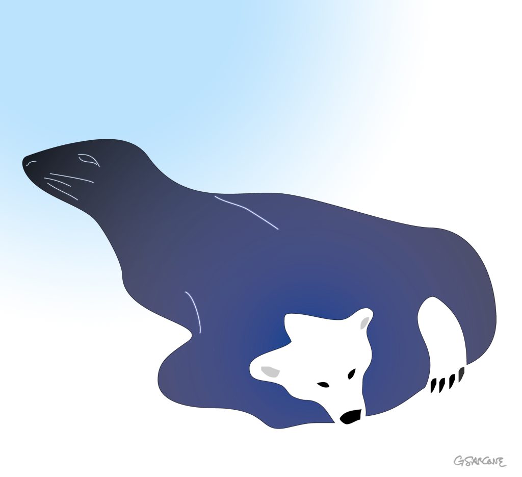
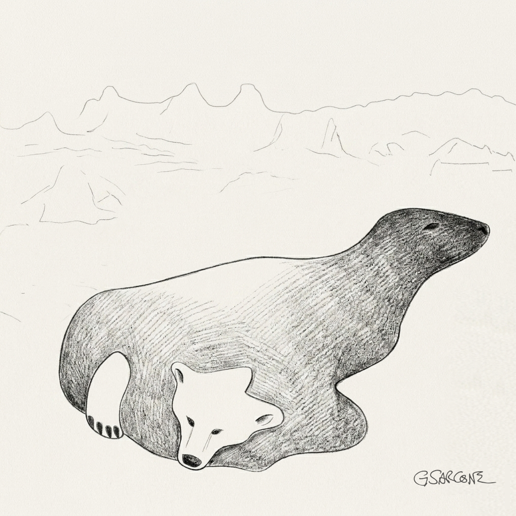
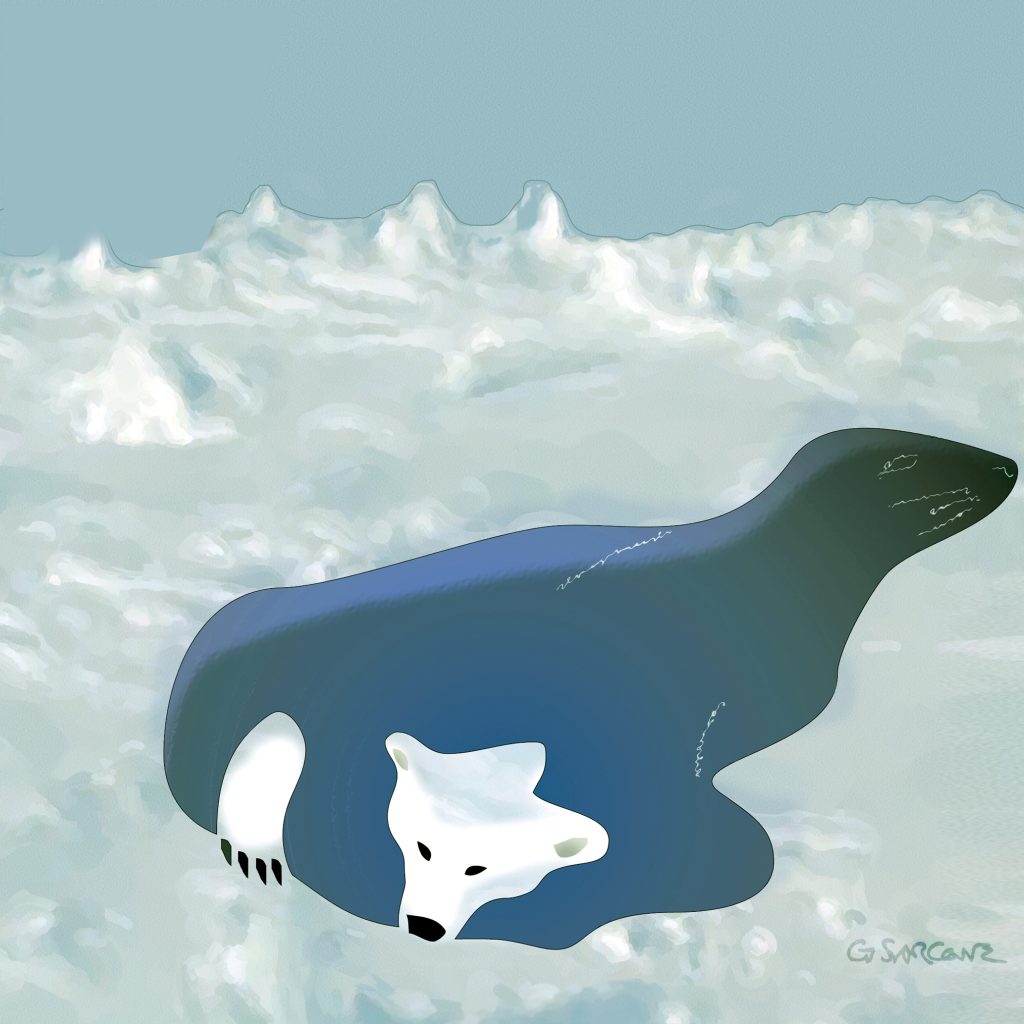
“Seal or Bear?” grew out of that kind of moment. An animal suspended in the vastness of a frozen world—emerging from an ice hole, yet refusing to settle into a single identity. Is it a polar bear? A seal? Or something that holds both readings at once?
The idea came to me while traveling through northern Canada, surrounded by the stillness of Arctic landscapes and the deep presence of Inuit traditions. That silence has a way of sharpening perception—of making ambiguity feel natural rather than puzzling.
First created in the 1990s, the illusion went on to become a reference point in visual perception studies and later found its way into textbooks.
More recently, the “Seal or Bear?” illusion will be featured by the NHK Educational Corporation as part of a 2026–2027 educational series on psychology and visual perception.
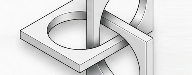
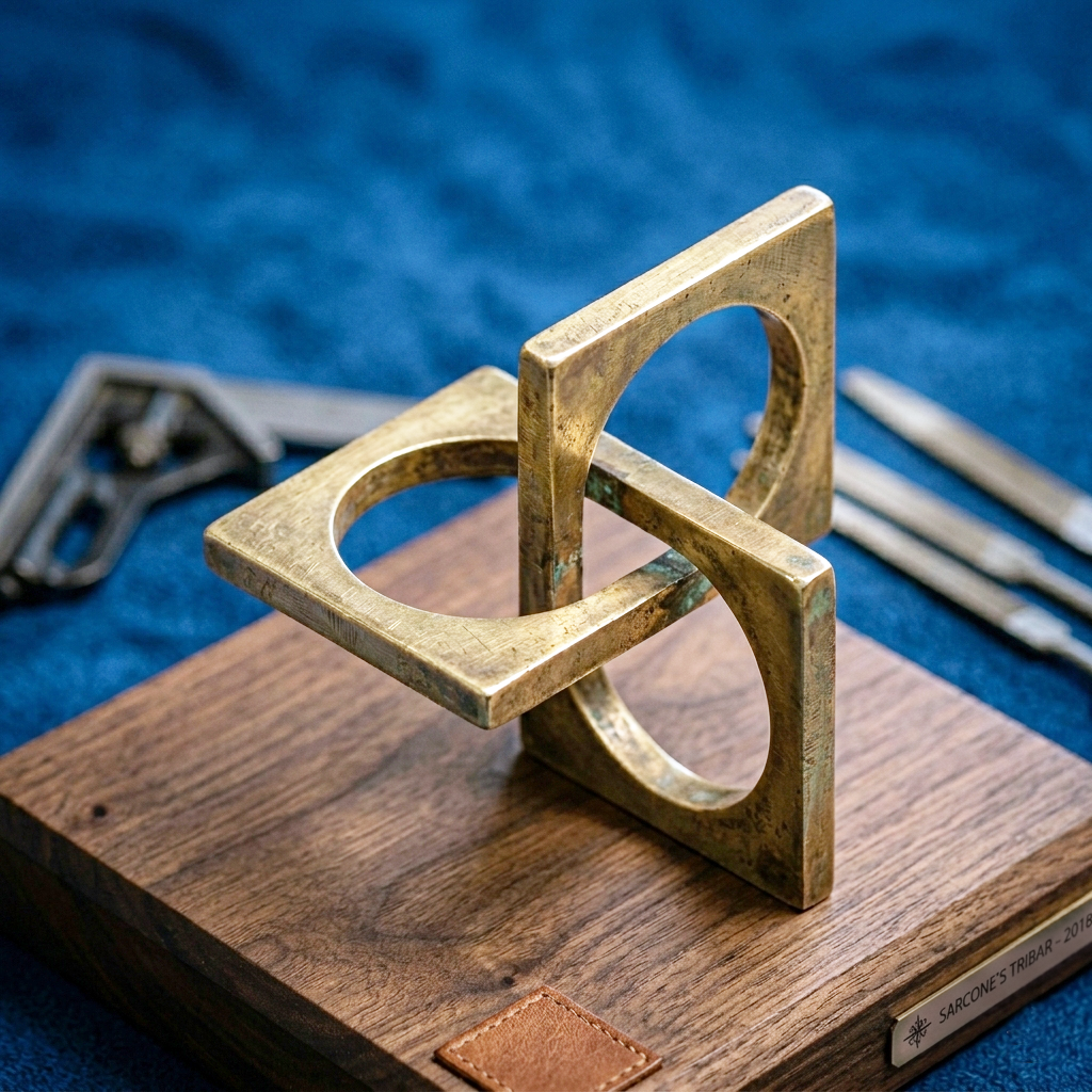
This form belongs to the family of impossible figures, more specifically to the Penrose triangle, or tribar.
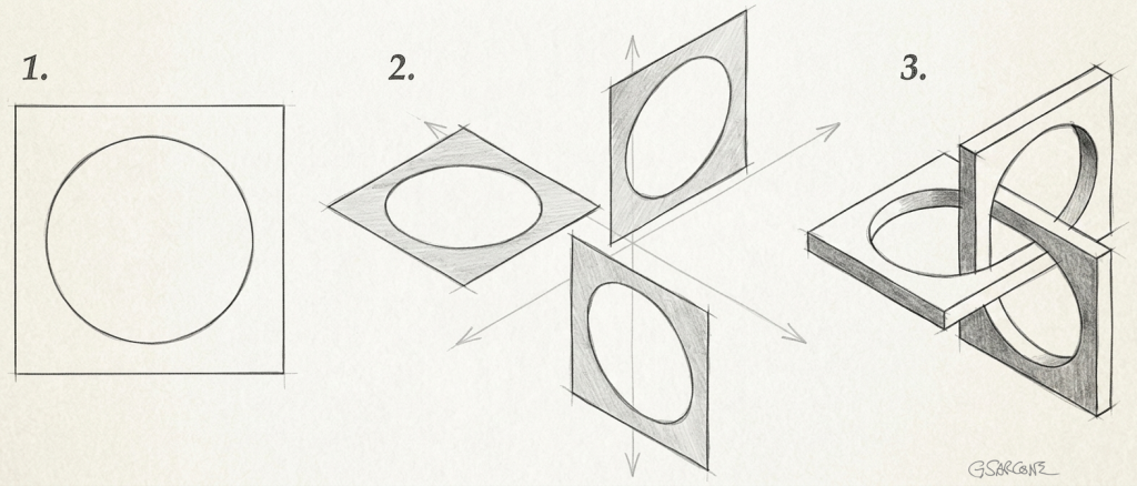
At first glance, it looks entirely manufacturable. The structure appears to be made from three identical square rings (Fig. 1), each pierced by a circular opening and arranged in three mutually perpendicular planes (Fig. 2). Together, they seem to interlock seamlessly, forming an impossible three-dimensional tribar that evokes a trefoil knot and its endless over-under weaving.
If this sculpture looks physically realizable to you, congratulations: your visual system has just accepted a geometric impossibility.
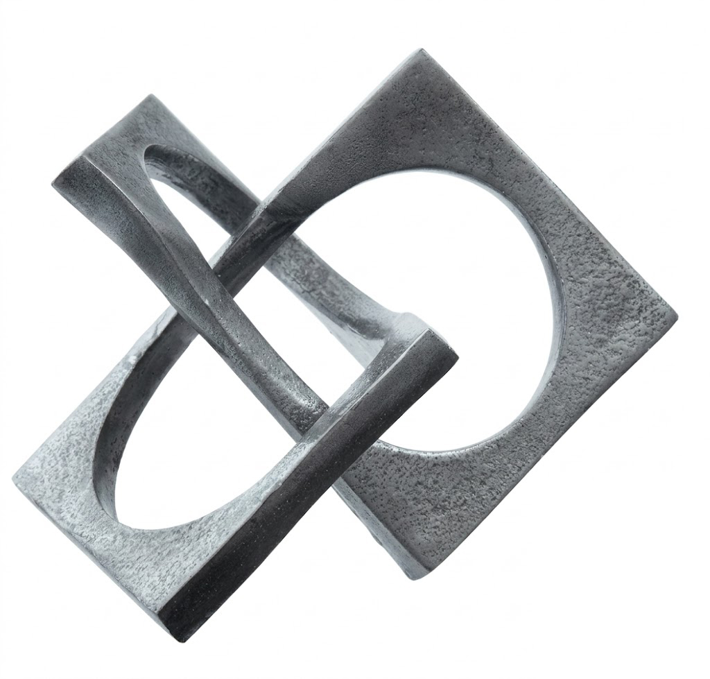
Could such an object be built? Not exactly. One solution would be to twist one of the junctions slightly, but that trick would be immediately noticeable here because some of the angles would no longer appear perfectly square (90°), as shown in the picture below. Another possibility would be to leave a small gap at one junction and view the sculpture from a carefully chosen angle, allowing perspective to hide the discontinuity.
This is how a real 3D Borromean Tribar would appear…
Inside plants and living beings, there are remnants of ancient independent beings that once lived on their own, long before becoming part of the cellular world we know today. Known in biology as “organelles,” these are the living proof of ‘endosymbiotic theory’. They survive not as ghosts, but as symbiotic, working structures—still active, still essential, still carrying their own ancient logic.
From the host cell, these once-independent bacteria receive what any free organism would constantly struggle to secure: a stable, protected environment. No predators. No sudden shifts in conditions. A controlled internal world with steady access to water, nutrients, and chemical balance. In short, they are sheltered inside a living system that maintains their continuity.
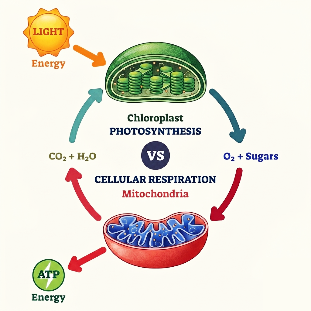
Chloroplasts are the light catchers. You can think of them as tiny green alchemists, turning sunlight and water into stored energy, like weaving daylight into sugar. They belong to plants and algae, quietly building the foundation of almost every food chain on Earth.
Mitochondria are the fire keepers. They don’t create energy from light, but unlock it from what we consume, breaking down fuel to release usable power for the cell. Without them, nothing in the body moves, thinks, or repairs itself.
There is also a quieter detail: mitochondria are inherited almost exclusively from the mother. They pass from mother to child through the egg, like an intimate biological thread, while paternal mitochondria are usually removed after fertilization. Every cell therefore carries a subtle maternal imprint within its energy system.
In simplified terms, chloroplasts harness sunlight and water to generate sugars, storing energy in chemical form, while mitochondria release that stored energy for the cell by breaking down those molecules. One captures energy from light; the other unlocks it from organic matter—together sustaining the energetic cycle of complex life.
An illusion carved in emotion—can you spot the hidden lovers within?
I created this illustration for a commissioned series examining the underlying strata of interpersonal intimacy.
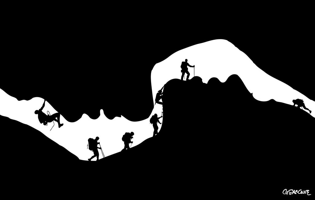
This black-and-white composition plays on figure–ground reversal. At first glance, it reads as a cave opening with a line of climbers moving along a rugged ridge. Look again, and the void resolves into the soft profile of two faces, suspended in the instant before a kiss.
Interested in commissioning my work to illustrate your next editorial project or conceptual series? Let’s discuss how we can bring your vision to light.
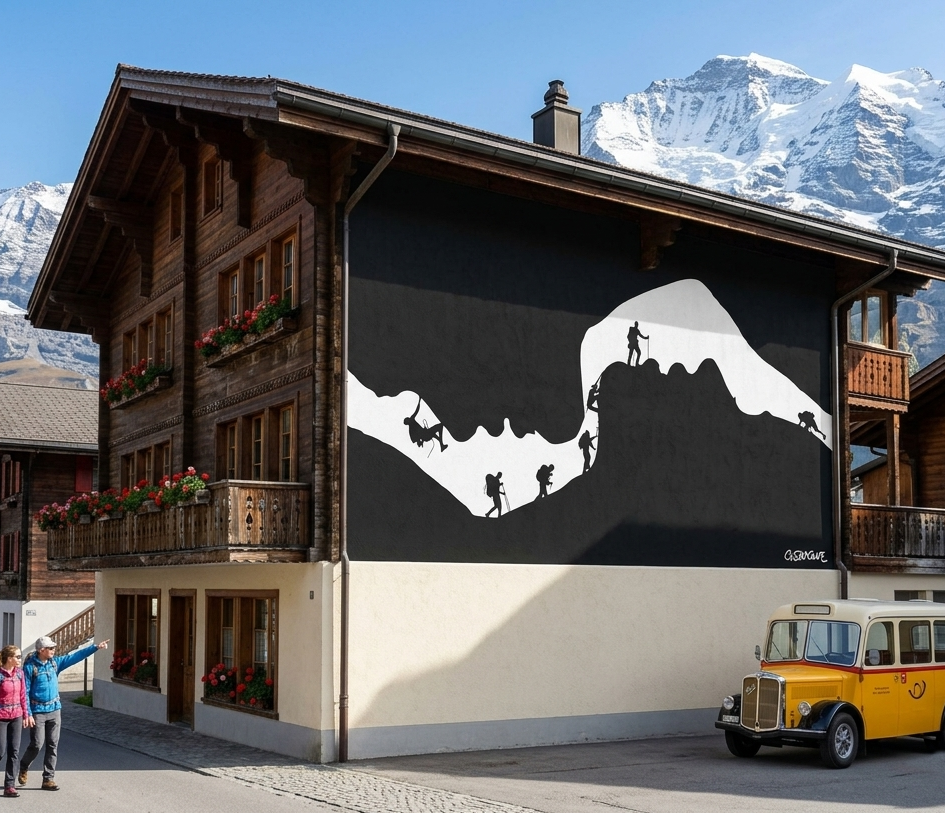
The stark contrast and clean silhouettes lend themselves naturally to large-scale applications. On a façade, the image finds a natural home as a mural in a Swiss village, where the alpine setting mirrors the climbers’ ascent.
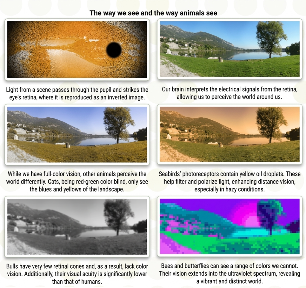
Deep in the retina, an ancient memory persists. Our visual cells rely on “opsins“—light-sensitive molecules inherited from unicellular organisms that existed long before animals. For over a billion years, life has refined this simple act: catching light. In the sea, the same logic still plays out. Some oysters host algae on their mantle; they feed them, and in return these light-sensitive cells signal the presence of light. A quiet watch system—almost an eye, spread across a surface. In certain algae, like Chlamydomonas reinhardtii, a tiny eyespot—the stigma—is enough to steer the organism toward light. Not an eye, but already a direction, a choice. Our rods and cones extend that first invention: a long lineage of light detectors, slowly shaped over time, linking our vision today to the faint glimmers of the earliest oceans.
In the tiny alga Volvox, a newly found light sensor glows green, showing where it sits around the cell’s center. (Image: Eva Laura von der Heyde / University of Bielefeld)
Color is energy—an electromagnetic phenomenon shaped by how light is reflected from objects. What we call vision is not innate. It is largely learned, built through a slow and demanding process. We tend to take it for granted, yet someone born blind who later gains sight must spend years learning how to organize and interpret what now enters the eyes.
Seeing is neither simple nor passive. When we look at a landscape, color information reaches the visual cortex in roughly 30 milliseconds (in the occipital lobe, V1). Only a fraction later—around 70 milliseconds—shape, depth, and motion begin to emerge. In these brief intervals, the brain filters, compares, and reconstructs fragments of data, assembling them into a coherent image. What we perceive is not a direct recording of reality but a refined interpretation—an internal best guess shaped for meaning and action.
I’ve long been intrigued by the way people with partial or total visual loss engage with the world. Any serious reflection on perception or optical illusion eventually meets its counterpoint. Understanding how they “see” without sight reveals the real weight of vision itself—and how inseparably it works with the other senses, each one calibrating the rest.
When we see, move, speak, and feel at once, what actually binds sight to touch or hearing? The truth is, we notice far less than we assume. We attend only to what matters in the moment. Without the constant support of the other senses, perception would collapse into confusion, because they operate quietly in the background, guiding everyday behavior.
A striking example comes from research on inattentional blindness. In a well-known 1999 experiment by Daniel Simons and Christopher Chabris, participants watched a video and counted basketball passes between two teams. Nearly 40 percent failed to notice a person in a gorilla suit walking through the scene, pausing, even dancing, before exiting. The demonstration is disarming in its simplicity: we do not see what we do not attend to—even when it stands directly in front of us.
It’s not uncommon to read, on a snack package, the phrase “with chocolate taste,” often printed in bold uppercase. The wording plays a subtle trick on the mind. Most people assume the product must contain chocolate. Yet a flavor is not a substance. More often than not, what we bite into carries only the impression—an illusion—of chocolate.
The same applies to color. Our brain is just as easily misled. Colors behave like flavors: they may smell—pardon… look—like a particular hue, but they are subjective sensations rather than fixed properties of the outside world. They shift with context, changing according to their surroundings. More striking still, identical colors can appear different under certain conditions, while different colors may look the same. This phenomenon is known as color induction.
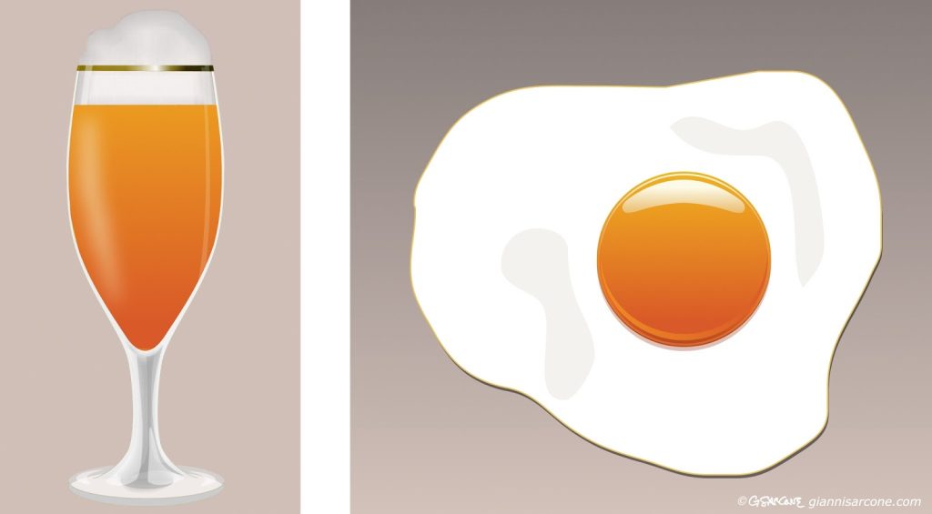
Even texture plays a role. It can alter how we perceive a color’s intensity and tone. Take beer and an egg yolk: they may share the same orange hue and gradation. Yet the brain reads them differently. The glass and the liquid are perceived as translucent, so their color seems lighter, duller, more diluted. The yolk, by contrast, appears opaque, with a richer, more glossy, more solid color.
In this picture, the beer and the egg share exactly the same orange gradation.
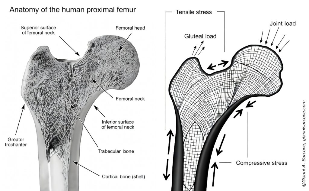
Few people know that the human femur—the body’s largest and strongest bone—played an indirect role in the thinking behind the design of the Eiffel Tower.
Part of the tower’s structural logic can be traced to Swiss engineer Maurice Koechlin, chief engineer in the firm of Gustave Eiffel. While determining how forces would travel through the iron frame, Koechlin applied a principle that places material along the natural paths of tension and compression.
A comparable pattern had been described earlier by Zurich anatomist Hermann von Meyer. His research revealed that the femur’s internal structure forms a network of delicate struts known as “trabeculae.” These tiny elements follow the directions of mechanical stress inside the bone, creating a highly efficient system of support—even though the femoral head sits off-center from the shaft.
The mathematician Karl Culmann later showed that these trabecular patterns correspond closely to the principal stress lines calculated in engineering. His method, called graphic statics, provided a visual way to map how forces move through structures.
This link between anatomy and engineering influenced nineteenth-century structural thinking. The same principle—placing material only where forces demand it—guided the development of lighter, more efficient frameworks in bridges, cranes, and reinforced-concrete designs.
In 1934, the Swedish artist Oscar Reutersvärd sketched a peculiar triangle made of small cubes, neatly aligned on an isometric grid. Everything looked geometrically sound—until the mind tried to assemble it in real space.
This triangular paradox has distant echoes in ancient Greek geometry, but Reutersvärd gave it a clear visual form: the impossible figure.
That’s the charm of impossible figures: every part looks right, yet the whole quietly breaks reality.
I began exploring these paradoxical structures in the 1980s. My interest grew naturally from the meeting point of two inclinations: a mathematical curiosity about spatial logic and a visual fascination with form. Over time I produced many variations—sometimes rediscovering ideas that others had already touched upon, occasionally arriving at configurations that felt genuinely new. In geometry, complete novelty is rare; most discoveries emerge as unexpected turns within an existing landscape.
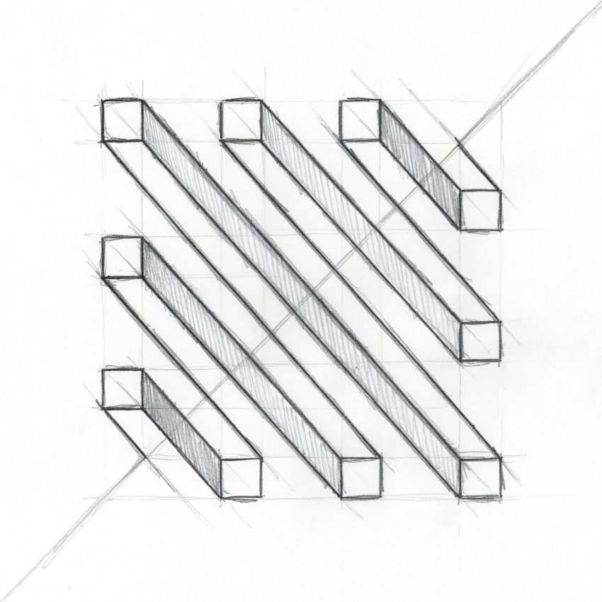
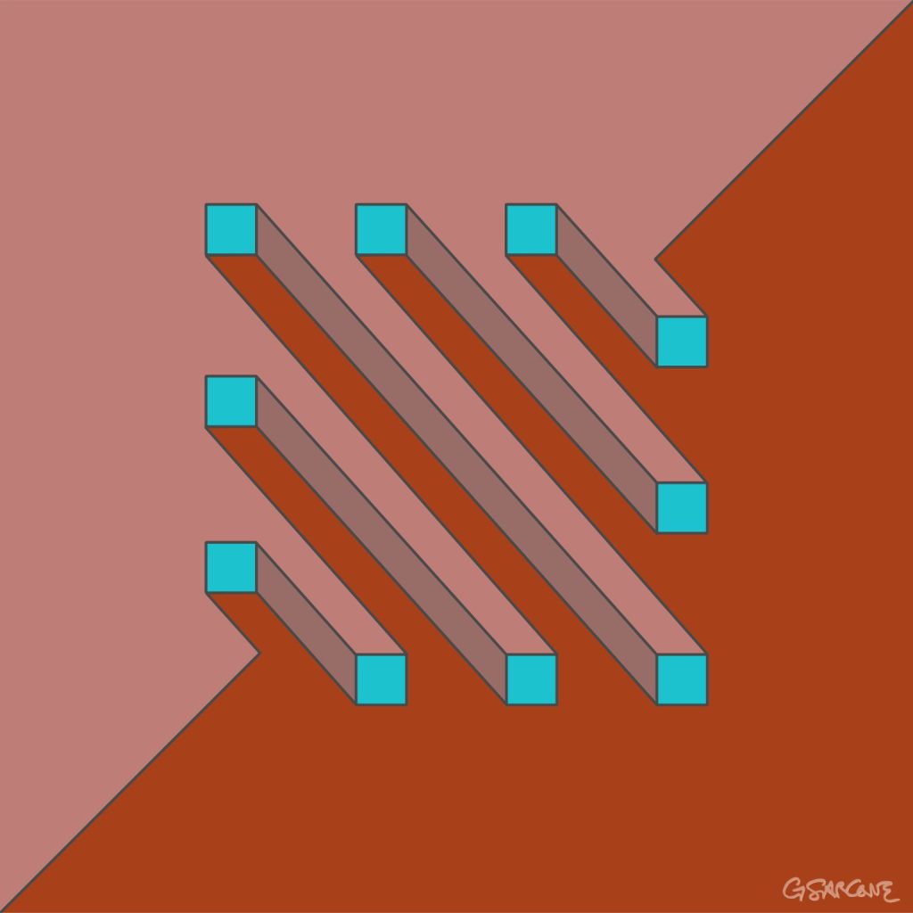
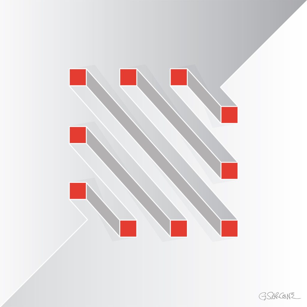
One example from that period is the study shown here, created in the late 1990s and titled Undecidable Bars.
Parallel bars appear to run calmly side by side, yet their connections quietly sabotage the logic of space. Perspective slips from one segment to another, forcing the eye to accept incompatible viewpoints at the same time.
Each element seems perfectly normal. Together, they form a structure that cannot exist.
Some bars appear to pass through others; some join where no joint should be possible. The geometry behaves as if the object were bending through space, while every line still respects the conventions of perspective drawing.
The result is an undecidable figure—a form the eye can follow effortlessly, but the mind cannot reconstruct.
Over the years I have created hundreds of images built on similar principles, across different formats and media. If these works interest you for a book, exhibition, or monograph, feel free to contact me.
Here’s a simple 18-frame animation of my Op Art piece—work in progress.
“The Master of Numbers” is an Op Art photomosaic portrait of the renowned physicist, created from a collection of photographs of numbers. Each detail contributes to a visual exploration of mathematics, perception, and pattern. The project took me two years to complete, photographing numbers in the most unusual places and objects, and bringing them together into a single portrait.
And a little secret: tucked inside the mosaic is a tiny portrait of me and my wife—a fun, hidden signature and a personal touch.
Limited edition posters and prints are available through my online gallery.
Explore My World of Art, Books, and Creative Concepts