Every frame in this GIF is a 3,100-digit prime number:
Together, they recreate the world’s first motion picture: Eadweard Muybridge’s iconic 1878 “Galloping Horse.”
How it works: Each frame is converted into a grid of 1s and 8s, then slightly tweaked until the math clicks and a prime number is born. Fast primality tests spot the candidates, and rigorous checks confirm them.
The result? An animated piece of history, built entirely out of pure mathematics.
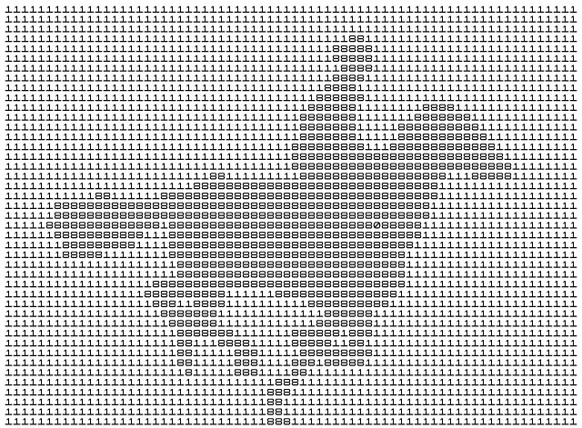
A Zen-inspired sumi-eunicursal brushstroke that gently evokes the silhouette of a sleeping cat.
A single brushstroke, almost nothing… and yet the mind completes the rest. This Zen-inspired sumi-e line suggests the presence of a sleeping cat, as the brain instinctively searches for form, balance, memory, and meaning within this minimal stroke. A curve becomes a back, a pause becomes a head, and empty space turns into stillness—peace, quietude itself. Strangely, this allegorical curve echoes the Japanese symbol ensō (円相; “circular form”), often drawn in calligraphy as a gesture that holds completeness and imperfection in the same breath.
Minimal drawing works because perception is never passive. We do not simply “see” the world; we continuously reconstruct it from fragments. A few essential marks are enough for the imagination to awaken and project life into absence. The unfinished image invites the viewer to participate in its creation.
This is one of the quiet powers of strict minimalism: removing detail does not always diminish reality — sometimes it amplifies it. In sumi-e, what is omitted matters as much as what is painted. The void is not empty; it breathes. Perhaps that is why a simple unicursal stroke can feel strangely alive.
Art begins precisely there: at the threshold where perception, imagination, and silence meet.
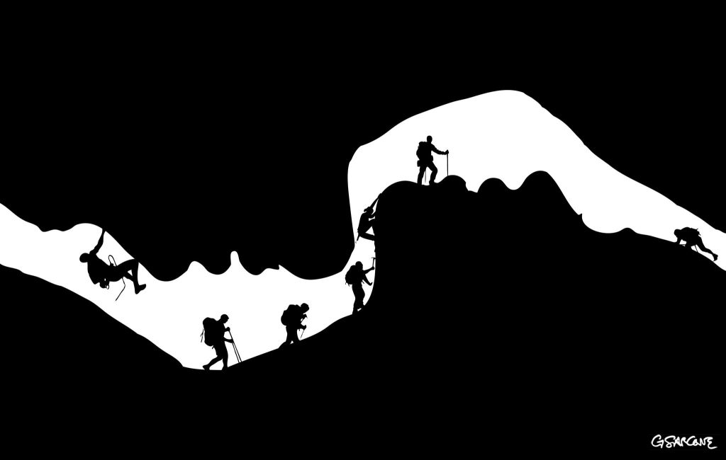
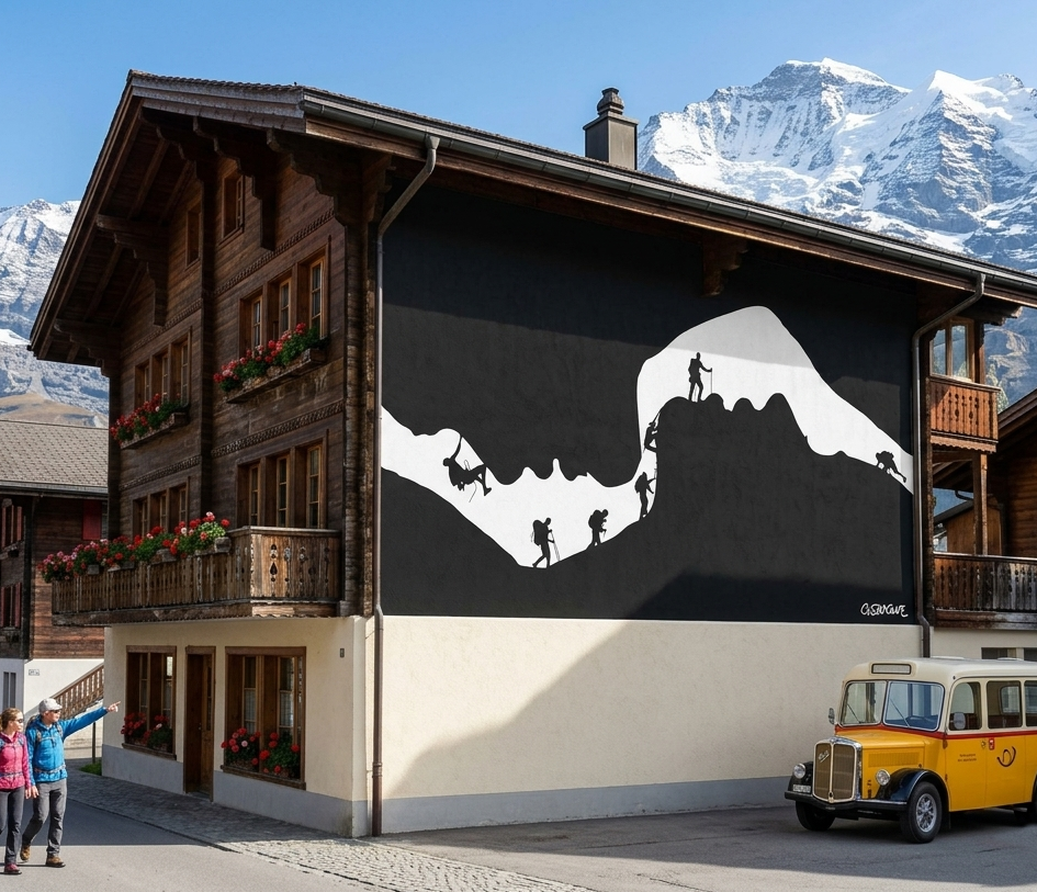
An illusion carved in emotion—can you spot the hidden lovers within?
I created this illustration for a commissioned series examining the underlying strata of interpersonal intimacy.
This black-and-white composition plays on figure–ground reversal. At first glance, it reads as a cave opening with a line of climbers moving along a rugged ridge. Look again, and the void resolves into the soft profile of two faces, suspended in the instant before a kiss.
Interested in commissioning my work to illustrate your next editorial project or conceptual series? Let’s discuss how we can bring your vision to light.
The stark contrast and clean silhouettes lend themselves naturally to large-scale applications. On a façade, the image finds a natural home as a mural in a Swiss village, where the alpine setting mirrors the climbers’ ascent.
In 1934, the Swedish artist Oscar Reutersvärd sketched a peculiar triangle made of small cubes, neatly aligned on an isometric grid. Everything looked geometrically sound—until the mind tried to assemble it in real space.
This triangular paradox has distant echoes in ancient Greek geometry, but Reutersvärd gave it a clear visual form: the impossible figure.
That’s the charm of impossible figures: every part looks right, yet the whole quietly breaks reality.
I began exploring these paradoxical structures in the 1980s. My interest grew naturally from the meeting point of two inclinations: a mathematical curiosity about spatial logic and a visual fascination with form. Over time I produced many variations—sometimes rediscovering ideas that others had already touched upon, occasionally arriving at configurations that felt genuinely new. In geometry, complete novelty is rare; most discoveries emerge as unexpected turns within an existing landscape.
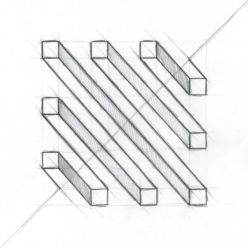
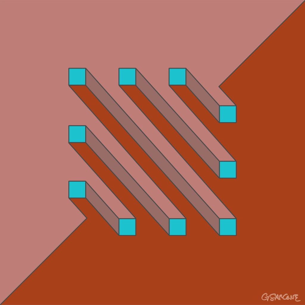
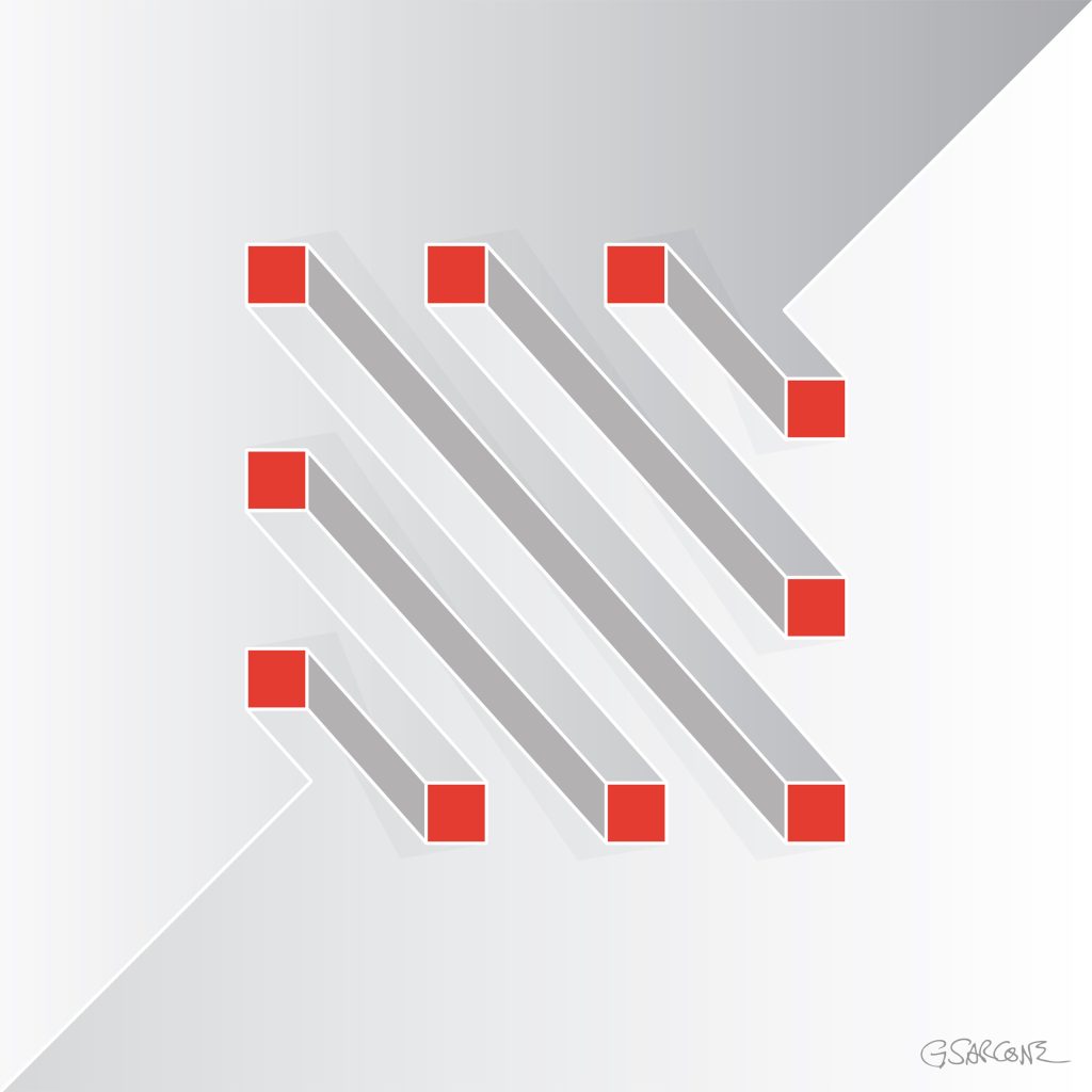
One example from that period is the study shown here, created in the late 1990s and titled Undecidable Bars.
Parallel bars appear to run calmly side by side, yet their connections quietly sabotage the logic of space. Perspective slips from one segment to another, forcing the eye to accept incompatible viewpoints at the same time.
Each element seems perfectly normal. Together, they form a structure that cannot exist.
Some bars appear to pass through others; some join where no joint should be possible. The geometry behaves as if the object were bending through space, while every line still respects the conventions of perspective drawing.
The result is an undecidable figure—a form the eye can follow effortlessly, but the mind cannot reconstruct.
Over the years I have created hundreds of images built on similar principles, across different formats and media. If these works interest you for a book, exhibition, or monograph, feel free to contact me.
Here’s a simple 18-frame animation of my Op Art piece—work in progress.
“The Master of Numbers” is an Op Art photomosaic portrait of the renowned physicist, created from a collection of photographs of numbers. Each detail contributes to a visual exploration of mathematics, perception, and pattern. The project took me two years to complete, photographing numbers in the most unusual places and objects, and bringing them together into a single portrait.
And a little secret: tucked inside the mosaic is a tiny portrait of me and my wife—a fun, hidden signature and a personal touch.
Limited edition posters and prints are available through my online gallery.
Impossible or undecidable figures have long fascinated artists, mathematicians, and viewers alike. Their appeal lies in a delicate tension: the structure appears perfectly logical at first glance, yet closer inspection reveals spatial contradictions that cannot exist in the physical world. My latest work revisits an idea I first explored in the 1990s—an impossible Rubik’s-style cube—now developed into a new series built across several stages, from hand-drawn construction to digital refinement and photographic interpretation.
The project began with a simple geometric framework—interlocking beams arranged to suggest a stable cubic volume. The challenge was to reinterpret an apparently ordinary three-dimensional cube into an ambiguous form that still appears structurally plausible. Through careful adjustments of line weight, contrast, and directional and formal cues, the cube gradually shifts from perceived solidity to spatial uncertainty, so that as the eye moves across the image, the object quietly reorganizes itself, producing a surreal perception in place of a coherent physical structure.
Here is the original version of the project, refined from my initial hand-drawn construction and carefully reconstructed using FreeHand MX
Two of the final images belong to the Op Art tradition, where sharp black-and-white geometry emphasizes visual tension and rhythmic structure. These compositions highlight the cube’s architectural clarity while allowing the paradox to emerge naturally from the viewer’s perceptual processing. The remaining two images take a different path: they present the object in a photographic setting, rendered with realistic lighting and textures.
Together, the four images form a small visual narrative—construction, transformation, and illusion—showing how a purely conceptual structure can evolve into multiple aesthetic forms. The Op Art versions focus on perceptual mechanics, while the photographic interpretations suggest how an impossible form might inhabit the physical world, even if only in appearance.
Fine art prints and canvas editions from this series are available through my official gallery shop, where each piece is produced using archival materials designed for long-term display.
Collectors and galleries interested in larger formats or special editions may also contact me directly for availability and production details. This series continues my exploration of perceptual geometry, where simple shapes become instruments for questioning how we construct space, depth, and visual certainty.
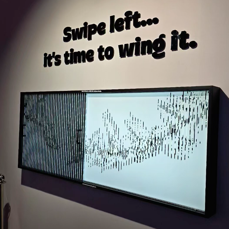
Here are two Kinegram installations I made, designed to educate, engage, and spark curiosity in visitors of all ages. These works make motion appear from static forms, offering an experience that is both playful and thought-provoking.
Kinegrams reveal movement through a sliding transparent panel printed with vertical black lines. As the panel moves over the underlying image, hidden sequences appear, animating the drawings like frames of a film. Each interaction lets the viewer explore how motion can emerge from stillness.
The concept of movement from static forms has long interested scientists and philosophers. Movement is a dimension unfolding in space and time—without time, there is no motion. Kinegrams make this idea tangible through touch and visual perception.
These exhibits are simple to set up but produce surprising results. I made the first panel for UNIFI, the University of Florence, and the second for the Mind Games Art Alive Museum in Sydney. Both projects engage and surprise visitors, combining education with visual impact.
“Twisting Cords,” Kinegram exhibit for UNIFI, Florence As the transparent panel etched with black lines glides across the design, colorful cords seem to twist, winding and unwinding in a mesmerizing, living rhythm.
“Flying Birds – Migration,” Kinegram exhibit for Mind Games, Sydney As the transparent panel etched with black lines glides across the static design in the background, the flock of birds rises and takes wing, transforming a still pattern into living, rhythmic motion.
I’ve always wondered about the limits of shape and color needed for us to represent or recognize an object. Take a stemmed glass, for example. To depict it, you might need just two circles and a straight line—and perhaps a red disc to suggest the wine inside.
But we can go further: by turning it from a flat image into a 3D form with a simple rotational movement, like in Duchamp’s rotoreliefs, the object suddenly comes alive in space.
All these graphic shortcuts rely on memory. Our brains interpret what we see based on past experience, filling in missing information and reconstructing the object from just a few essential cues. This process aligns with the principles of visual perception: the Gestalt laws of closure and continuity explain why we perceive a complete glass even when much of it is absent. Minimalist perception highlights how human cognition distills visual information, showing that a few simple shapes and colors are enough to evoke a rich, instantly recognizable image.
We usually perceive lines and shapes as forming a figure, while the paper and surrounding white space recede into the background. Yet, under certain conditions, what we assume to be background can itself acquire form and meaning. In the illustrations shown here, a clear geometric figure emerges—even though no lines actually define it. These visual phenomena are known as illusory figures.
What kind of 3-dimensional shape do you see?
Illusory figures depend, in part, on the presence of regular gaps within a visual arrangement. When such gaps occur, the visual system instinctively tries to resolve them into coherent forms. These gaps can be created by simple elements, such as circles. When solid black circles and partially “chipped” ones are arranged carefully, they produce striking illusory shapes.
The most familiar example is the Kanizsa triangle. Here, an illusory contour is perceived when black disks with wedge-shaped sections removed are aligned so that their edges define a triangular form in the negative space. Remarkably, this illusory region appears brighter than the surrounding page, even though its physical luminance is identical.
Kanizsa triangle
Etherial Cross
A pattern of black dots forms a ghostly ‘X’ shape through negative space. The arrangement of dots creates a subtle sense of motion and depth. The piece combines the Ouchi effect—where contrast between figure and background generates apparent movement—with the Kanizsa illusion, where the mind completes shapes that aren’t actually drawn.
Fine art prints of this Op Art piece are available for purchase through my official gallery.
The effect becomes even more dramatic when the illusion is animated. Rotate the cross, for example, and the X-shaped form—with no explicit outline—appears to emerge from a rigid grid of black dots. The shape is defined solely by subtle local distortions: small asymmetric intrusions along the contours of the X disrupt the regularity of the dots, making the form pop into perception despite having no actual boundaries.
Etherial Circle
Using the same technique, we can replace the X with a large O. Now the regular arrangement of black circles is disrupted by a ghostly central shape that seems to lift off the background, almost floating. As above, this Op Art piece combines the Ouchi effect—where the contrast between figure and background creates apparent motion—with the Kanizsa effect, where the mind completes shapes that aren’t actually drawn.
Fine art prints of this Op Art piece are available for purchase through my official gallery.
It is also interesting to add a rotational motion to this Op Art piece. I experimented with different solutions, and this one is the simplest yet striking nonetheless.
To conclude this journey into the world of contour illusions, still using black disks as our starting point, here are a few further experiments. They explore negative superpositions, translucent effects, and the emergence of more complex forms—showing how simple elements can give rise to unexpected visual structures.
Fine art prints of this Op Art piece are available for purchase through my official gallery.
Explore My World of Art, Books, and Creative Concepts