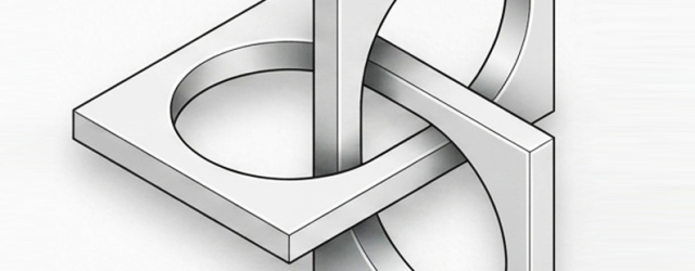
This form belongs to the family of impossible figures, more specifically to the Penrose triangle, or tribar.
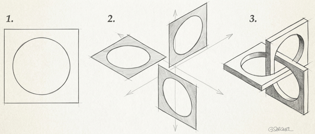
At first glance, it looks entirely manufacturable. The structure appears to be made from three identical square rings (fig. 1), each pierced by a circular opening and arranged in three mutually perpendicular planes (fig. 2). Together, they seem to interlock seamlessly, forming an impossible three-dimensional tribar, that evokes a trefoil knot and its endless over-under weaving.
If this sculpture looks physically realizable to you, congratulations: your visual system has just accepted a geometric impossibility.
Could such an object be built? Not exactly. One solution would be to twist one of the junctions slightly, but that trick would be immediately noticeable here because some of the angles would no longer appear perfectly square (90°), as shown in the picture below. Another possibility would be to leave a small gap at one junction and view the sculpture from a carefully chosen angle, allowing perspective to hide the discontinuity.
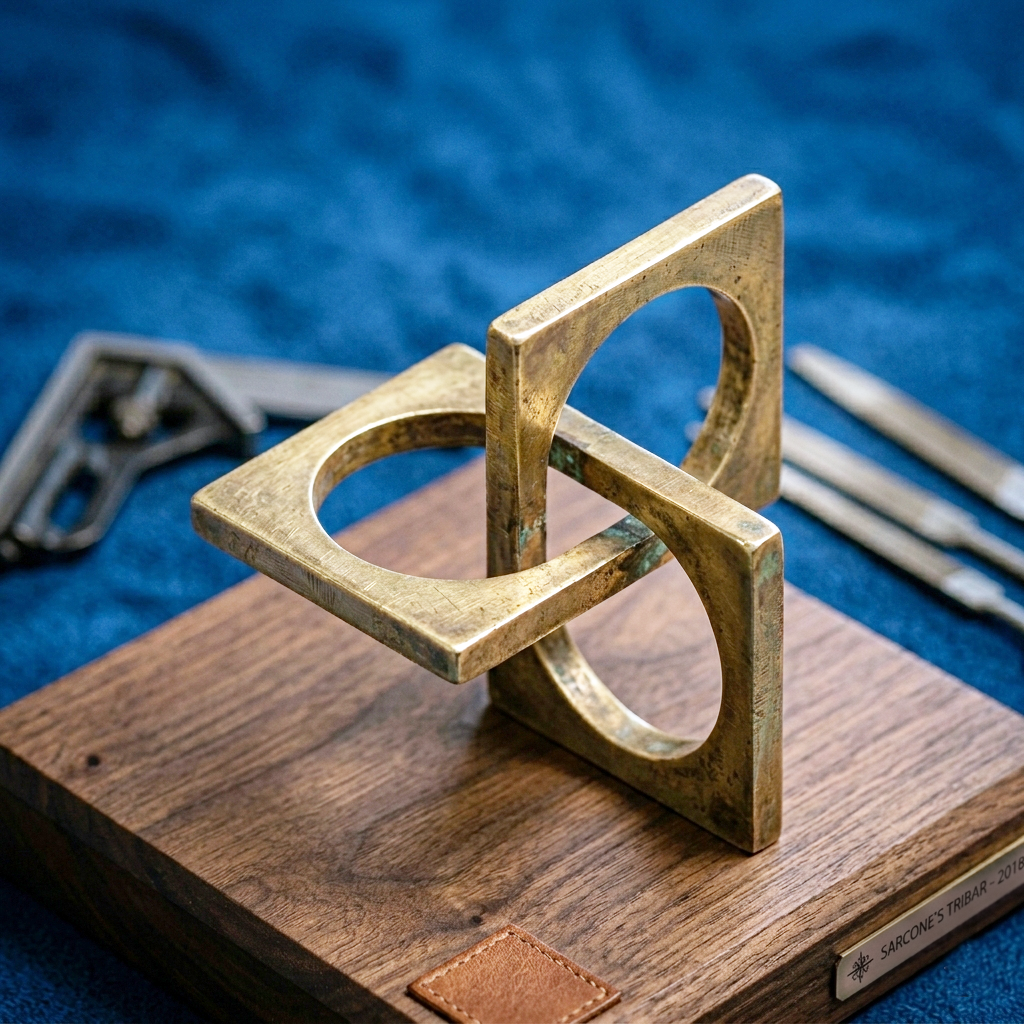
This is how a real 3D Borromean Tribar would appear…
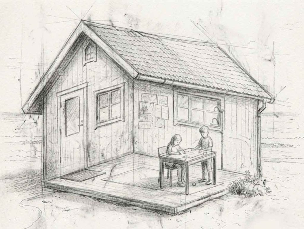
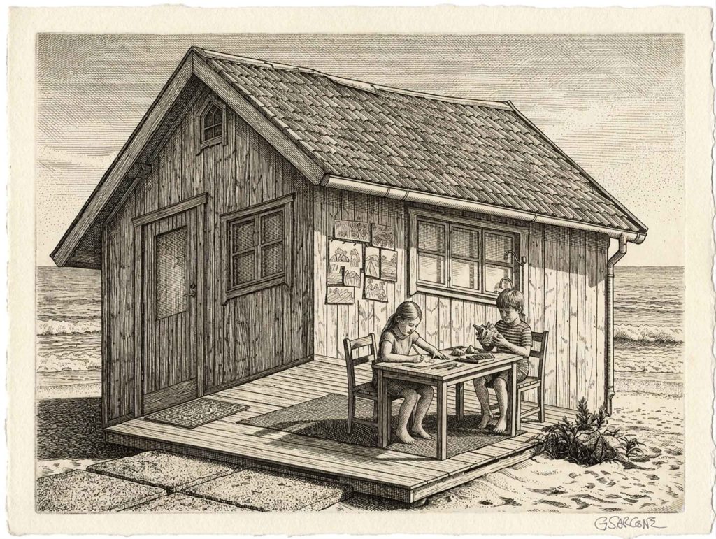
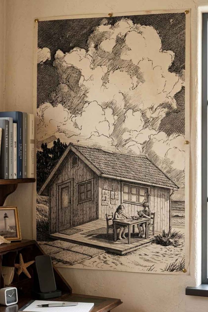
With summer just around the corner, I find myself drifting back to the shores of time, to this delightfully impossible little structure perched on the beach.
A drawing concept created for a children’s coloring book on optical illusions. Over the years, I’ve explored this theme through many curious and playful variations.
Are the kids engaging in creative activities inside the cabin or outside it?
The roof insists we’re looking at the exterior, while the floor pulls us firmly indoors. Both readings feel correct, yet they cancel each other out. So, there’s no clean resolution here—just a quiet visual paradox.
Curious to see more of my optical illusion book concepts, impossible worlds, and mind-bending creations? Take a stroll through my author page.
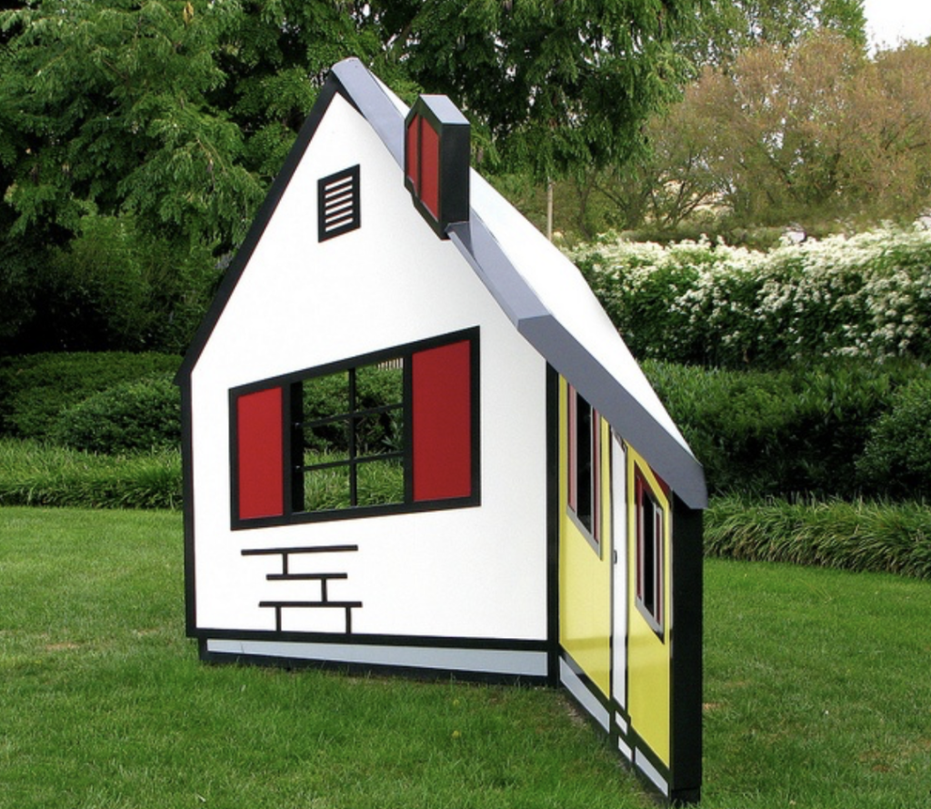
The idea itself is far from new and has inspired countless artists, architects, and photographers. It even exists in three dimensions. A notable example is Roy Lichtenstein‘s House I (1996), an ingenious sculpture that appears to be a solid house but is actually a concave construction made of angled steel planes. As viewers move around it, the structure seems to rotate and reshape itself, turning perception into part of the artwork.
Edo, under the Tokugawa shogunate. Merchants wealthy enough to unsettle the hierarchy, yet still ranked below the samurai. Power without status—watched closely, dressed carefully.
Sumptuary laws did the rest: no gold, no loud silk, no bright declarations. Only browns, greys, indigo. A forced muting of visibility.
Constraint rarely suppresses imagination. It concentrates it.
From this narrow register emerged a refined spectrum known as Shijuhattcha Hyakunezumi (四十八茶百鼠)—“48 browns, 100 greys.” Not literal numbers, but a cultural way of naming excess within restraint: an almost infinite sensitivity to difference inside what first appears uniform.
Fashion became a coded language. Subtle shifts in tone, legible only to trained eyes. Outside, discipline. Inside, excess held in reserve. A lining of rare fabric. A color hidden against the skin. A private flash revealed only when a sleeve turns in the wind.
This is iki: elegance that refuses emphasis. Presence without display. A form of refinement that collapses the moment it is named.
Its opposite is yabo (野暮): excess, insistence, the compulsion to be seen. Not morality—measure. Or the lack of it.
Today, the direction has inverted. Visibility has become currency. Those who do not perform disappear; those who do not declare are not counted. What was once failure has become strategy.
And yet the counter-move remains simple.
Lower the volume. Leave gaps. Let meaning breathe in what is not shown.
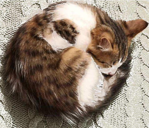
A Zen-inspired sumi-eunicursal brushstroke that gently evokes the silhouette of a sleeping cat.
A single brushstroke, almost nothing… and yet the mind completes the rest. This Zen-inspired sumi-e line suggests the presence of a sleeping cat, as the brain instinctively searches for form, balance, memory, and meaning within this minimal stroke. A curve becomes a back, a pause becomes a head, and empty space turns into stillness—peace, quietude itself. Strangely, this allegorical curve echoes the Japanese symbol ensō (円相; “circular form”), often drawn in calligraphy as a gesture that holds completeness and imperfection in the same breath.
Minimal drawing works because perception is never passive. We do not simply “see” the world; we continuously reconstruct it from fragments. A few essential marks are enough for the imagination to awaken and project life into absence. The unfinished image invites the viewer to participate in its creation.
This is one of the quiet powers of strict minimalism: removing detail does not always diminish reality — sometimes it amplifies it. In sumi-e, what is omitted matters as much as what is painted. The void is not empty; it breathes. Perhaps that is why a simple unicursal stroke can feel strangely alive.
Art begins precisely there: at the threshold where perception, imagination, and silence meet.
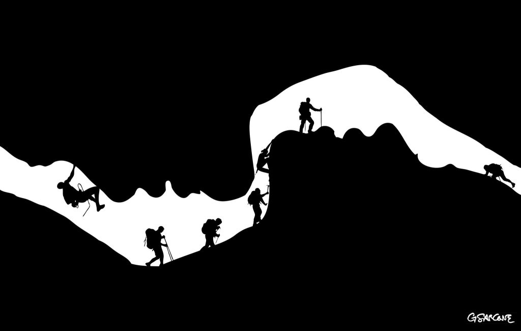
An illusion carved in emotion—can you spot the hidden lovers within?
I created this illustration for a commissioned series examining the underlying strata of interpersonal intimacy.
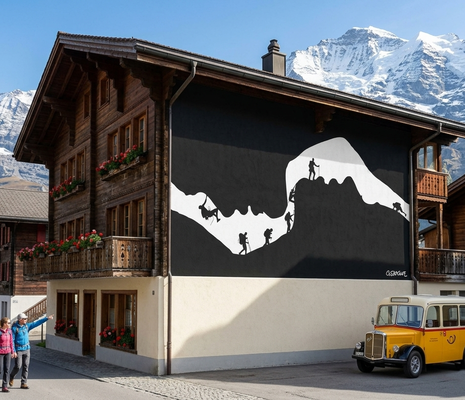
This black-and-white composition plays on figure–ground reversal. At first glance, it reads as a cave opening with a line of climbers moving along a rugged ridge. Look again, and the void resolves into the soft profile of two faces, suspended in the instant before a kiss.
Interested in commissioning my work to illustrate your next editorial project or conceptual series? Let’s discuss how we can bring your vision to light.
The stark contrast and clean silhouettes lend themselves naturally to large-scale applications. On a façade, the image finds a natural home as a mural in a Swiss village, where the alpine setting mirrors the climbers’ ascent.
It’s not uncommon to read, on a snack package, the phrase “with chocolate taste,” often printed in bold uppercase. The wording plays a subtle trick on the mind. Most people assume the product must contain chocolate. Yet a flavor is not a substance. More often than not, what we bite into carries only the impression—an illusion—of chocolate.
The same applies to color. Our brain is just as easily misled. Colors behave like flavors: they may smell—pardon… look—like a particular hue, but they are subjective sensations rather than fixed properties of the outside world. They shift with context, changing according to their surroundings. More striking still, identical colors can appear different under certain conditions, while different colors may look the same. This phenomenon is known as color induction.
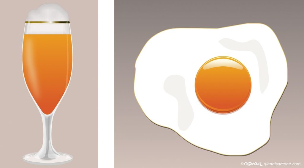
Even texture plays a role. It can alter how we perceive a color’s intensity and tone. Take beer and an egg yolk: they may share the same orange hue and gradation. Yet the brain reads them differently. The glass and the liquid are perceived as translucent, so their color seems lighter, duller, more diluted. The yolk, by contrast, appears opaque, with a richer, more glossy, more solid color.
In this picture, the beer and the egg share exactly the same orange gradation.
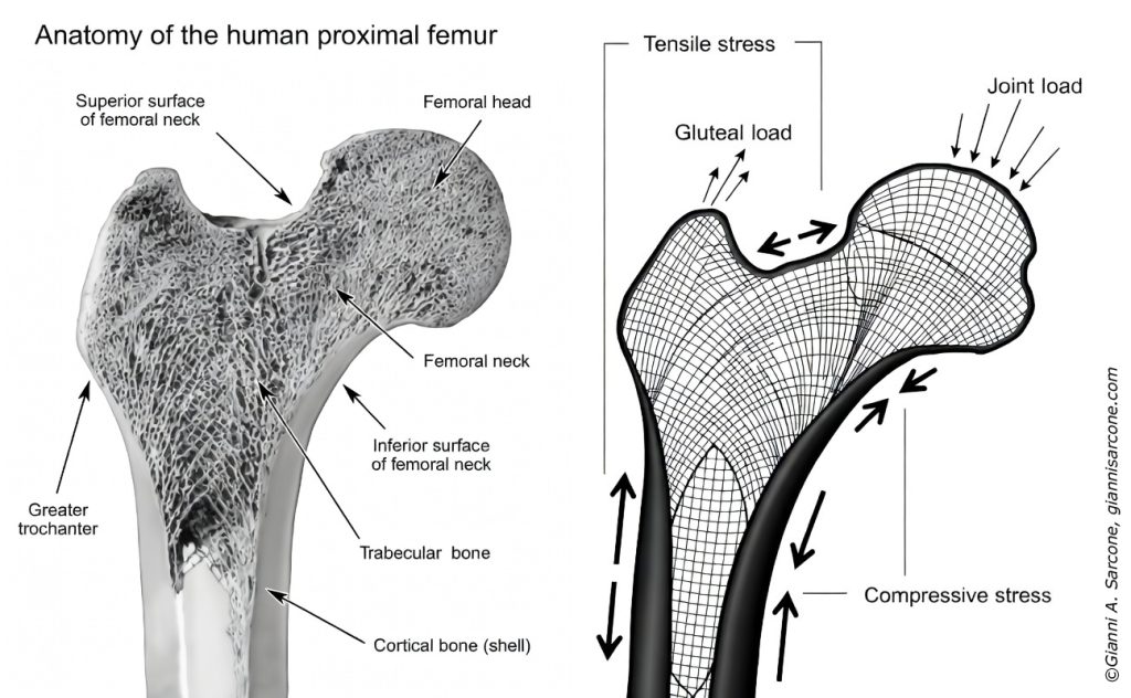
Few people know that the human femur—the body’s largest and strongest bone—played an indirect role in the thinking behind the design of the Eiffel Tower.
Part of the tower’s structural logic can be traced to Swiss engineer Maurice Koechlin, chief engineer in the firm of Gustave Eiffel. While determining how forces would travel through the iron frame, Koechlin applied a principle that places material along the natural paths of tension and compression.
A comparable pattern had been described earlier by Zurich anatomist Hermann von Meyer. His research revealed that the femur’s internal structure forms a network of delicate struts known as “trabeculae.” These tiny elements follow the directions of mechanical stress inside the bone, creating a highly efficient system of support—even though the femoral head sits off-center from the shaft.
The mathematician Karl Culmann later showed that these trabecular patterns correspond closely to the principal stress lines calculated in engineering. His method, called graphic statics, provided a visual way to map how forces move through structures.
This link between anatomy and engineering influenced nineteenth-century structural thinking. The same principle—placing material only where forces demand it—guided the development of lighter, more efficient frameworks in bridges, cranes, and reinforced-concrete designs.
In 1934, the Swedish artist Oscar Reutersvärd sketched a peculiar triangle made of small cubes, neatly aligned on an isometric grid. Everything looked geometrically sound—until the mind tried to assemble it in real space.
This triangular paradox has distant echoes in ancient Greek geometry, but Reutersvärd gave it a clear visual form: the impossible figure.
That’s the charm of impossible figures: every part looks right, yet the whole quietly breaks reality.
I began exploring these paradoxical structures in the 1980s. My interest grew naturally from the meeting point of two inclinations: a mathematical curiosity about spatial logic and a visual fascination with form. Over time I produced many variations—sometimes rediscovering ideas that others had already touched upon, occasionally arriving at configurations that felt genuinely new. In geometry, complete novelty is rare; most discoveries emerge as unexpected turns within an existing landscape.
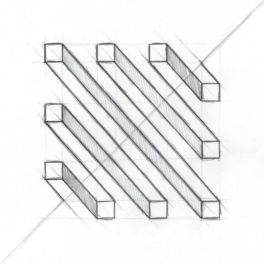
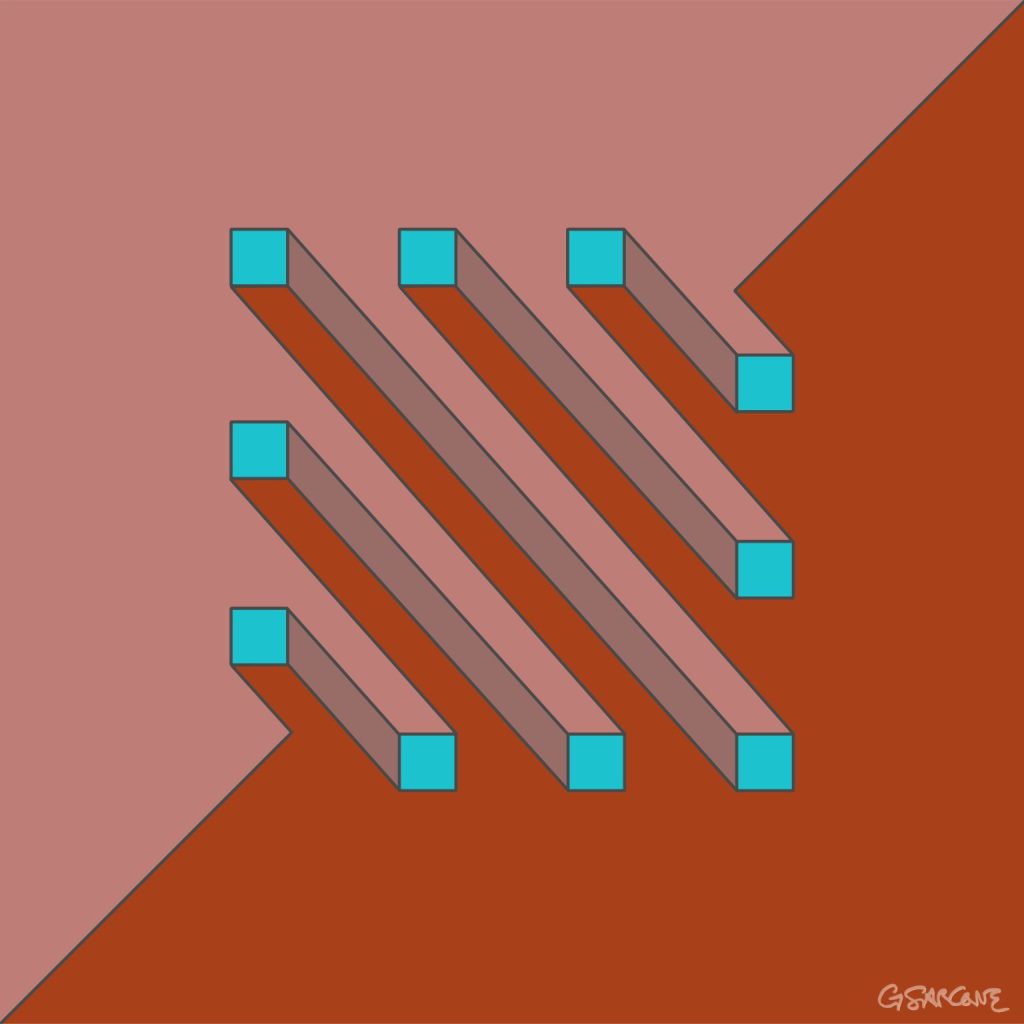
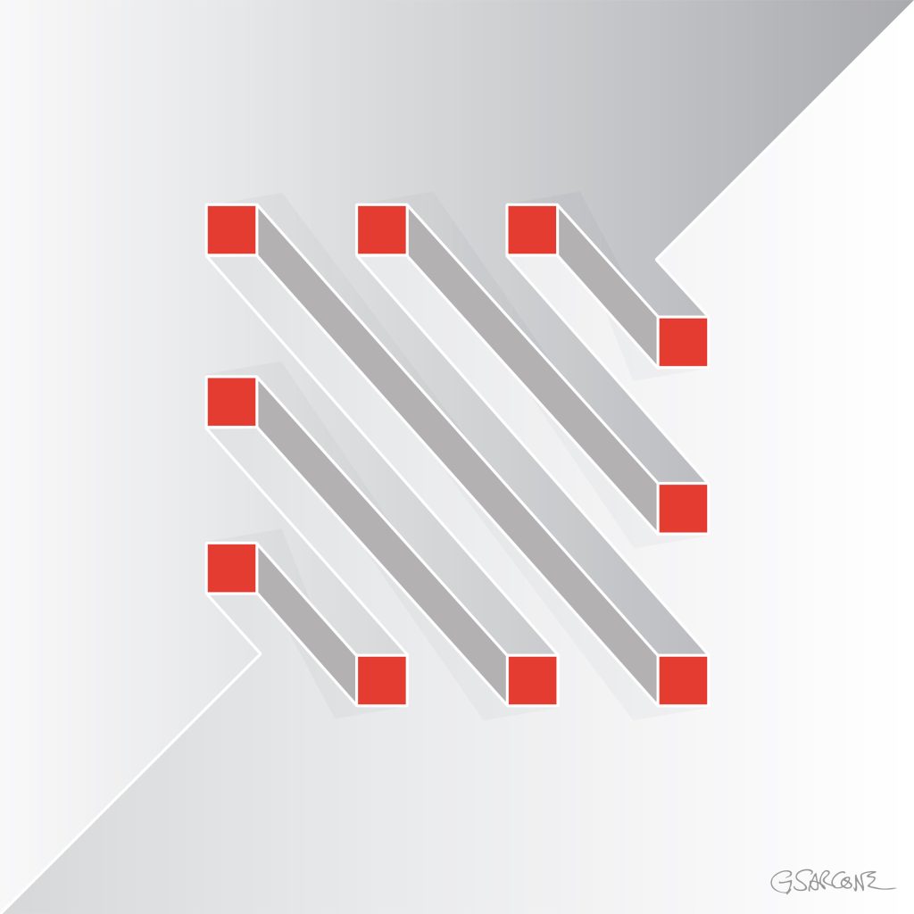
One example from that period is the study shown here, created in the late 1990s and titled Undecidable Bars.
Parallel bars appear to run calmly side by side, yet their connections quietly sabotage the logic of space. Perspective slips from one segment to another, forcing the eye to accept incompatible viewpoints at the same time.
Each element seems perfectly normal. Together, they form a structure that cannot exist.
Some bars appear to pass through others; some join where no joint should be possible. The geometry behaves as if the object were bending through space, while every line still respects the conventions of perspective drawing.
The result is an undecidable figure—a form the eye can follow effortlessly, but the mind cannot reconstruct.
Over the years I have created hundreds of images built on similar principles, across different formats and media. If these works interest you for a book, exhibition, or monograph, feel free to contact me.
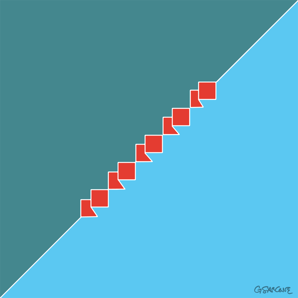
Here’s a simple 18-frame animation of my Op Art piece—work in progress.
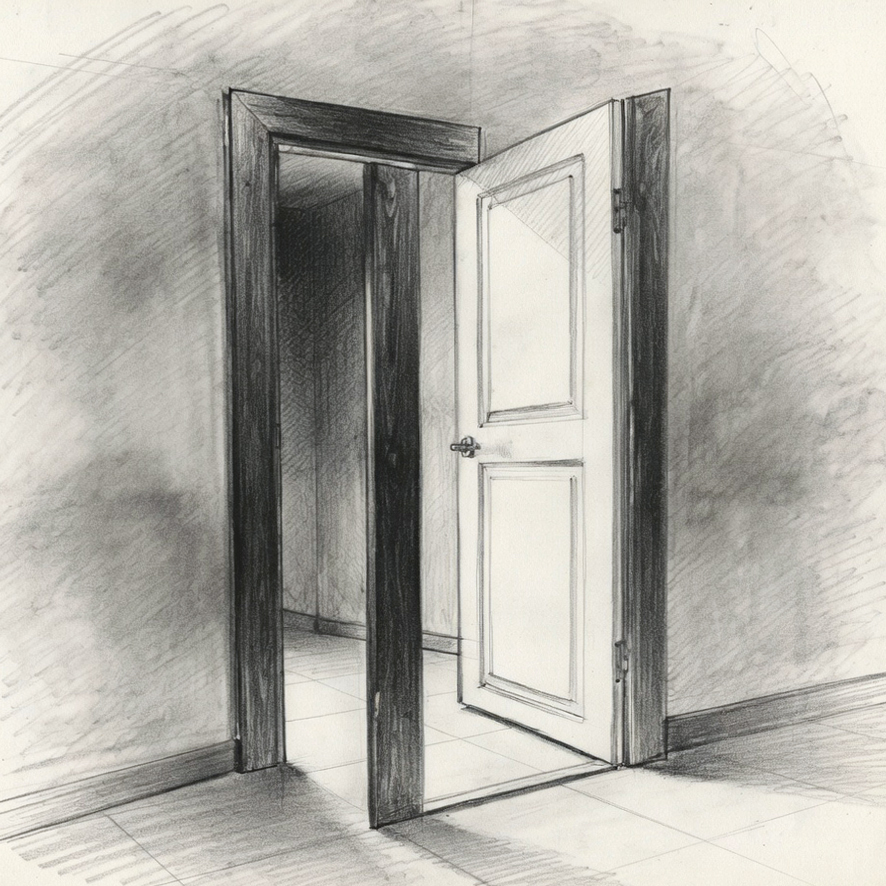
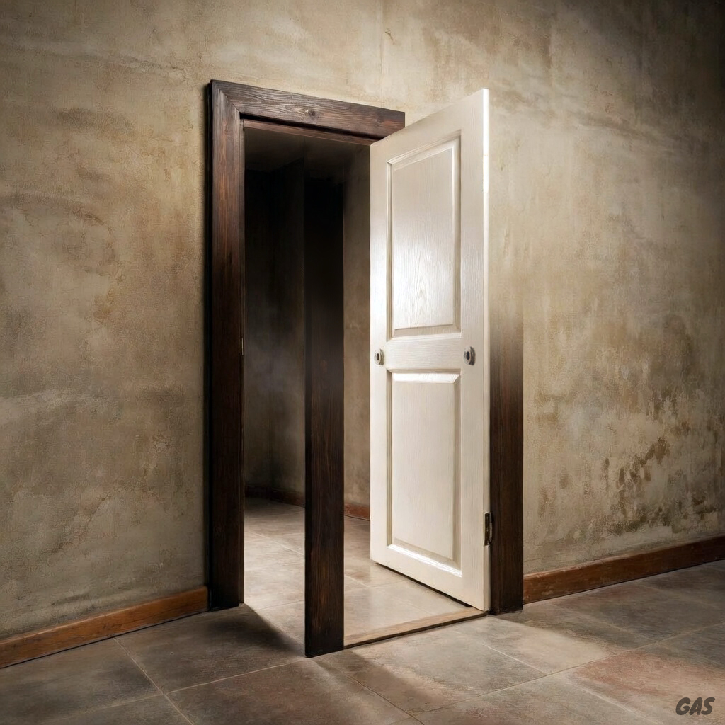
I’ve always been drawn to impossible objects—those forms that slip between logic and illusion, never fully settling into one or the other.
This piece grew out of an old idea I felt compelled to revisit, almost as if reopening a long-forgotten door. A binary door, in fact—one that leads to two distinct worlds. Depending on how you look at it, it shifts, tilts, and reveals something else.
It starts with pencil on paper. A loose, intuitive phase where the form finds its way. From there, I move into FreeHand MS—an old tool I’ve never quite let go of. It still gives me a certain precision and feel I can’t replace. Finally, I refine the piece in Photoshop, adjusting, balancing, pushing it toward that delicate point where everything holds together.
There’s still work to be done. Something remains unresolved—but maybe that tension is part of what keeps it alive.
Explore My World of Art, Books, and Creative Concepts