The Logic of Abstraction

Some say abstract art is non-representational—that it avoids visual reality and relies on color, shape, form, and gesture to trigger emotion or thought. I see it differently. Abstraction does not reject reality; it reframes it. It is a change of optics, not a disappearance of the world.

Take, for example, this video of goldfinches perched on swaying thistles. At first glance, does it not resemble an abstract painting? Rhythms, repetitions, subtle chromatic tensions, forms dissolving into movement. From there, one could push the abstraction further with the slightest shifts in shape or color—without betraying reality, only rephrasing it.

This idea is hardly new. From Cézanne’s insistence on treating nature through cylinder, sphere, and cone, to Kandinsky’s claim that abstraction reveals inner necessity rather than surface likeness, many artists and thinkers have argued that abstraction sharpens perception instead of diluting it. Even in cognitive science, perception is understood as an active construction, not a passive recording of facts.

Abstraction starts precisely there: with attention. Not with denial, not with decoration, but with the recognition that reality is already structured, already abstract, long before the artist intervenes.

Minimal Perception

I’ve always wondered about the limits of shape and color needed for us to represent or recognize an object. Take a stemmed glass, for example. To depict it, you might need just two circles and a straight line—and perhaps a red disc to suggest the wine inside.

But we can go further: by turning it from a flat image into a 3D form with a simple rotational movement, like in Duchamp’s rotoreliefs, the object suddenly comes alive in space.

All these graphic shortcuts rely on memory. Our brains interpret what we see based on past experience, filling in missing information and reconstructing the object from just a few essential cues. This process aligns with the principles of visual perception: the Gestalt laws of closure and continuity explain why we perceive a complete glass even when much of it is absent. Minimalist perception highlights how human cognition distills visual information, showing that a few simple shapes and colors are enough to evoke a rich, instantly recognizable image.

Duchamp rotoreliefs.

Seeing Beyond Lines: The Illusion of Form

We usually perceive lines and shapes as forming a figure, while the paper and surrounding white space recede into the background. Yet, under certain conditions, what we assume to be background can itself acquire form and meaning. In the illustrations shown here, a clear geometric figure emerges—even though no lines actually define it. These visual phenomena are known as illusory figures.

illusory spring
What kind of 3-dimensional shape do you see?

Illusory figures depend, in part, on the presence of regular gaps within a visual arrangement. When such gaps occur, the visual system instinctively tries to resolve them into coherent forms. These gaps can be created by simple elements, such as circles. When solid black circles and partially “chipped” ones are arranged carefully, they produce striking illusory shapes.

The most familiar example is the Kanizsa triangle. Here, an illusory contour is perceived when black disks with wedge-shaped sections removed are aligned so that their edges define a triangular form in the negative space. Remarkably, this illusory region appears brighter than the surrounding page, even though its physical luminance is identical.

Kanisza triangle
Kanizsa triangle

Etherial Cross

A pattern of black dots forms a ghostly ‘X’ shape through negative space. The arrangement of dots creates a subtle sense of motion and depth. The piece combines the Ouchi effect—where contrast between figure and background generates apparent movement—with the Kanizsa illusion, where the mind completes shapes that aren’t actually drawn.

Sarcone's Illusory Cross
Fine art prints of this Op Art piece are available for purchase through my official gallery.

The effect becomes even more dramatic when the illusion is animated. Rotate the cross, for example, and the X-shaped form—with no explicit outline—appears to emerge from a rigid grid of black dots. The shape is defined solely by subtle local distortions: small asymmetric intrusions along the contours of the X disrupt the regularity of the dots, making the form pop into perception despite having no actual boundaries.

Animated Sarcone's Illusory Cross

Etherial Circle

Using the same technique, we can replace the X with a large O. Now the regular arrangement of black circles is disrupted by a ghostly central shape that seems to lift off the background, almost floating. As above, this Op Art piece combines the Ouchi effect—where the contrast between figure and background creates apparent motion—with the Kanizsa effect, where the mind completes shapes that aren’t actually drawn.

Floating O
Fine art prints of this Op Art piece are available for purchase through my official gallery.

It is also interesting to add a rotational motion to this Op Art piece. I experimented with different solutions, and this one is the simplest yet striking nonetheless.

To conclude this journey into the world of contour illusions, still using black disks as our starting point, here are a few further experiments. They explore negative superpositions, translucent effects, and the emergence of more complex forms—showing how simple elements can give rise to unexpected visual structures.

hidden beauty
Fine art prints of this Op Art piece are available for purchase through my official gallery.

Ananke’s Die

A simple study in visual perception—an exploration of how a plain hexagon can evolve into the illusion of a cube. Through precise geometry and controlled form blending, static lines awaken into rhythm and volume, giving rise to a subtle sense of depth and movement.

Constructing the Illusion

Fig. A — The Base Shape
Start with a regular hexagon. Divide it into three equal diamond shapes (rhombuses)—these represent the three visible faces of the cube. Each diamond has four equal sides: two acute angles (60°) and two obtuse angles (120°). Together, they form the geometric foundation of the cube.

Fig. B — Building Volume with Shape Blends
In Illustrator, or any other vector software, use the Blend Tool to create a shape blend inside each diamond. Start with a small central circle and blend it toward the outer edge of the diamond. Adjust the number of blend steps to control how smooth or tight the transition appears. This process builds the cube’s apparent volume and visual tension. You’ll notice that the distance from corner to corner in the nested, diamond-like shapes is slightly greater than from side to side, creating subtle gaps that lead the eye to perceive an X across the surface.

Fig. C — Perspective and Transformation
Distort slightly the hexagon to set the three diamonds in perspective. This step transforms the flat figure into a die-like cube, giving it spatial depth and presence.

ananke cube

Enhancing the Optical Effect
Next, add horizontal background lines and some color, as shown in the two examples in the image. You can also adjust the illusion by making the visible faces of the die appear slightly concave, as in the figure on the right. This effect is created by shifting the concentric, nested diamond shapes slightly off-center—the position of the central ellipse determines whether the die appears concave or convex.

 two Ananke dice

Below is the finished stage of the work. Curiously, the cube appears to hover, slide, and even emit a faint blue glow—though it remains entirely black and motionless.
Ananke’s Die is a study I began in 2010, a continuing exploration of how repetitive lines and geometric precision can trick the mind into sensing motion and color where none exist.

Ananke die

You can get Ananke’s Die as a fine art print or canvas, available in different sizes and finishes.
👉 Buy it here

Why Ananke’s Die

I titled this work Ananke’s Die after Ananke, the Greek goddess of necessity and fate.
The cube, a symbol of structure, represents order and control. Yet the three visible faces that seem to define its volume are an illusion—shifting and unstable.
Under the viewer’s gaze, the shape changes, its meaning shifts, yet the form remains.
This illusory die shows the balance between order, perception, and destiny, reminding us that what we think we control often exists within the unpredictable interplay of vision and inevitability.

This image also triggers multiple associations in a loop: hexagon, cube, die, chance, illusion, order, fate, contradiction. These connections show how perception mixes stability and randomness, revealing that what we see is shaped as much by the mind as by reality.

Immergiti nel mondo dell’arte ottica!

Le mie opere, esposte permanentemente alla Città della Scienza e al Dipartimento di Fisica dell’UNIFI, offrono un’esperienza visiva che stimola curiosità e meraviglia. Non perdere l’occasione di vederle dal vivo!
Scopri di più.

Dipartimento di Fisica dell’UNIFI

🇬🇧 Dive into the world of optical art!
My works, on permanent display at Città della Scienza and the Physics Department of UNIFI, offer a visual journey that sparks curiosity and wonder. Don’t miss the chance to experience them in person!

Learn more.

Related links:

Moona Lisa

The Cube That Lies

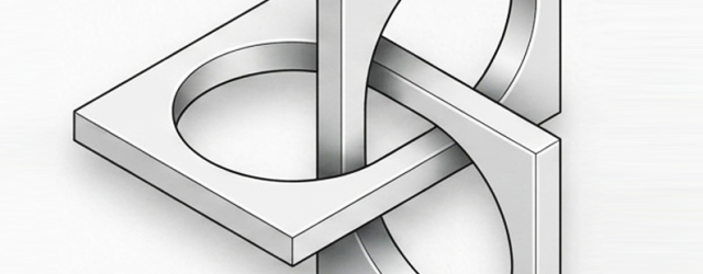
I’ve always been drawn to the architecture of geometry. The hexagon, with its quiet strength and symmetry, sits at the root of so many spatial illusions—it’s the seed of cubes, isometric grids, and 3D paradoxes. From this shape, I began exploring structures that bend logic and perception, eventually giving life to a trio of optical works: Enigma 1, Enigma 2, and Enigma 3.

Each piece is built around the visual tension of the impossible cube, created by merging two tribars in perfect isometric perspective. The lines suggest solidity, yet the form escapes reality—what looks structurally sound unravels the moment the eye tries to make sense of it. That’s the game I love to play: where geometry behaves, but perception rebels.

These “Enigmas” are spatial riddles dressed in stripes and angles, each one twisting the viewer’s reading of depth, volume, and continuity in its own way.

The Story of Blue

Sonne au comble de l'or
l'azur du jeune hiv
er
– Paul Valéry

For me, blue is air, wind, melancholy. It is like a Fellini film—always haunted by the whisper of the wind, the scent of things, and the fleeting moments of time we wish we could hold in an eternal present. Blue can carry regret; it is, in a way, a conservative principle. Blue has always held a strange duality: so immediate, yet once so elusive. Looking back to antiquity, it fascinates me that Homer never described the sea as blue, but as ‘wine-dark.’ In Greek, kyaneos evoked a dark, mineral depth, while glaukos hovered between gray, green, and blue. The Romans spoke of caeruleus, tied to the sky (caelum), and of lividus, the bruised, bluish tone of flesh. They never elevated blue; it was the color of outsiders, the hue of Celts painted in woad. Only the Egyptians seemed to truly revere it. They invented Egyptian blue, the first artificial pigment, and made it the shade of eternity and the divine.

In the Middle Ages, blue nearly vanished from prominence. Christian art turned to red, white, and black, leaving blue to the margins. Yet the word itself was evolving. The Germanic blāo—and its Vulgar Latin adoption, blavus—once meant something far less precise: shimmering, lustrous, dark, gray, even pale or yellowish. That ambiguity makes me realize how fluid color once was, before language fixed its boundaries. From blāo we inherited English blue and French bleu. Meanwhile, through Arabic lazaward came the words azure, azzurro, and azul, all born from lapis lazuli.

Then, in the 12th century, blue was transformed. Artists began clothing the Virgin Mary in ultramarine, ground from lapis lazuli more costly than gold. What had been humble became heavenly. Heraldry embraced azure as one of its noble tinctures, and kings like Louis IX made blue their emblem. A forgotten hue became a sacred, regal presence.

By the Renaissance, ultramarine shone as a color of prestige, truth, and constancy. Painters reserved it for the highest subjects, poets linked it to loyalty, and explorers carried its name across the seas as azul. Blue had finally claimed its place.

The modern era democratized it. Prussian blue appeared in 1704, followed by cobalt, cerulean, and synthetic ultramarine. Blue poured into uniforms, flags, and revolutions; it became the shade of liberty, of nations, of collective identity. Goethe called it spiritual, a color that retreats yet draws the soul inward.

In the 20th century, painters gave blue an entirely new destiny. The Expressionists used blue to conjure emotion, depth, and inner turbulence—think of Kandinsky, who saw blue as moving ‘toward the infinite,’ or Franz Marc, who painted blue animals to symbolize spirituality and hope. Even Van Gogh’s Starry Night swirls with blue, capturing both wonder and melancholy. Later, Picasso entered his Blue Period, transmuting sorrow into tone. Yves Klein went further still, reducing blue to its purest intensity with his International Klein Blue, turning it into an immaterial field of experience. For Klein, blue was not simply a color but ‘the most abstract color of all,’ a space in which one could lose oneself.

Today, I see blue everywhere. In the jeans that became the fabric of daily life. In corporate logos designed to inspire trust. In flags that mark belonging. Blue is calm, yet melancholy; humble, yet exalted. Once overlooked, it is now the world’s favorite color.

Blue is more than a hue. It is an idea shaped across centuries—etymologically born of caelum, blāo, and blavus; symbolically stretched between heaven and earth; culturally tied to faith, power, and identity. Its story mirrors our own: restless, mutable, and ever searching for meaning.

I’ll end with a little story from my own family. After World War II, my paternal grandfather, a house painter, bought a massive surplus of blue paint from the military. He had so much of it that whenever a client asked how he planned to paint their home, his answer was always the same, year after year: “All in blue, yes, all in blue…” (in our dialect, tutt’azzurr, tutt’azzurr).

That simple phrase stuck. Before long, the whole village started calling our family the Tuttazzurr family, and I myself became known as Giuan Tuttazzurr. Blue marked our home, but also my identity and my story—etched in memory and in name.

Moonlight Reflections on the Waters

A memory from Japan, where I lived briefly in the 1980s. This piece recalls earthy colors, organic shapes, and fragments of that time. A circle emerges from a flowing field of triangles—like ripples of moonlight dancing on the sea near Kamakura.

Immersing in my Op Art is entering a space where opposing forces meet, interlock, and balance with precision and intensity. Each piece is a silent dialogue of form, line, color, perception, and mathematical structure, anchored in the language of symbols. Beneath the surface, it engages archetypes and ancient rites that still resonate in the collective unconscious.

This unique op art piece is available as fine art prints and canvases in my online gallery.

Rediscovering Flutex: Simple Glass, Complex Illusions

I’ve been toying with the idea of revisiting an old, low-key material for my art: Flutex.

If you haven’t heard of it, Flutex is a patterned industrial glass from the 1930s and ’40s, mostly used to give a bit of privacy in bathrooms and office partitions.

In the ’70s, Op artist Sydney Cash started playing with this glass and found that its ribbed surface works like a lenticular screen—showing different images depending on how you look at it. The effect? Hypnotic, shifting artworks that change as you move around them.

It’s just simple glass, but it tricks perception in a really cool way.

I’m seriously considering giving it a try myself—there’s something about that mix of humble material and complex visual play that feels worth exploring again.

The Art of Discovery Between a Question Mark and an Exclamation Point

Science — like art — doesn’t really speak in the indicative. It doesn’t say this is, it asks what if? It begins in the conditional, in the open-ended curiosity of what could be, and unfolds in the imperative, the bold call to look, try, observe.

Discovery doesn’t start with answers — it starts with a question. And when it arrives, it rarely comes wrapped in neat descriptions. It comes as a gesture, a provocation, a set of instructions that invite us to experience something for ourselves.

Think about it: no one learns to cook from a description of flavor. They follow a recipe — a list of directives. A musician doesn’t explain the music in his head; he writes a score. And when we follow it, sound becomes experience. The composer’s vision is reborn in the hands of another.

In my own work, I do much the same — though my instrument is perception, and my notes are lines, colors, forms. Each visual illusion, each image, is a kind of instructional code. Not a description of what’s there, but an opening. If you engage with it, something clicks — not because I told you what to see, but because the form guided your eyes to see it for yourself.

G. Spencer Brown wrote that the act of drawing a distinction is the first creative move — a way of bringing something into being. In that spirit, I don’t aim to define the world. I aim to make space for new ways of seeing it.

So perhaps the real language of both science and art isn’t declarative at all.

It’s performative. It doesn’t tell you what reality is — it dares you to experience it.
And in that challenge, something unexpected happens:
You discover not just what the world could be — but what you might be within it.

Title: Follow the Light
“Follow the Light” – A visual imperative that pulls the eye into the unknown. This piece doesn’t describe — it directs. It doesn’t tell you what to see — it invites you to find out. Available as a fine art print.