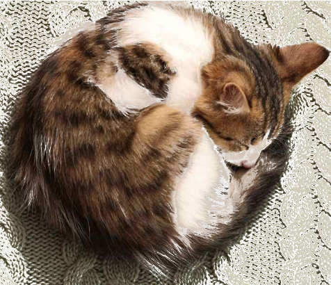
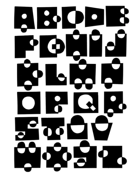
A Zen-inspired sumi-eunicursal brushstroke that gently evokes the silhouette of a sleeping cat.
A single brushstroke, almost nothing… and yet the mind completes the rest. This Zen-inspired sumi-e line suggests the presence of a sleeping cat, as the brain instinctively searches for form, balance, memory, and meaning within this minimal stroke. A curve becomes a back, a pause becomes a head, and empty space turns into stillness—peace, quietude itself. Strangely, this allegorical curve echoes the Japanese symbol ensō (円相; “circular form”), often drawn in calligraphy as a gesture that holds completeness and imperfection in the same breath.
Minimal drawing works because perception is never passive. We do not simply “see” the world; we continuously reconstruct it from fragments. A few essential marks are enough for the imagination to awaken and project life into absence. The unfinished image invites the viewer to participate in its creation.
This is one of the quiet powers of strict minimalism: removing detail does not always diminish reality — sometimes it amplifies it. In sumi-e, what is omitted matters as much as what is painted. The void is not empty; it breathes. Perhaps that is why a simple unicursal stroke can feel strangely alive.
Art begins precisely there: at the threshold where perception, imagination, and silence meet.
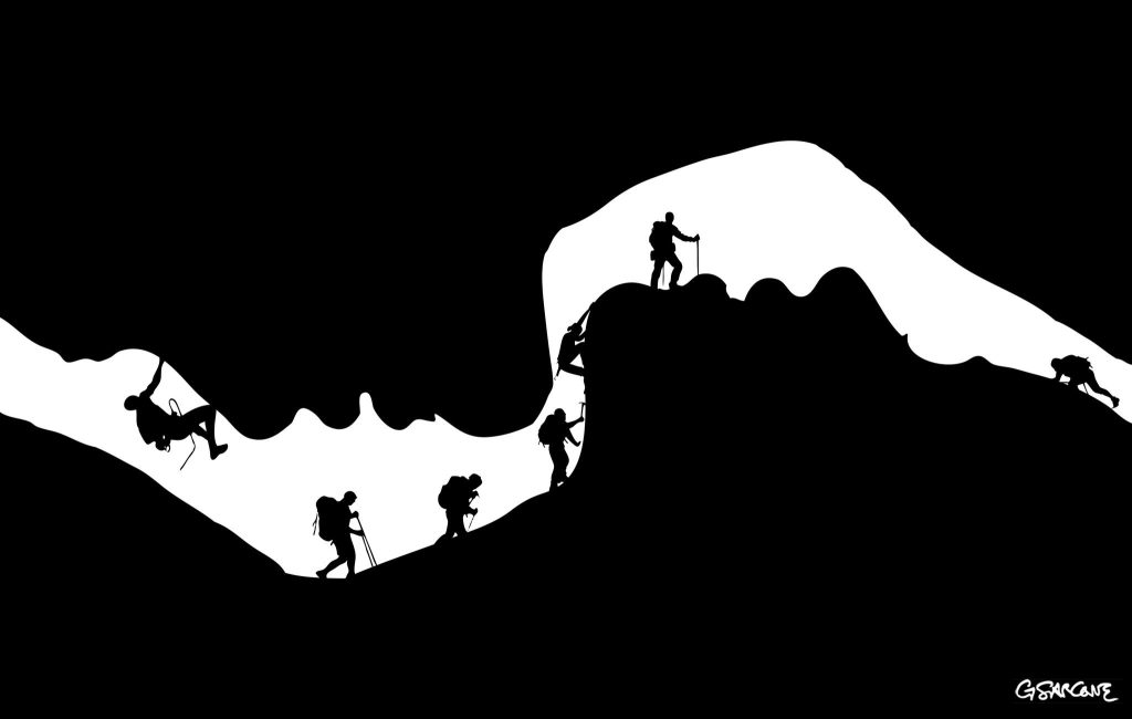
An illusion carved in emotion—can you spot the hidden lovers within?
I created this illustration for a commissioned series examining the underlying strata of interpersonal intimacy.
This black-and-white composition plays on figure–ground reversal. At first glance, it reads as a cave opening with a line of climbers moving along a rugged ridge. Look again, and the void resolves into the soft profile of two faces, suspended in the instant before a kiss.
Interested in commissioning my work to illustrate your next editorial project or conceptual series? Let’s discuss how we can bring your vision to light.
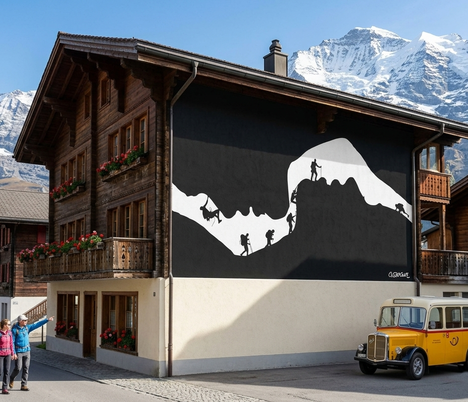
The stark contrast and clean silhouettes lend themselves naturally to large-scale applications. On a façade, the image finds a natural home as a mural in a Swiss village, where the alpine setting mirrors the climbers’ ascent.
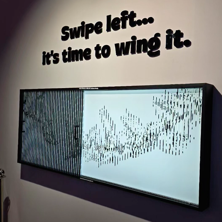
The blue and yellow arrows in this video seem to move up and down in a rhythmic dance—yet their motion is strictly horizontal and uniform. This illusion is a variation of the “Stepping Feet Motion” effect, first demonstrated by Stuart Anstis in 2003.
In the original phenomenon, two objects glide side by side at a constant speed across a striped background, but appear to alternately speed up and slow down, creating a stepping or oscillatory effect. The visual system misreads contrast differences as changes in motion, producing a false sense of vertical or staggered movement.
First, observe the alignment of the red circles as they move in a straight vertical path, up and down. Then keep your gaze on one of the three Xs in the middle. What do you notice?
The red circles seem to drift away from their true physical trajectories, as if they were following the curves of the static lines. This perceptual shift is known as the “Mainz-Linez Illusion“.
When you keep your gaze on the central X, the moving dots shift into peripheral vision, where spatial resolution is limited and detail is reduced. The visual system compensates by interpolating missing information based on contextual cues and prior experience. As a result, the dots become perceptually “bound” to the nearby curved lines, as if threaded on them, and their straight vertical motion is misread as oscillating.
The Mainz-Linez phenomenon reflects a broader principle: peripheral vision is largely constructive. Under certain conditions, this predictive filling-in can also distort motion judgments in real-world tasks—such as driving—where events in the periphery may be misperceived.
Impossible or undecidable figures have long fascinated artists, mathematicians, and viewers alike. Their appeal lies in a delicate tension: the structure appears perfectly logical at first glance, yet closer inspection reveals spatial contradictions that cannot exist in the physical world. My latest work revisits an idea I first explored in the 1990s—an impossible Rubik’s-style cube—now developed into a new series built across several stages, from hand-drawn construction to digital refinement and photographic interpretation.
The project began with a simple geometric framework—interlocking beams arranged to suggest a stable cubic volume. The challenge was to reinterpret an apparently ordinary three-dimensional cube into an ambiguous form that still appears structurally plausible. Through careful adjustments of line weight, contrast, and directional and formal cues, the cube gradually shifts from perceived solidity to spatial uncertainty, so that as the eye moves across the image, the object quietly reorganizes itself, producing a surreal perception in place of a coherent physical structure.
Here is the original version of the project, refined from my initial hand-drawn construction and carefully reconstructed using FreeHand MX
Two of the final images belong to the Op Art tradition, where sharp black-and-white geometry emphasizes visual tension and rhythmic structure. These compositions highlight the cube’s architectural clarity while allowing the paradox to emerge naturally from the viewer’s perceptual processing. The remaining two images take a different path: they present the object in a photographic setting, rendered with realistic lighting and textures.
Together, the four images form a small visual narrative—construction, transformation, and illusion—showing how a purely conceptual structure can evolve into multiple aesthetic forms. The Op Art versions focus on perceptual mechanics, while the photographic interpretations suggest how an impossible form might inhabit the physical world, even if only in appearance.
Fine art prints and canvas editions from this series are available through my official gallery shop, where each piece is produced using archival materials designed for long-term display.
Collectors and galleries interested in larger formats or special editions may also contact me directly for availability and production details. This series continues my exploration of perceptual geometry, where simple shapes become instruments for questioning how we construct space, depth, and visual certainty.
Here are two Kinegram installations I made, designed to educate, engage, and spark curiosity in visitors of all ages. These works make motion appear from static forms, offering an experience that is both playful and thought-provoking.
Kinegrams reveal movement through a sliding transparent panel printed with vertical black lines. As the panel moves over the underlying image, hidden sequences appear, animating the drawings like frames of a film. Each interaction lets the viewer explore how motion can emerge from stillness.
The concept of movement from static forms has long interested scientists and philosophers. Movement is a dimension unfolding in space and time—without time, there is no motion. Kinegrams make this idea tangible through touch and visual perception.
These exhibits are simple to set up but produce surprising results. I made the first panel for UNIFI, the University of Florence, and the second for the Mind Games Art Alive Museum in Sydney. Both projects engage and surprise visitors, combining education with visual impact.
“Twisting Cords,” Kinegram exhibit for UNIFI, Florence As the transparent panel etched with black lines glides across the design, colorful cords seem to twist, winding and unwinding in a mesmerizing, living rhythm.
“Flying Birds – Migration,” Kinegram exhibit for Mind Games, Sydney As the transparent panel etched with black lines glides across the static design in the background, the flock of birds rises and takes wing, transforming a still pattern into living, rhythmic motion.
A simple study in visual perception—an exploration of how a plain hexagon can evolve into the illusion of a cube. Through precise geometry and controlled form blending, static lines awaken into rhythm and volume, giving rise to a subtle sense of depth and movement.
Constructing the Illusion
Fig. A — The Base Shape Start with a regular hexagon. Divide it into three equal diamond shapes (rhombuses)—these represent the three visible faces of the cube. Each diamond has four equal sides: two acute angles (60°) and two obtuse angles (120°). Together, they form the geometric foundation of the cube.
Fig. B — Building Volume with Shape Blends In Illustrator, or any other vector software, use the Blend Tool to create a shape blend inside each diamond. Start with a small central circle and blend it toward the outer edge of the diamond. Adjust the number of blend steps to control how smooth or tight the transition appears. This process builds the cube’s apparent volume and visual tension. You’ll notice that the distance from corner to corner in the nested, diamond-like shapes is slightly greater than from side to side, creating subtle gaps that lead the eye to perceive an X across the surface.
Fig. C — Perspective and Transformation Distort slightly the hexagon to set the three diamonds in perspective. This step transforms the flat figure into a die-like cube, giving it spatial depth and presence.
Enhancing the Optical Effect Next, add horizontal background lines and some color, as shown in the two examples in the image. You can also adjust the illusion by making the visible faces of the die appear slightly concave, as in the figure on the right. This effect is created by shifting the concentric, nested diamond shapes slightly off-center—the position of the central ellipse determines whether the die appears concave or convex.
Below is the finished stage of the work. Curiously, the cube appears to hover, slide, and even emit a faint blue glow—though it remains entirely black and motionless. Ananke’s Die is a study I began in 2010, a continuing exploration of how repetitive lines and geometric precision can trick the mind into sensing motion and color where none exist.
You can get Ananke’s Die as a fine art print or canvas, available in different sizes and finishes. 👉 Buy it here
Why Ananke’s Die
I titled this work Ananke’s Die after Ananke, the Greek goddess of necessity and fate. The cube, a symbol of structure, represents order and control. Yet the three visible faces that seem to define its volume are an illusion—shifting and unstable. Under the viewer’s gaze, the shape changes, its meaning shifts, yet the form remains. This illusory die shows the balance between order, perception, and destiny, reminding us that what we think we control often exists within the unpredictable interplay of vision and inevitability.
This image also triggers multiple associations in a loop: hexagon, cube, die, chance, illusion, order, fate, contradiction. These connections show how perception mixes stability and randomness, revealing that what we see is shaped as much by the mind as by reality.
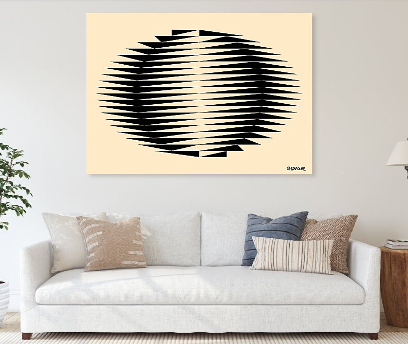
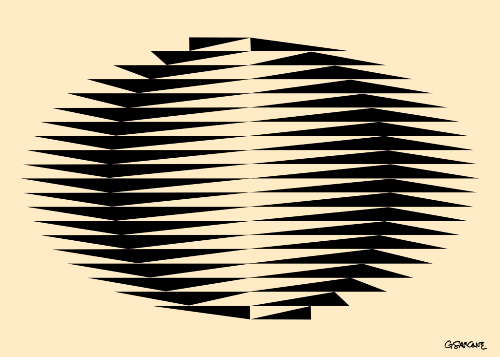
A memory from Japan, where I lived briefly in the 1980s. This piece recalls earthy colors, organic shapes, and fragments of that time. A circle emerges from a flowing field of triangles—like ripples of moonlight dancing on the sea near Kamakura.
Immersing in my Op Art is entering a space where opposing forces meet, interlock, and balance with precision and intensity. Each piece is a silent dialogue of form, line, color, perception, and mathematical structure, anchored in the language of symbols. Beneath the surface, it engages archetypes and ancient rites that still resonate in the collective unconscious.