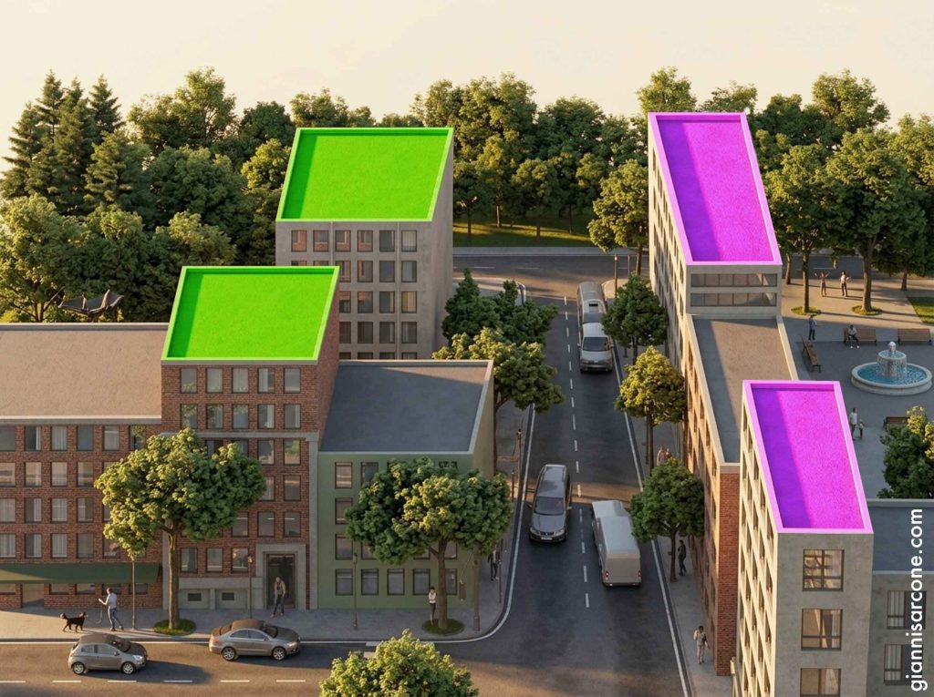
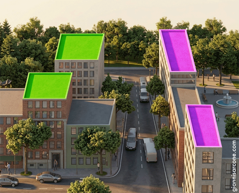
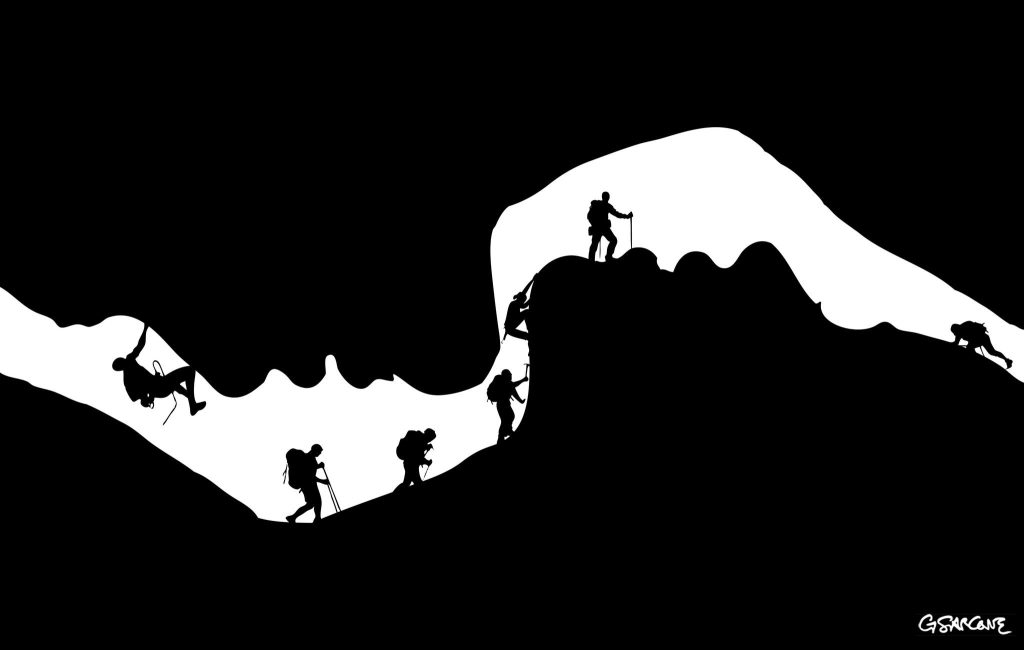
Color is energy—an electromagnetic phenomenon shaped by how light is reflected from objects. What we call vision is not innate. It is largely learned, built through a slow and demanding process. We tend to take it for granted, yet someone born blind who later gains sight must spend years learning how to organize and interpret what now enters the eyes.
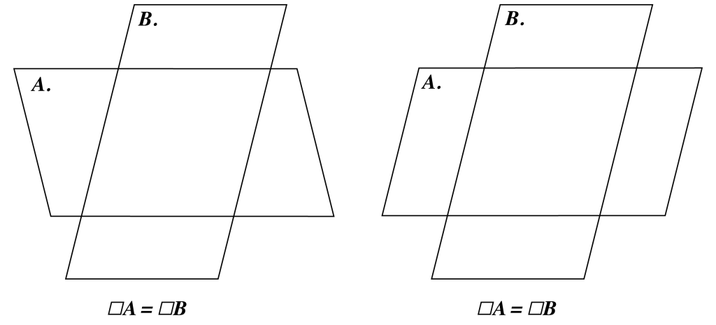
Seeing is neither simple nor passive. When we look at a landscape, color information reaches the visual cortex in roughly 30 milliseconds (in the occipital lobe, V1). Only a fraction later—around 70 milliseconds—shape, depth, and motion begin to emerge. In these brief intervals, the brain filters, compares, and reconstructs fragments of data, assembling them into a coherent image. What we perceive is not a direct recording of reality but a refined interpretation—an internal best guess shaped for meaning and action.
I’ve long been intrigued by the way people with partial or total visual loss engage with the world. Any serious reflection on perception or optical illusion eventually meets its counterpoint. Understanding how they “see” without sight reveals the real weight of vision itself—and how inseparably it works with the other senses, each one calibrating the rest.
When we see, move, speak, and feel at once, what actually binds sight to touch or hearing? The truth is, we notice far less than we assume. We attend only to what matters in the moment. Without the constant support of the other senses, perception would collapse into confusion, because they operate quietly in the background, guiding everyday behavior.
A striking example comes from research on inattentional blindness. In a well-known 1999 experiment by Daniel Simons and Christopher Chabris, participants watched a video and counted basketball passes between two teams. Nearly 40 percent failed to notice a person in a gorilla suit walking through the scene, pausing, even dancing, before exiting. The demonstration is disarming in its simplicity: we do not see what we do not attend to—even when it stands directly in front of us.
→ Source.