Exploring Tessellations & Op Art: Hidden Arrows

This brief tutorial explores an Op Art tessellation that plays with bistable perception, figure–ground reversal and negative space. By combining modular geometric tiles with contrasting colors, the pattern creates a visual interplay in which arrows can be perceived as either foreground shapes or background forms, depending on how the pattern is interpreted.

Experiment 1:

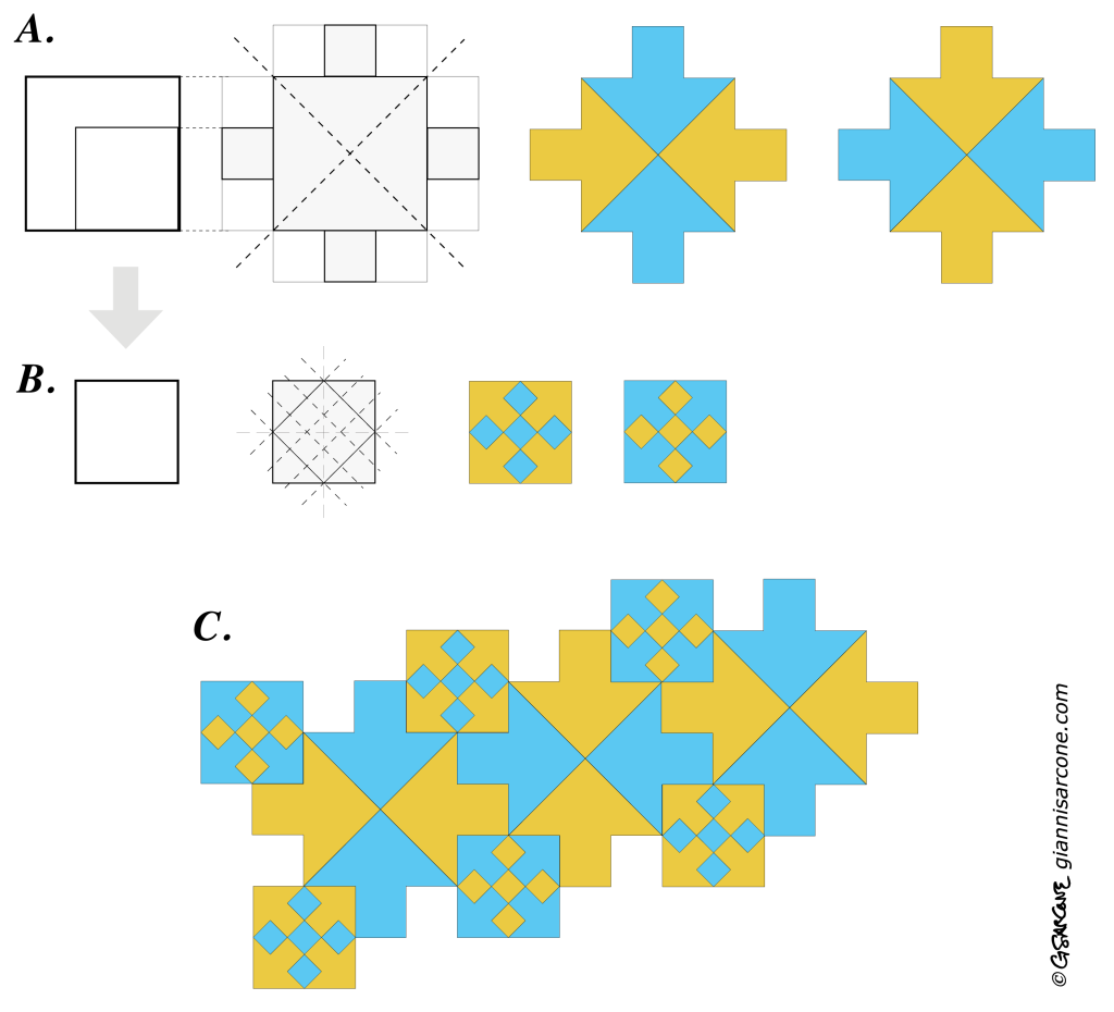
· Preparation — Fig. A: Start with a 3 × 3 square. Divide it along its diagonals into four triangles, then add a 1 × 1 square to the outer side of each triangle, as shown. Color the resulting cross-shaped tile with two contrasting colors, ensuring that adjacent sections are different colors. The construction produces four inward-pointing arrows.

· Preparation — Fig. B: Following the construction shown, subdivide a 2 × 2 square to create five diamonds arranged in a staggered pattern. Use the same two contrasting colors. This produces a complementary tile containing four outward-pointing arrows.

· Assembly — Fig. C: The two tiles are complementary and fit together. Interlock the cross-shaped tiles with inward-pointing arrows and the square tiles containing the diamond pattern to create a continuous tessellation.
Visual result: The alternating geometric modules form a large geometric Op Art pattern in which arrows emerge through figure–ground reversal. And hidden within it are, believe it or not, 100 arrows. Yes, one hundred arrows!
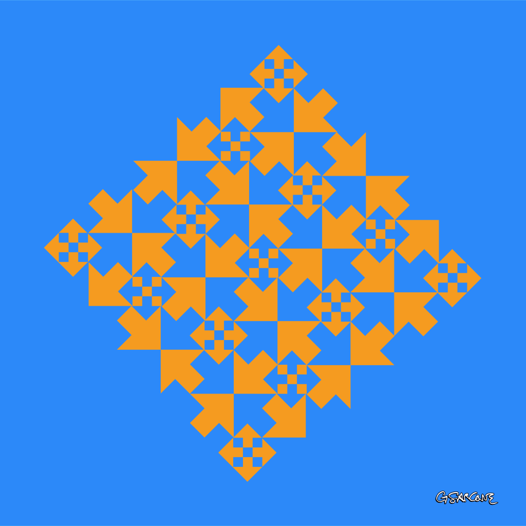
This op art work is available as fine art prints and canvases from my online official gallery.

Experiment 2:

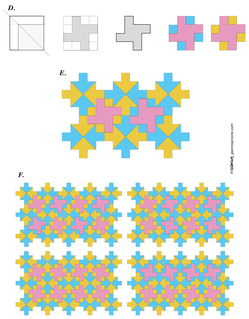
· Preparation — Fig. D: Build a four-armed pinwheel shape from a 4 × 4 square, as shown.

· Assembly — Fig. E: Interlock the four-armed pinwheel shape with the cross-shaped motifs containing the inward-pointing arrows.

· Assembly — Fig. F: As shown, these four-armed pinwheel shapes can be assembled in four or more different ways, producing different geometric configurations.
Visual Result: As seen in the example below, the contrasting colors make the bright blue arrows radiating around the pink central hubs—the pinwheel shapes—stand out, while the yellow arrows, matching the background color, virtually disappear from view.
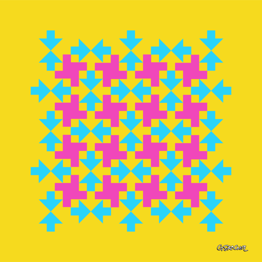
pattern with pinwheel shapes

Experiment 3:

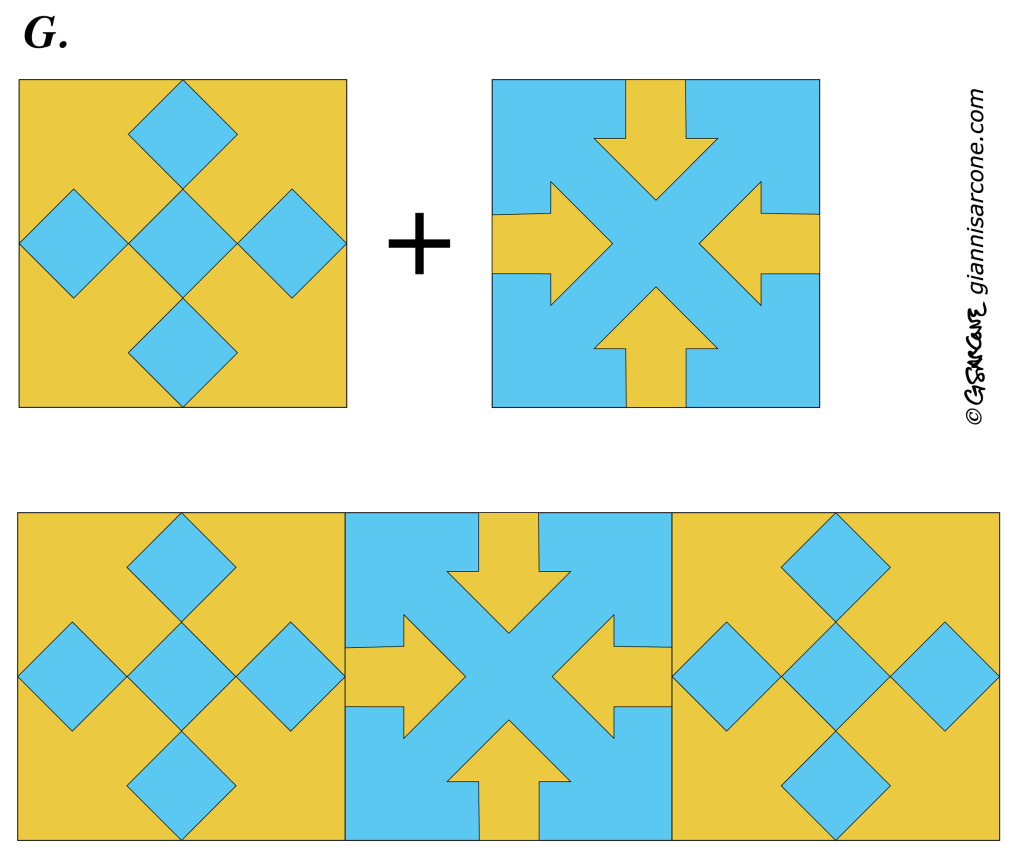
· Preparation & Assembly — Fig. G: Combine square tiles containing interior diamond arrangements with tiles featuring four inward- and four outward-pointing arrows formed by negative space. Arrange them alternately to create a checkerboard pattern.
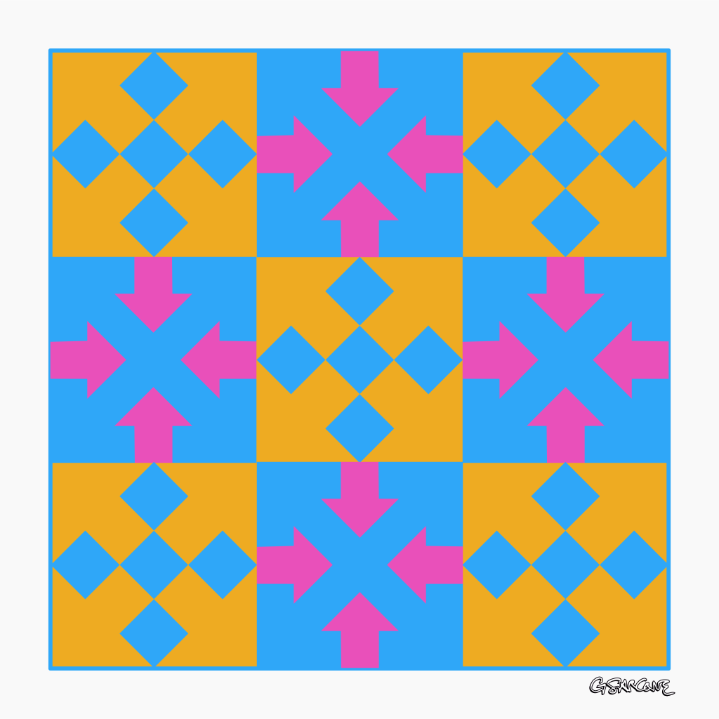
The example below shows a 3 × 3 alternating checkerboard configuration that surprisingly reveals 52 arrows in total.
Variation: Here is a striking variation of the tile with four inward- and outward-pointing arrows. The inward arrows extend into continuous paths on a white background, creating the effect of interwoven arrowed ribbons.

Extra 3D Arrow Illusion

Let’s take a different direction from the experiments above and explore a 3D isometric illusion. This construction is inspired by classic impossible figures depicting ambiguous stacks of cubes, whose apparent number can change depending on how you interpret their spatial arrangement.

Start with a hexagonal boundary (Fig. 1) and overlay a triangular isometric grid (Fig. 2). Then draw six interlocking arrow shapes around a central point, folding their tails inward (Fig. 3).

Finally, use three colors to shade the isometric planes, or apply directional line hatching, to give the flat arrows a three-dimensional, interlocking appearance.
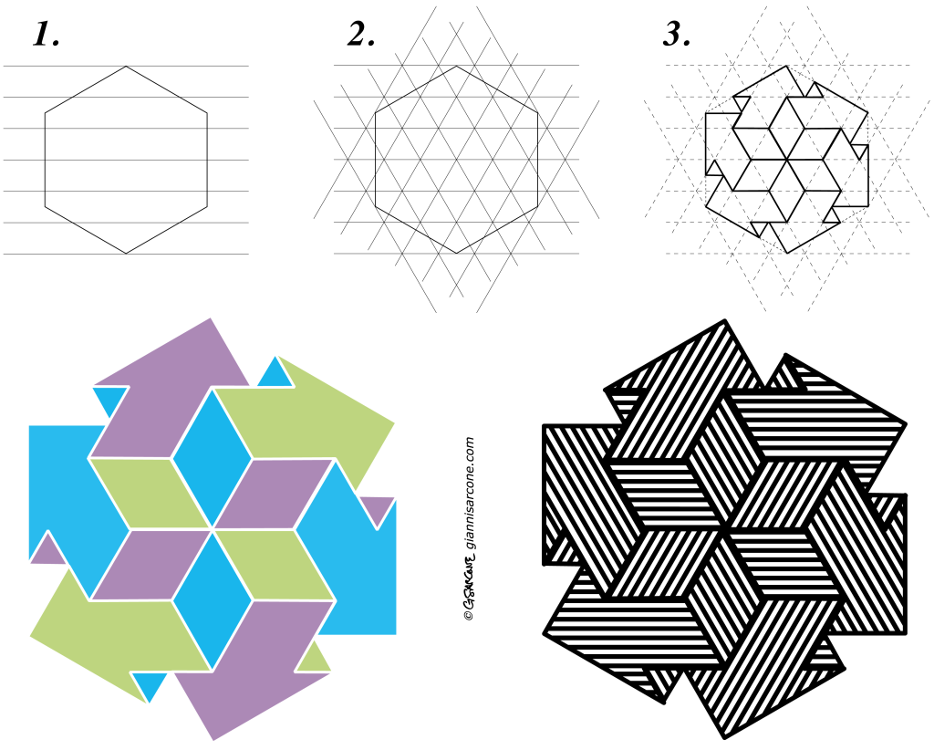
Curious about the mathematics behind these impossible 3D arrows? Math lovers can explore the geometry and construction 👉 here.

Creating a New Impossible Cube: From Concept to Print

Impossible or undecidable figures have long fascinated artists, mathematicians, and viewers alike. Their appeal lies in a delicate tension: the structure appears perfectly logical at first glance, yet closer inspection reveals spatial contradictions that cannot exist in the physical world. My latest work revisits an idea I first explored in the 1990s—an impossible Rubik’s-style cube—now developed into a new series built across several stages, from hand-drawn construction to digital refinement and photographic interpretation.

The project began with a simple geometric framework—interlocking beams arranged to suggest a stable cubic volume. The challenge was to reinterpret an apparently ordinary three-dimensional cube into an ambiguous form that still appears structurally plausible. Through careful adjustments of line weight, contrast, and directional and formal cues, the cube gradually shifts from perceived solidity to spatial uncertainty, so that as the eye moves across the image, the object quietly reorganizes itself, producing a surreal perception in place of a coherent physical structure.

impossible cube
Here is the original version of the project, refined from my initial hand-drawn construction and carefully reconstructed using FreeHand MX

Two of the final images belong to the Op Art tradition, where sharp black-and-white geometry emphasizes visual tension and rhythmic structure. These compositions highlight the cube’s architectural clarity while allowing the paradox to emerge naturally from the viewer’s perceptual processing. The remaining two images take a different path: they present the object in a photographic setting, rendered with realistic lighting and textures.

impossible cube etched
Astraea Paradox Cube: Available as fine art print.
Rubik’s Paradox Cube: Available as fine art print.

Together, the four images form a small visual narrative—construction, transformation, and illusion—showing how a purely conceptual structure can evolve into multiple aesthetic forms. The Op Art versions focus on perceptual mechanics, while the photographic interpretations suggest how an impossible form might inhabit the physical world, even if only in appearance.

Fine art prints and canvas editions from this series are available through my official gallery shop, where each piece is produced using archival materials designed for long-term display.

Collectors and galleries interested in larger formats or special editions may also contact me directly for availability and production details. This series continues my exploration of perceptual geometry, where simple shapes become instruments for questioning how we construct space, depth, and visual certainty.

The Importance of Dots

It is often the little things that are the basis of progress… So let me tell you a little story about the tiniest thing on earth: the dot.

Thousands of years ago, a man in his solitude scanned the night sky and saw all those dots shining like so many still fireflies, and, perhaps for fun, he decided to join them together to form shapes. This is how zodiac signs and astronomy were born.

Far away, in ancient India, the dot symbolized beauty and the eye of knowledge. But even more, the dot they called “shunya-bindu” (शून्यबिन्दु) represented what we nowadays know as zero. It was first a placeholder and then a fully fledged number, for when it is added to the right of the representation of any given digit, the value of the digit is multiplied by ten. This is how our current numbers and decimal numeration system were born.

While drawing or painting, visual artists of all times used to fix a dot – or more specifically a point in space – which was traditionally visualized from the tip of their thumb. Eventually, when this point receded so far away in space, it became known as a “vanishing point”. A vanishing point is where all converging lines of a landscape meet at the horizon. This is how perspective and geometry were born.

One day, medieval musicians were tired of having to rely solely on their memories to remember songs. So they started to use dots, named “puncti”, placed on or between four lines to represent the pitch and duration of a sound. This is how musical notation and programming were born.

In the modern era, at the beginning of the nineteenth century, dots were used in many other symbolic forms: bumps, holes, single tones, flashes of light… Do the terms Braille, Morse, punched card, or pixel sound familiar to you? This is how communication and coding were born.

This is how the humble dot, often overlooked, has served as a fundamental building block for countless advancements throughout history. Never underestimate the power of small things; within a dot was the whole universe.

Bridget Riley, White Discs 2, 1964, emulsion on board, 41 × 39 inches (104 × 99 cm) © Bridget Riley 2021. All rights reserved.

(The text above has been used as foreword for the book “The All-Round Activity Book” available from Amazon)

Globes within Spirals? (Optical Art Tutorial)

© Gianni A. Sarcone – redbubble.com

Are you seeing spirals? Look again, they’re actually concentric circles! This unique variation of the “Fraser spiral” plays tricks on your eyes by blending a regular line pattern (representing the circle’s circumference) with misaligned elements (the spheres with varying brightness).

Would you like to learn how to create this mesmerizing illusion? Follow my simple visual tutorial. If you have any ideas to further enhance this project, please don’t hesitate to reach out.

Continue Reading →

“Infinity”, A Kaleidoscope of Squares

With this work, I aim to push geometry to its limits, transcending the confines of color. My goal is to showcase the creative potential of simple concentric squares as a medium for experimentation and the discovery of new op art patterns. By delving into this exploration, I strive to unveil captivating illusions of color and mesmerizing motion.


Draw a large and a small square with thick lines and center them (Fig. A). Next, blend the inner and outer squares in six steps to create a set of concentric squares. Reproduce the set to form a larger square pattern, as shown in Fig. B.

“Enigma”, Paradoxical Volumes

In these minimalist op art works, I explore geometry as metaphor, using the hexagon as a building block for cubes and other regular solids. The forms appear stable and believable, yet they are impossible. Their contradiction isn’t obvious at first; it reveals itself only when the eye slows down and follows the structure closely. By merging incompatible viewpoints and softening the boundary between inside and outside, the drawings turn logic against itself. The more ordinary the form looks, the stronger the effect—these objects are meant less to trick the eye than to unsettle the mind and challenge our sense of space.

Enigma 1: Available as fine prints and t-shirts.

The two drawings displayed above and below combine paired tribars to form an impossible isometric cube, where form and illusion lock into a single structure.

Enigma 3: Available as fine prints and t-shirts.

Here, the “volume” turns itself inside out, quietly echoing the logic of a Klein bottle and unsettling the usual distinction between interior and exterior.

Enigma 2: Available as fine prints and t-shirts.

I am currently in the process of writing an informative book titled “Mastering Optical & Geometric Art: A Journey to Captivating Creations.” With a length of 136 pages, this book serves as an engaging guide to creating visually striking optical art and intricate 2D and 3D patterns. If you are interested in exploring further, I invite you to connect with me on Amazon.

Scintillating Starburst: Seeing rays that aren’t there…

This is one of my oldest illusions I created in the 90s. In the picture you may see ghostlike dark radial beams. This illusion is a variant of the Herman’s scintillating grid illusion. I designed this illusion just by turning 45 degrees the Herman grid and then by applying a polar transformation.

From my book “Eye Tricks“, 2001-2007.
Continue Reading →

My Dossier on Visual Illusions: A Special Feature in Focus Magazine

For over 10 years, I’ve had the pleasure of collaborating with Focus, an Italian monthly popular science magazine published in Milan.

In October 2020, Focus released issue #336, which featured my article and optical illusions. This special edition included a 10-page dossier on visual perception, showcasing over 13 original illusions I created, complete with explanations.

The cover of this issue also featured a unique effect I designed for Focus. As you read the main title, the cover image moves, and, intriguingly, the title changes depending on your perspective—read closely, and it says ILLUSIONI; look from a distance, and it transforms into COSA VEDI?

Focus Mag cover

Continue Reading →

Frankenstein’s Dream: Hybrid Picture

Frankenstein Marylin

This intriguing image is taken from my book “Curiopticals“. Look at Frankenstein from a certain distance – approximately 2-3 meters, or 7-8 feet – and you will see what he is dreaming about. This type of illusion is known as a cryptic or hybrid optical illusion, and is produced by merging two subjects with different resolutions. The result is that one subject is hidden or suggested in the ‘host’ image. Continue Reading →