Some say abstract art is non-representational—that it avoids visual reality and relies on color, shape, form, and gesture to trigger emotion or thought. I see it differently. Abstraction does not reject reality; it reframes it. It is a change of optics, not a disappearance of the world.
Take, for example, this video of goldfinches perched on swaying thistles. At first glance, does it not resemble an abstract painting? Rhythms, repetitions, subtle chromatic tensions, forms dissolving into movement. From there, one could push the abstraction further with the slightest shifts in shape or color—without betraying reality, only rephrasing it.
This idea is hardly new. From Cézanne’s insistence on treating nature through cylinder, sphere, and cone, to Kandinsky’s claim that abstraction reveals inner necessity rather than surface likeness, many artists and thinkers have argued that abstraction sharpens perception instead of diluting it. Even in cognitive science, perception is understood as an active construction, not a passive recording of facts.
Abstraction starts precisely there: with attention. Not with denial, not with decoration, but with the recognition that reality is already structured, already abstract, long before the artist intervenes.
Here are two Kinegram installations I made, designed to educate, engage, and spark curiosity in visitors of all ages. These works make motion appear from static forms, offering an experience that is both playful and thought-provoking.
Kinegrams reveal movement through a sliding transparent panel printed with vertical black lines. As the panel moves over the underlying image, hidden sequences appear, animating the drawings like frames of a film. Each interaction lets the viewer explore how motion can emerge from stillness.
The concept of movement from static forms has long interested scientists and philosophers. Movement is a dimension unfolding in space and time—without time, there is no motion. Kinegrams make this idea tangible through touch and visual perception.
These exhibits are simple to set up but produce surprising results. I made the first panel for UNIFI, the University of Florence, and the second for the Mind Games Art Alive Museum in Sydney. Both projects engage and surprise visitors, combining education with visual impact.
“Twisting Cords,” Kinegram exhibit for UNIFI, Florence As the transparent panel etched with black lines glides across the design, colorful cords seem to twist, winding and unwinding in a mesmerizing, living rhythm.
“Flying Birds – Migration,” Kinegram exhibit for Mind Games, Sydney As the transparent panel etched with black lines glides across the static design in the background, the flock of birds rises and takes wing, transforming a still pattern into living, rhythmic motion.
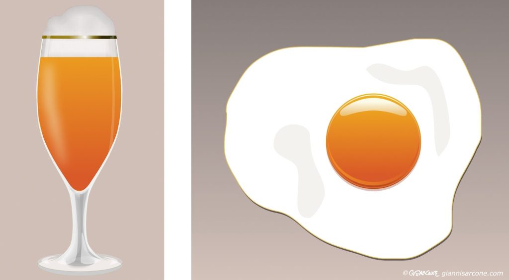
I’ve always wondered about the limits of shape and color needed for us to represent or recognize an object. Take a stemmed glass, for example. To depict it, you might need just two circles and a straight line—and perhaps a red disc to suggest the wine inside.
But we can go further: by turning it from a flat image into a 3D form with a simple rotational movement, like in Duchamp’s rotoreliefs, the object suddenly comes alive in space.
All these graphic shortcuts rely on memory. Our brains interpret what we see based on past experience, filling in missing information and reconstructing the object from just a few essential cues. This process aligns with the principles of visual perception: the Gestalt laws of closure and continuity explain why we perceive a complete glass even when much of it is absent. Minimalist perception highlights how human cognition distills visual information, showing that a few simple shapes and colors are enough to evoke a rich, instantly recognizable image.
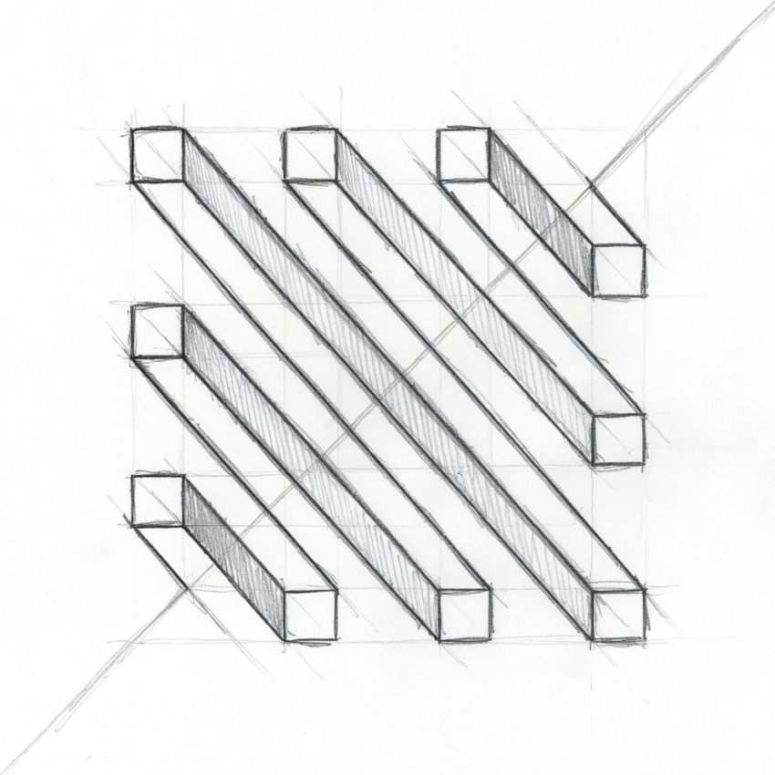
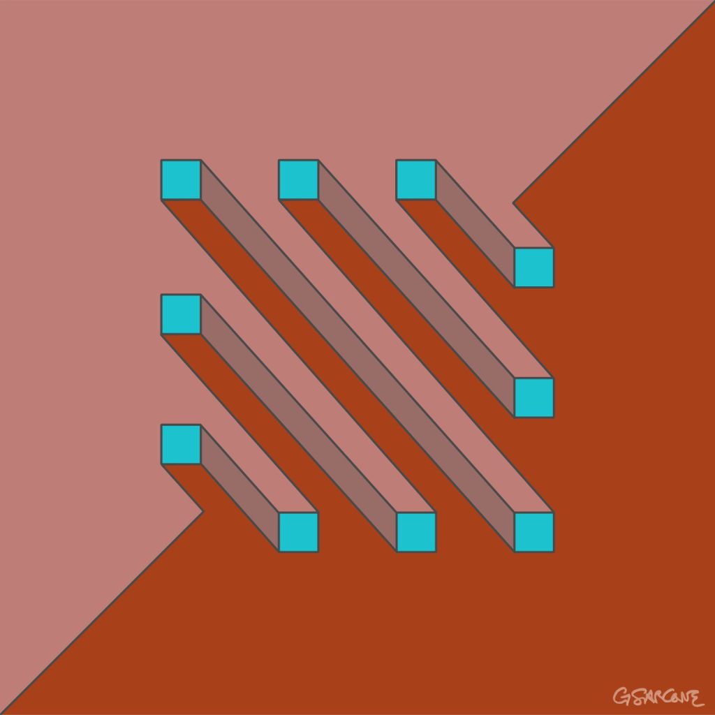
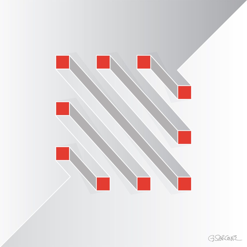
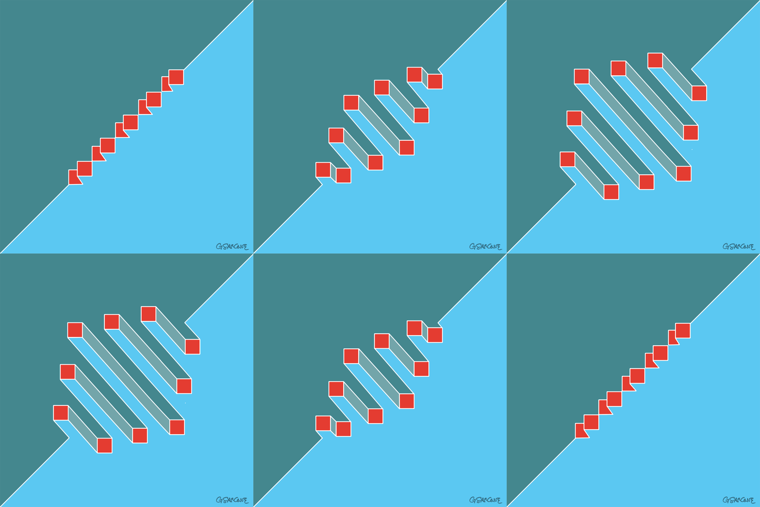
We usually perceive lines and shapes as forming a figure, while the paper and surrounding white space recede into the background. Yet, under certain conditions, what we assume to be background can itself acquire form and meaning. In the illustrations shown here, a clear geometric figure emerges—even though no lines actually define it. These visual phenomena are known as illusory figures.
What kind of 3-dimensional shape do you see?
Illusory figures depend, in part, on the presence of regular gaps within a visual arrangement. When such gaps occur, the visual system instinctively tries to resolve them into coherent forms. These gaps can be created by simple elements, such as circles. When solid black circles and partially “chipped” ones are arranged carefully, they produce striking illusory shapes.
The most familiar example is the Kanizsa triangle. Here, an illusory contour is perceived when black disks with wedge-shaped sections removed are aligned so that their edges define a triangular form in the negative space. Remarkably, this illusory region appears brighter than the surrounding page, even though its physical luminance is identical.
Kanizsa triangle
Etherial Cross
A pattern of black dots forms a ghostly ‘X’ shape through negative space. The arrangement of dots creates a subtle sense of motion and depth. The piece combines the Ouchi effect—where contrast between figure and background generates apparent movement—with the Kanizsa illusion, where the mind completes shapes that aren’t actually drawn.
Fine art prints of this Op Art piece are available for purchase through my official gallery.
The effect becomes even more dramatic when the illusion is animated. Rotate the cross, for example, and the X-shaped form—with no explicit outline—appears to emerge from a rigid grid of black dots. The shape is defined solely by subtle local distortions: small asymmetric intrusions along the contours of the X disrupt the regularity of the dots, making the form pop into perception despite having no actual boundaries.
Etherial Circle
Using the same technique, we can replace the X with a large O. Now the regular arrangement of black circles is disrupted by a ghostly central shape that seems to lift off the background, almost floating. As above, this Op Art piece combines the Ouchi effect—where the contrast between figure and background creates apparent motion—with the Kanizsa effect, where the mind completes shapes that aren’t actually drawn.
Fine art prints of this Op Art piece are available for purchase through my official gallery.
It is also interesting to add a rotational motion to this Op Art piece. I experimented with different solutions, and this one is the simplest yet striking nonetheless.
To conclude this journey into the world of contour illusions, still using black disks as our starting point, here are a few further experiments. They explore negative superpositions, translucent effects, and the emergence of more complex forms—showing how simple elements can give rise to unexpected visual structures.
Fine art prints of this Op Art piece are available for purchase through my official gallery.
People often ask me where the ideas for my illusions come from. The truth is, they often arrive quietly, inspired by the places I’ve visited and the cultures I’ve encountered. During my travels, it’s not unusual for me to create something that reflects the spirit of a place. Take “Seal or Bear?” for example—it came to me while wandering through northern Canada, surrounded by the vast, silent landscapes of the Arctic and the rich traditions of Inuit culture. That illusion went on to become a classic in the 1990s and even made its way into textbooks on perception.
Later, during my journey through Japan between Tokyo and Kyoto, I was captivated by the delicate balance of light, shadow, and movement in the world around me. It was there that “How Many Birds?” took shape, in the ukiyo-e style. One of my earliest optical illusions, it explores bistable perception in a playful way. Depending on your gaze, you can see four birds nestled in their respective nests with one perched on a branch—or four chirping chicks gathered around their mother. I like to think that, in that moment, the spirit of the place and the quiet rhythm of daily life found a way into the lines and spaces of the image, letting viewers glimpse more than one reality at once.
Ultimately, I am like a sponge, absorbing everything that orbits around me, all while staying true to my own style. That is simply how I work.
What strikes in the tiny space between God’s and Adam’s fingers in the Sistine Chapel is neither mysticism nor religion—it is humanity itself. Michelangelo, perhaps without realizing it, captures a simple yet profound truth: the hardest distance to cross does not depend on strength or span, but on “human will”—or its absence.
We perceive a tension in the image: God leans forward, taut and ready to give all He can. Adam, by contrast, extends his hand half-heartedly, hesitant, the finger limp and weak. That missing centimeter seems, at first glance, to symbolize free will—or the refusal of determinism: the choice to make a tiny gesture that can shift our understanding of life, to move forward with conviction, or to remain still, waiting for everything to arrive on its own.
The fresco speaks beyond faith: to moments when we could act, yet remain still. Stillness is not failure—it is awareness. Like Wu Wei (無為) in Zen philosophy, it is effortless action: a letting go, a recognition that life flows even when we do not grasp it. Free will and determinism fade into labels, defined only by belief.
That one-centimeter gulf becomes infinite. It stretches across light-years, embodying the human condition: our extraordinary capacity to feel and aspire, in tension with the world, facing life’s trials and the inevitability of our own mortality.
Few stories of creative and intellectual theft are as striking—or ironic—as the origins of the billion-dollar phenomenon known as Monopoly. It all began with Elizabeth “Lizzie” Magie, a brilliant economist and game designer, who in 1904 created The Landlord’s Game to illustrate the dangers of property monopolies and rent-seeking. Her game included two rule sets: one showing how wealth concentrates under monopolies, and another promoting shared prosperity—a subtle critique of unrestrained capitalism.
Over the decades, her game spread informally, with players adapting it to local streets and rules. In the early 1930s, Charles B. Darrow encountered a variant, tweaked it, and sold it as Monopoly. Parker Brothers bought the rights in 1935, marketed it as Darrow’s invention, and turned it into the family-friendly capitalist pastime we know today—while Magie received a mere $500 for her patent and vanished from the mainstream narrative.
The irony is bitter: a game designed to expose the dangers of monopolies became one of the most lucrative symbols of them. And the woman who invented it? Forgotten, while the world continues to pass “Go” and collect $200.
I often catch myself wondering how different our art, our literature, our techniques, our architecture, our science, and all our so-called achievements would be if, at some point in history—say, right after the late Middle Ages—everything humanity had created were wiped out so thoroughly that no one could even recall what a wheel looked like. A world where no one knew whether the Venus de Milo had been a place, a painting, a wine, a poem, or perhaps an ancient weapon. And where “democracy” or “monarchy” might just as well be fireworks or seasonal mushrooms.
As for me, I suspect that the evolution of such a world would feel strangely familiar while being completely different, a kind of cosmic déjà vu. Everything reinvented, yet uncannily the same. Worn-out ideas would return with fresh paint, old opinions would resurface disguised as revelations, eccentric religions would bloom—new in appearance, ancient in essence—and intolerance would simply find new masks. I don’t imagine this world as a better one. No, not that… just the same stage with new props, perhaps a bit more entertaining.
After all, when the dinosaurs vanished in an instant, life went on—and brought forth creatures no less terrifying. Take humans, for example.
What is an instant—the punctum temporis—that Plato called ἐξαίφνης (exaíphnēs), the sudden? Is it a vanishing point between past and future, or the hinge on which both unfold? Plato saw it as an interruption in the flow of time, a fleeting spark where change occurs, yet which itself seems to escape duration. Augustine later reflected that the present, though indivisible, lives within us as the tension between memory and expectation.
Bergson went further, arguing that real time—la durée—cannot be reduced to a series of measurable instants. If an instant is infinitely small, it cannot be summed; if it can be summed, it is no longer an instant. Thus arises the paradox: if the present is composed of infinite instants, how can it ever be said to exist?
Perhaps time is not made of points but of relations—of movement, perception, and becoming. The instant would then be less a unit of time than a threshold of consciousness, the meeting place of continuity and change. In that sense, punctum temporis is where time reveals its true nature: elusive, dynamic, and inseparable from the act of being.
A simple study in visual perception—an exploration of how a plain hexagon can evolve into the illusion of a cube. Through precise geometry and controlled form blending, static lines awaken into rhythm and volume, giving rise to a subtle sense of depth and movement.
Constructing the Illusion
Fig. A — The Base Shape Start with a regular hexagon. Divide it into three equal diamond shapes (rhombuses)—these represent the three visible faces of the cube. Each diamond has four equal sides: two acute angles (60°) and two obtuse angles (120°). Together, they form the geometric foundation of the cube.
Fig. B — Building Volume with Shape Blends In Illustrator, or any other vector software, use the Blend Tool to create a shape blend inside each diamond. Start with a small central circle and blend it toward the outer edge of the diamond. Adjust the number of blend steps to control how smooth or tight the transition appears. This process builds the cube’s apparent volume and visual tension. You’ll notice that the distance from corner to corner in the nested, diamond-like shapes is slightly greater than from side to side, creating subtle gaps that lead the eye to perceive an X across the surface.
Fig. C — Perspective and Transformation Distort slightly the hexagon to set the three diamonds in perspective. This step transforms the flat figure into a die-like cube, giving it spatial depth and presence.
Enhancing the Optical Effect Next, add horizontal background lines and some color, as shown in the two examples in the image. You can also adjust the illusion by making the visible faces of the die appear slightly concave, as in the figure on the right. This effect is created by shifting the concentric, nested diamond shapes slightly off-center—the position of the central ellipse determines whether the die appears concave or convex.
Below is the finished stage of the work. Curiously, the cube appears to hover, slide, and even emit a faint blue glow—though it remains entirely black and motionless. Ananke’s Die is a study I began in 2010, a continuing exploration of how repetitive lines and geometric precision can trick the mind into sensing motion and color where none exist.
You can get Ananke’s Die as a fine art print or canvas, available in different sizes and finishes. 👉 Buy it here
Why Ananke’s Die
I titled this work Ananke’s Die after Ananke, the Greek goddess of necessity and fate. The cube, a symbol of structure, represents order and control. Yet the three visible faces that seem to define its volume are an illusion—shifting and unstable. Under the viewer’s gaze, the shape changes, its meaning shifts, yet the form remains. This illusory die shows the balance between order, perception, and destiny, reminding us that what we think we control often exists within the unpredictable interplay of vision and inevitability.
This image also triggers multiple associations in a loop: hexagon, cube, die, chance, illusion, order, fate, contradiction. These connections show how perception mixes stability and randomness, revealing that what we see is shaped as much by the mind as by reality.
Explore My World of Art, Books, and Creative Concepts