Why W Is Called “Double-U”

The letter W ultimately derives from the letter V, but its history is more layered than a simple invention after the Norman Conquest.

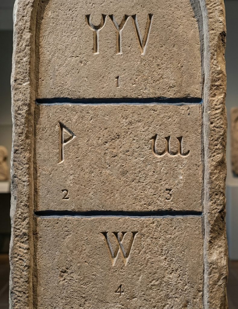
In classical Latin, inherited from the Greek and Phoenician alphabet traditions (Fig 1), the letter V served a dual function: it represented both the vowel /u/ and the consonantal sound /v/. There was no distinct symbol for /w/. In contrast, Old English (Anglo-Saxon) already had a need for this sound and used a separate rune, wynn” (ƿ, Fig. 2), to represent it.

After the Norman Conquest of England in 1066, scribal practices shifted toward continental Latin conventions. The rune wynn gradually fell out of use, and scribes began representing the /w/ sound by writing a doubled form of U (or V, since the two were not yet fully distinguished, Figs. 3-4). This “double u” convention eventually evolved graphically: two V-shaped characters were written side by side, then gradually joined.

From this duplication comes the modern name “double U,” which preserves the historical origin even though the visual form is closer to two V’s than two U’s. The lowercase w developed directly from this doubled form, simplifying over time into a continuous script shape.

In short, W is not a direct Roman invention, but a medieval solution: a hybrid born from Latin writing habits adapting to a sound already present in Old English.

Born into Iki

I am iki from birth.

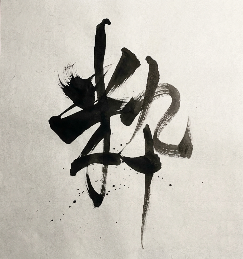
But what is iki (粋)?

Edo, under the Tokugawa shogunate. Merchants wealthy enough to unsettle the hierarchy, yet still ranked below the samurai. Power without status—watched closely, dressed carefully.

Sumptuary laws did the rest: no gold, no loud silk, no bright declarations. Only browns, greys, indigo. A forced muting of visibility.

Constraint rarely suppresses imagination. It concentrates it.

From this narrow register emerged a refined spectrum known as Shijuhattcha Hyakunezumi (四十八茶百鼠)—“48 browns, 100 greys.” Not literal numbers, but a cultural way of naming excess within restraint: an almost infinite sensitivity to difference inside what first appears uniform.

Fashion became a coded language. Subtle shifts in tone, legible only to trained eyes. Outside, discipline. Inside, excess held in reserve. A lining of rare fabric. A color hidden against the skin. A private flash revealed only when a sleeve turns in the wind.

This is iki: elegance that refuses emphasis. Presence without display. A form of refinement that collapses the moment it is named.

Its opposite is yabo (野暮): excess, insistence, the compulsion to be seen. Not morality—measure. Or the lack of it.

Today, the direction has inverted. Visibility has become currency. Those who do not perform disappear; those who do not declare are not counted. What was once failure has become strategy.

And yet the counter-move remains simple.

Lower the volume. Leave gaps. Let meaning breathe in what is not shown.

And become something worth looking at twice.

Small Strokes, Big Meanings

Human writing systems are built from strokes. I’ve always been fascinated by how a simple line or mark can alter the sound or meaning of a letter, pictogram, ideogram, hieroglyph, or sinogram. Exploring scripts across the world—even from countries far apart—revealed surprising connections, almost like hidden equivalences between them. The true marvel is how our eyes can sense meaning, even when tiny, seemingly insignificant changes are made to the original sign.

In some writing systems—especially those built on characters rather than alphabets—a subtle visual change can completely shift meaning, much like how English plays with homonyms and homographs. But here, it is the visual structure itself that carries the transformation.

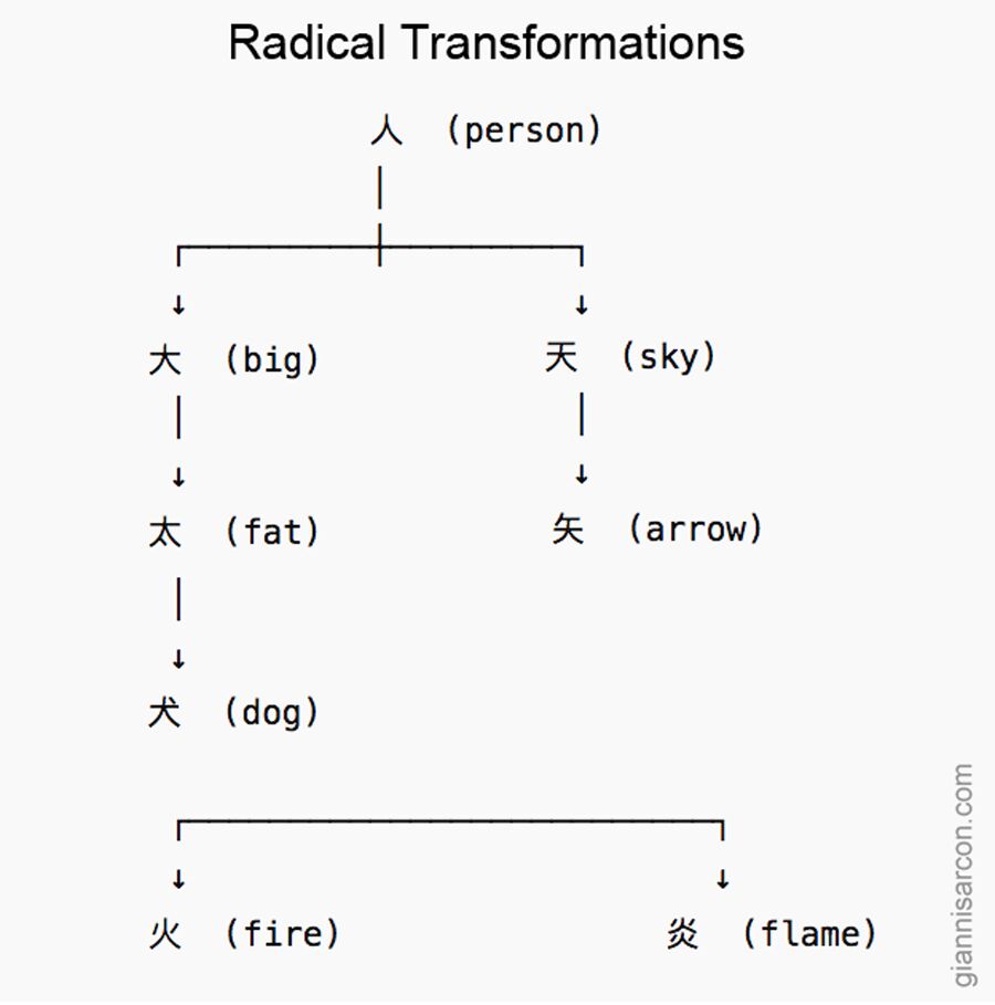
Take the Chinese character , meaning “person.” In Chinese and Japanese, this simple shape often acts as a base or radical. By adding a stroke, adjusting placement, or combining it with another element, you get entirely new words and concepts. A single alteration can lead to a dramatic change in meaning.

Here are a few examples showing how characters evolve from that shared visual root:

  • (dai, oo) — “big, large”
    Looks like a person with arms extended. One stroke changes the meaning from “person” to “large.”
  • (tai, futo) — “fat, thick”
    Add a small dot below , and the concept shifts from “big” to “overly big” or “thick.”
  • 犬 (ken, inu) — “dog”
    A short slanted stroke above the horizontal line of 大 turns the human figure into an animal.
  • (ten, ama) — “heaven, sky”
    By placing a stroke above the “big” shape, the idea rises upward—symbolically to the sky.
  • (shi, ya) — “arrow”
    Adding a vertical stroke that meets the upper horizontal line of turns it into a tool or weapon.
  • (ka, hi) — “fire”
    Here the strokes branch downward, evoking sparks or flames.
  • (en, honoo) — “flame”
    Double the fire element and you intensify the meaning: from fire to blazing flame.
radical transformations

What’s striking is how these changes don’t require entirely new symbols—just minimal visual tweaks. Where English relies on spelling or pronunciation shifts (like lead the metal vs. lead as in to guide), character-based languages often rely on visual logic. A dot, a stroke, or a slight rearrangement can redirect the meaning toward something bigger, higher, brighter, or more intense.

It’s a compact, elegant way to build vocabulary: meaning evolves visibly, not phonetically.