The blue and yellow arrows in this video seem to move up and down in a rhythmic dance—yet their motion is strictly horizontal and uniform. This illusion is a variation of the “Stepping Feet Motion” effect, first demonstrated by Stuart Anstis in 2003.
In the original phenomenon, two objects glide side by side at a constant speed across a striped background, but appear to alternately speed up and slow down, creating a stepping or oscillatory effect. The visual system misreads contrast differences as changes in motion, producing a false sense of vertical or staggered movement.
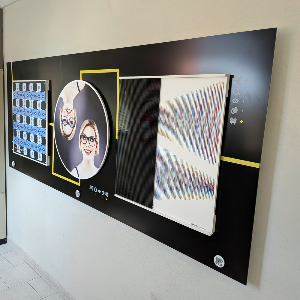
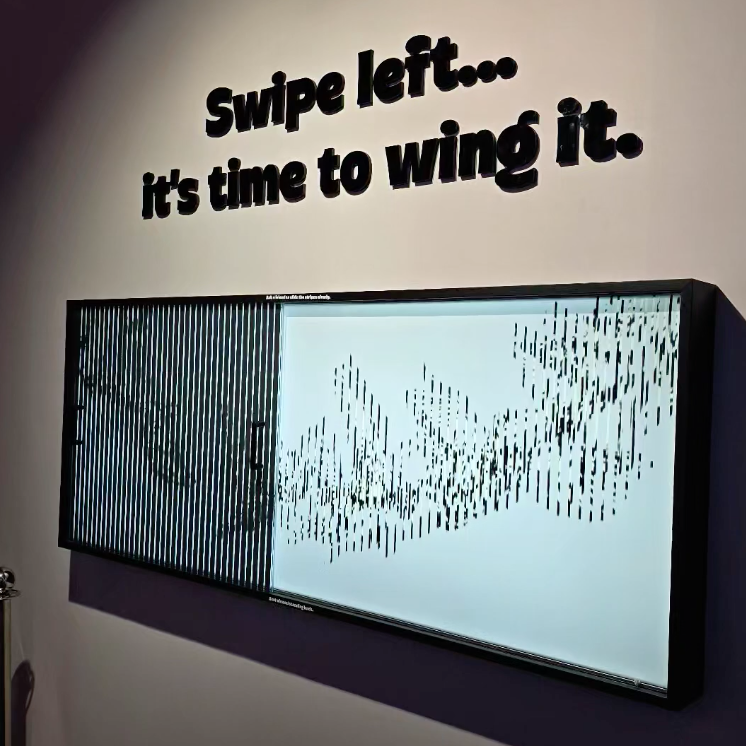
Here are two Kinegram installations I made, designed to educate, engage, and spark curiosity in visitors of all ages. These works make motion appear from static forms, offering an experience that is both playful and thought-provoking.
Kinegrams reveal movement through a sliding transparent panel printed with vertical black lines. As the panel moves over the underlying image, hidden sequences appear, animating the drawings like frames of a film. Each interaction lets the viewer explore how motion can emerge from stillness.
The concept of movement from static forms has long interested scientists and philosophers. Movement is a dimension unfolding in space and time—without time, there is no motion. Kinegrams make this idea tangible through touch and visual perception.
These exhibits are simple to set up but produce surprising results. I made the first panel for UNIFI, the University of Florence, and the second for the Mind Games Art Alive Museum in Sydney. Both projects engage and surprise visitors, combining education with visual impact.
“Twisting Cords,” Kinegram exhibit for UNIFI, Florence As the transparent panel etched with black lines glides across the design, colorful cords seem to twist, winding and unwinding in a mesmerizing, living rhythm.
“Flying Birds – Migration,” Kinegram exhibit for Mind Games, Sydney As the transparent panel etched with black lines glides across the static design in the background, the flock of birds rises and takes wing, transforming a still pattern into living, rhythmic motion.
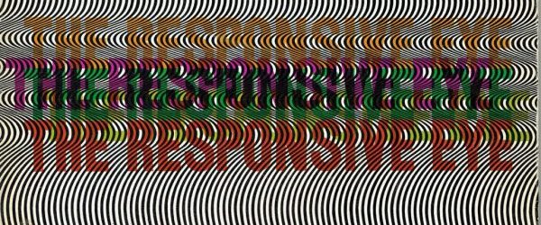
“The Responsive Eye,” held at MoMA in 1965 and organized by William C. Seitz, was a landmark exhibition in Op Art. Featuring over 100 artists—including Bridget Riley, Victor Vasarely, Richard Anuszkiewicz, and Josef Albers—it explored how geometric patterns and color could manipulate perception.
Riley stood out with her precise, rhythmic paintings that seemed to move and breathe, challenging the way we see. The show fascinated the public, drawing huge crowds, and sparked a wave of interest in optical effects across art, design, and fashion.
Critics were divided. Some celebrated its innovation and playful engagement with vision; others dismissed it as flashy spectacle, questioning the depth and seriousness of Op Art. Personally, I see it as a pivotal moment—one that reminded everyone that perception itself could be the medium, and that art could be both cerebral and exhilarating.
A memory from Japan, where I lived briefly in the 1980s. This piece recalls earthy colors, organic shapes, and fragments of that time. A circle emerges from a flowing field of triangles—like ripples of moonlight dancing on the sea near Kamakura.
Immersing in my Op Art is entering a space where opposing forces meet, interlock, and balance with precision and intensity. Each piece is a silent dialogue of form, line, color, perception, and mathematical structure, anchored in the language of symbols. Beneath the surface, it engages archetypes and ancient rites that still resonate in the collective unconscious.
I’ve been toying with the idea of revisiting an old, low-key material for my art: Flutex.
If you haven’t heard of it, Flutex is a patterned industrial glass from the 1930s and ’40s, mostly used to give a bit of privacy in bathrooms and office partitions.
In the ’70s, Op artist Sydney Cash started playing with this glass and found that its ribbed surface works like a lenticular screen—showing different images depending on how you look at it. The effect? Hypnotic, shifting artworks that change as you move around them.
It’s just simple glass, but it tricks perception in a really cool way.
I’m seriously considering giving it a try myself—there’s something about that mix of humble material and complex visual play that feels worth exploring again.
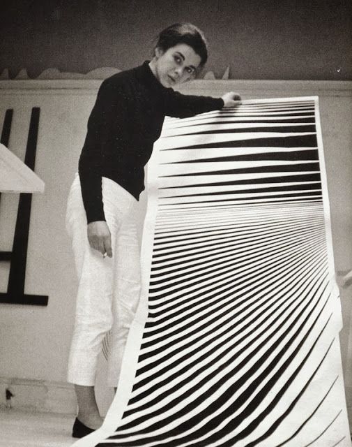
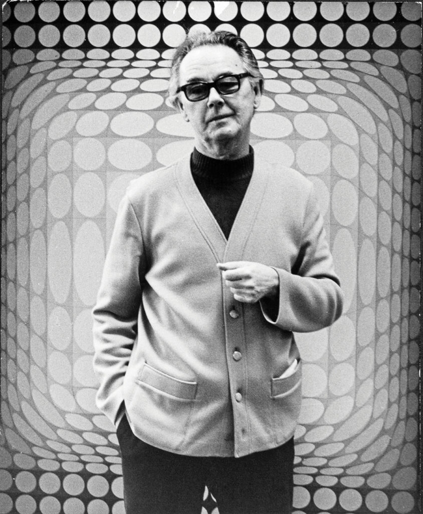
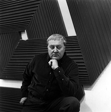
Although I’ve been working in the field of Op Art since the mid-1980s, it’s important to recognize that the movement itself has a deeper history. It began to take shape in the 1960s, led by pioneering figures such as Victor Vasarely and Bridget Riley.
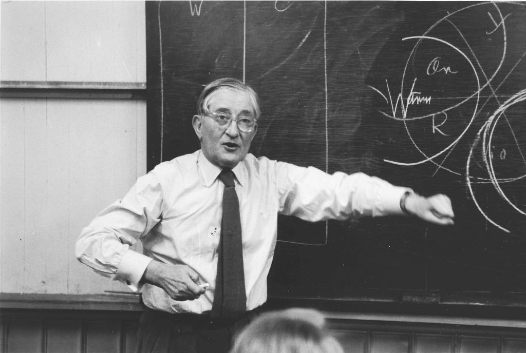
However, the artists who truly captivate me—the ones who expanded the language of perception—are often the outsiders. One such figure is Julio Le Parc (b. September 23, 1928), an Argentine-born artist whose practice bridges Op Art and kinetic art. Le Parc studied at the School of Fine Arts in Argentina and went on to co-found the Groupe de Recherche d’Art Visuel (GRAV). His work, honored with numerous awards, holds a prominent place in Latin American modernism.
Le Parc’s recurring themes—color, light, and movement—have always resonated with me. During the ’60s and ’70s, he explored light not just as a visual element but as a living, dynamic material. Yet by the late ’70s, his presence in the art world had faded; his output became sporadic, and for decades his work slipped quietly out of the international spotlight.
Fortunately, recent years have witnessed a renewed appreciation of his explorations in light and movement, bringing his contributions once again to the attention of a wider public.
Take a moment to focus on the circular pattern. How many spirals do you see? The surprising answer is none. There are no spirals here—just alternating black and yellow discs, slightly off-center and layered to create a striking illusion of swirling depth and motion.
I began crafting pieces like this in the early ’90s, drawing inspiration from Duchamp’s Rotoreliefs. I was captivated by how simple rotation could deceive the eye, inviting the viewer into a world of optical illusions. It’s a unique experience—seeing motion and depth in something entirely flat, both puzzling and mesmerizing.
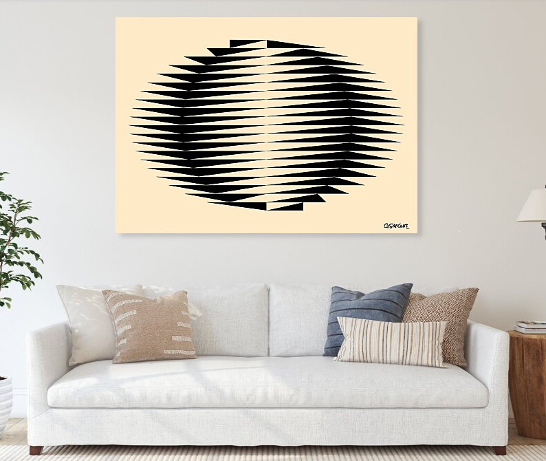
This op art pattern comes to life across various mediums and transforms into artistic expressions on different objects. In my online gallery, you’ll find art prints and everyday items featuring this work, all available for purchase.
Let your gaze wander across the image below. Do the shapes in the first and third rows seem to subtly shift leftward, while the second and fourth rows appear to glide rightward?
Why do these static images appear to move? This perceptual phenomenon, known as “anomalous motion” or “peripheral drift illusion”, results from the interplay of color contrast, luminance, and eye movements. It occurs due to a sawtooth luminance grating in the visual periphery, where a sequence of contrasting colors transitions from light to dark. The speed of the perceived motion is influenced by the frequency of microsaccadic eye movements.
In the 1990s, I began creating many of these fascinating images, experimenting with patterns and contrasts to bring this mesmerizing effect to life.
Fine art prints and merchandise of these mesmerizing pieces are available in my online gallery—a perfect addition to any space!
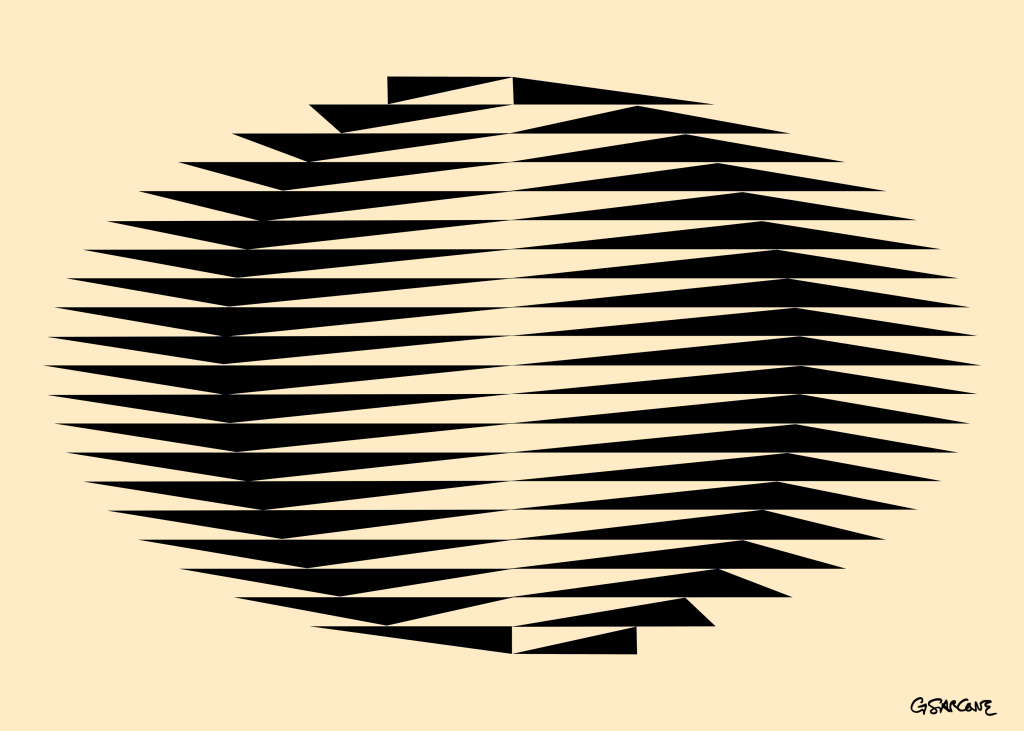
When bending the sides of a square structure forward, each edge forming a sine wave shape, the structure reveals a circle when viewed from the reverse angle. This illusion plays with perspective, specifically utilizing an effect known as “anamorphosis“.
Anamorphosis refers to a artistic technique that uses perspective to create distorted images that can only be viewed correctly from a specific angle.
Explore My World of Art, Books, and Creative Concepts