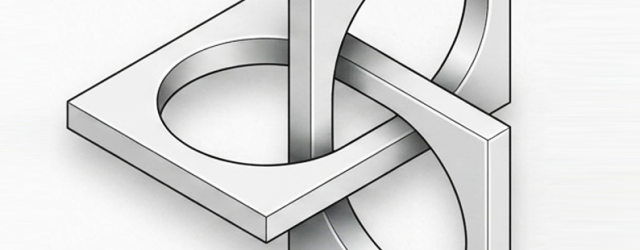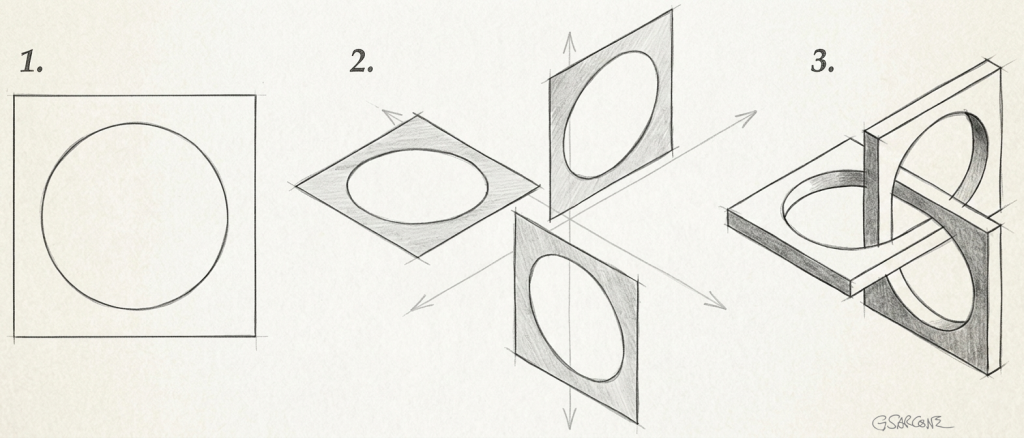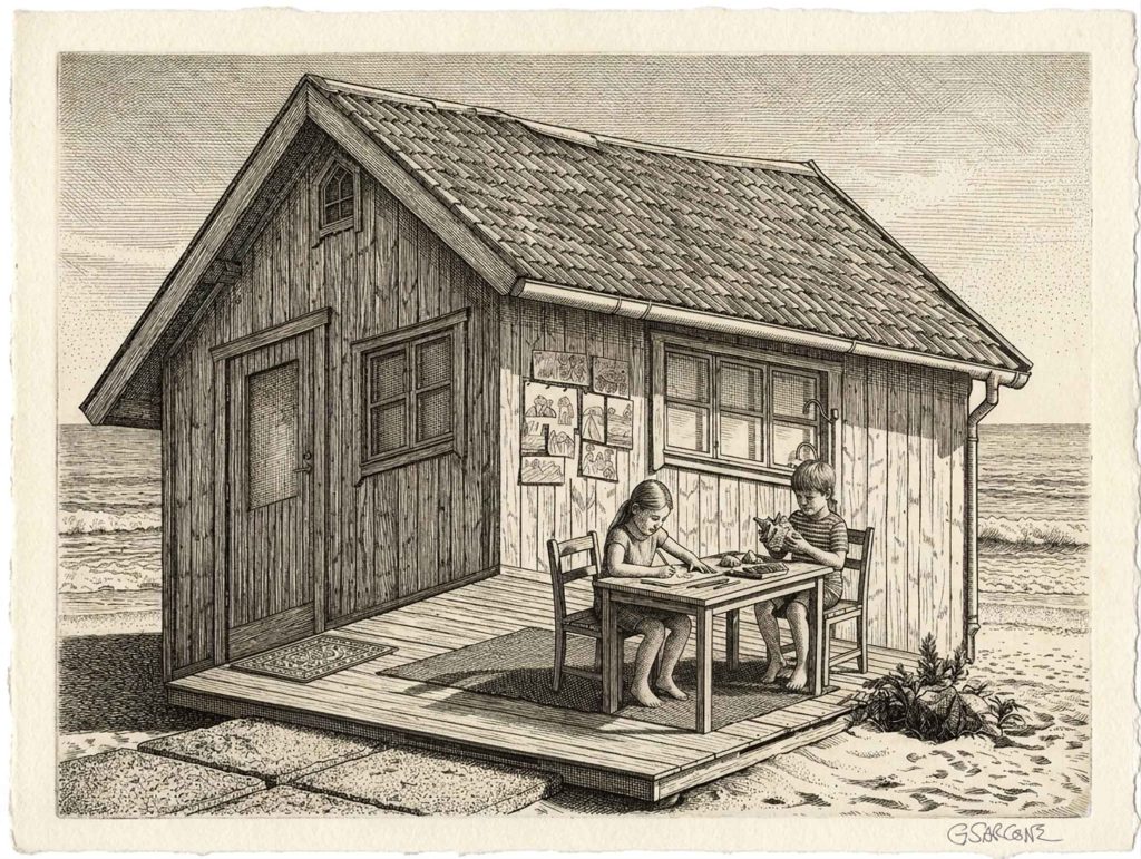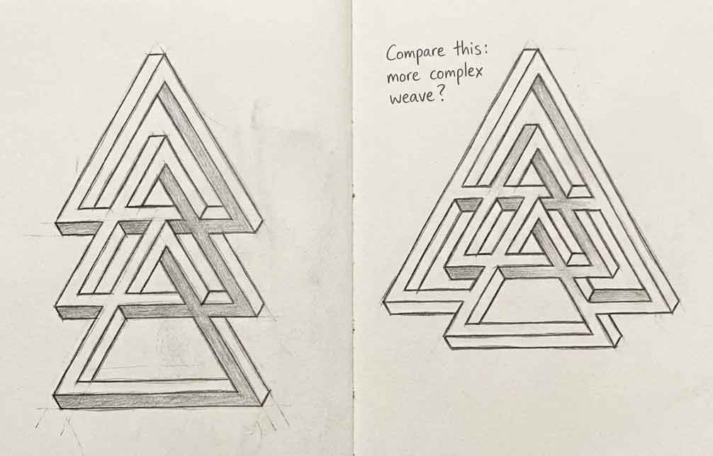
One of my finest sculptures: nested triangles, the central one in wood, the others in stainless steel…

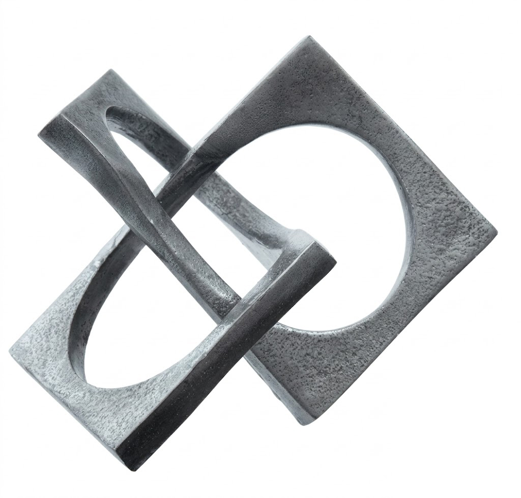
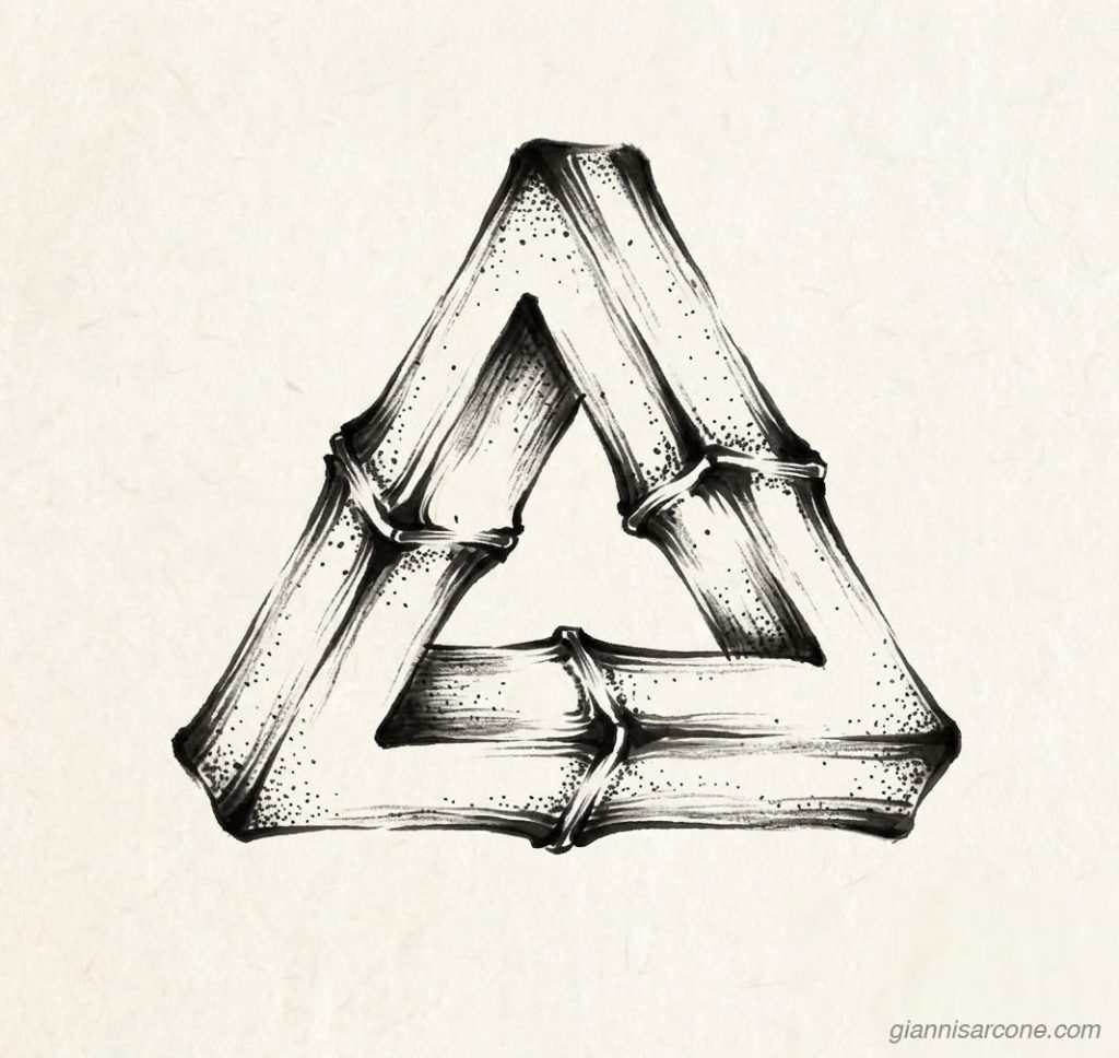
Just kidding. It’s an impossible tribar composition — a sculpture that can exist only in the eye and the mind.
The Penrose triangle (or Penrose tribar) is generally credited to Roger Penrose, who, together with his father Lionel Penrose, published it in 1958 as an “impossible object.” However, the visual idea of creating paradoxical triangular forms and impossible geometries has older precedents.
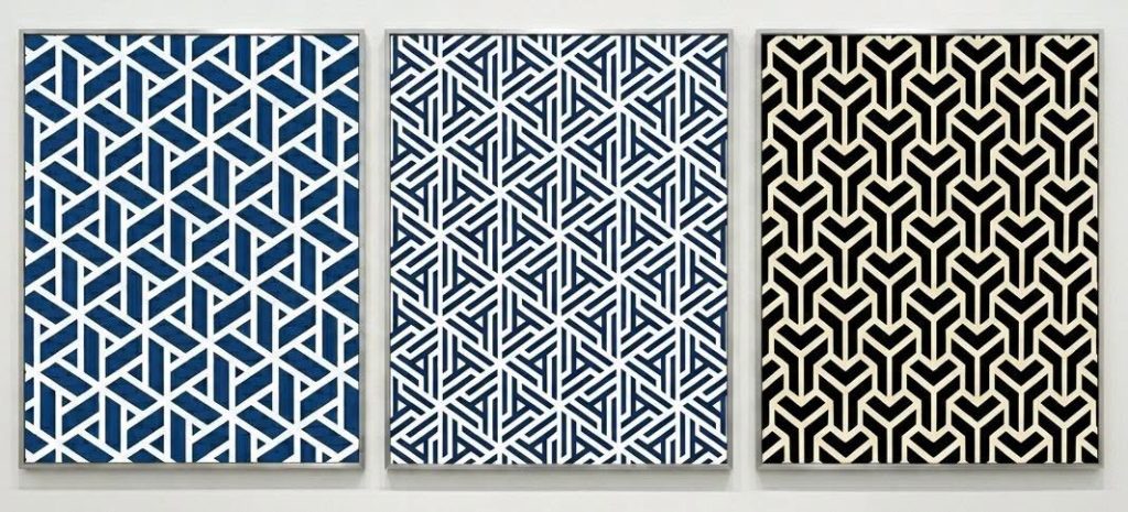
Japanese visual culture is often mentioned in discussions of geometric illusion because Edo-period (1603–1868) art, decorative motifs, and craft traditions reveal a deep fascination with complex patterns, ambiguous spaces, and unconventional perspectives. Elements found in traditions such as sankaku mokkō (triangular motifs), karakusa patterns, architectural ornamentation, and woodworking designs show how Japanese artists and craftsmen explored visual structures that challenge perception. While no confirmed direct predecessor of the Penrose tribar has been identified in Japanese art, these examples belong to a broader historical tradition of creating forms that play with geometry and the limits of visual interpretation.
A glimpse below into traditional Japanese fabric patterns, where triangular designs reveal how interlaced geometry can create the sensation of impossible structures.