How fast do we actually see the world?

Our visual system does not work like a camera shooting at a fixed number of frames per second. There is no single human “FPS.”

Reality is continuous, but our brain processes visual information on different time scales. Some visual mechanisms are remarkably fast; others are much slower. What we perceive depends on what we are looking at, the stimulus, its brightness and contrast, and even where it falls on the retina.

Flicker is a good example.

When a light flickers fast enough, we stop seeing individual flashes and perceive a steady light. But there is no universal cutoff such as 30 or 60 FPS. Under some conditions, humans can detect flicker well above 60 Hz, and the threshold changes with luminance, contrast, stimulus size, retinal location, and other factors.

And detecting a very brief visual event does not mean that we see at 250 FPS. Temporal resolution is not a single number. Different visual tasks have different limits.

Then there is the famous wagon-wheel illusion.

A spinning wheel can appear to slow down, stop, or even rotate backward. In films, this is a straightforward consequence of the camera sampling the motion at discrete intervals. Interestingly, similar effects can also occur under continuous illumination, suggesting that temporal sampling or aliasing may also occur within the visual system itself. The exact mechanism, however, is more complicated than simply saying that the brain “takes snapshots.”

And what about the feeling that time slows down during danger?

It can certainly feel that way. But experiments have found no evidence that frightening situations suddenly increase our temporal resolution—as if the brain switched to a higher frame rate. Instead, the experience seems to involve changes in attention, memory, and the way the event is reconstructed afterward.

So forget the idea that your brain runs at 30, 60, or 250 FPS.

There is no single frame rate for human vision.

We don’t simply record reality.

We construct our experience of it.
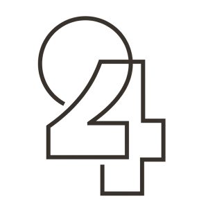
How minimal can a drawing be?

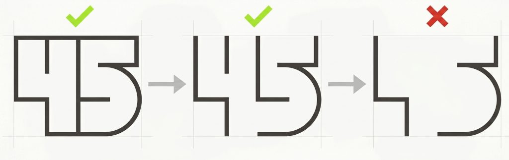
How far can you strip away a design and still leave it readable? Take almost everything out, and your brain will still fight to make sense of what’s left.

Here are two experiments in pushing that boundary:

  • 24 Configuration: The curve of the 2 flows straight into the diagonal of the 4. The brain uses the Gestalt principle of closure—filling in the missing pieces so you see two distinct digits sharing a single outline.
  • 45 Configuration: Standard typography is stripped back to raw vertical and horizontal lines. The crossbar of the 4 turns directly into the top curve of the 5, relying on your memory of numbers to decode the abstract shape instantly.

When you remove the noise, viewing becomes interactive. You aren’t just looking at a drawing—your mind is actively completing it.

👉 For more patterns, and mathematical curiosities, explore these number facts.

Lions, Elephants, and the Medieval Imagination

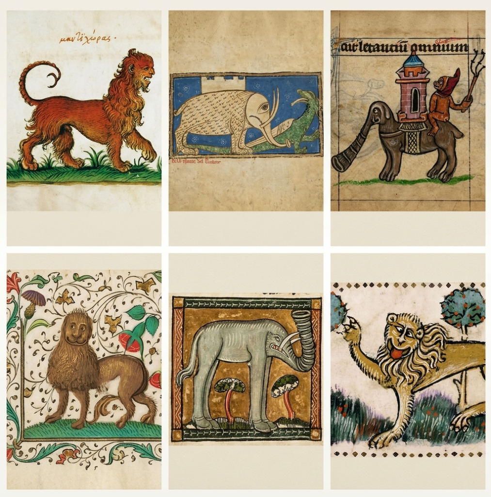
Lions had already appeared in Roman arenas, where they were set loose to devour Christians. Hannibal famously dragged elephants across the Alps. Yet, strangely enough, very few artists left us reliable images of these exotic beasts from the time.

So, centuries later, European artists faced a minor problem: how do you draw an animal you have never seen?

Simple. You copy someone who also never saw it.

This was the medieval version of the telephone game. A lion might be described in a manuscript, copied from an older drawing, or reported by a traveler as “a huge cat with a mane.” Each artist then copied, misunderstood, embellished, and passed the result on. After enough generations, the lion could acquire a human face, bizarre feet, and the general appearance of a creature that had escaped from someone’s nightmare.

The same problem survived well into the Renaissance. Take Albrecht Dürer’s famous 1515 rhinoceros. Dürer had never seen a rhinoceros. He worked from a written description and a sketch made after a real Indian rhino arrived in Portugal. He added armor-like plates that the animal did not actually have.Yet his rhinoceros became so influential that Europeans kept copying Dürer’s imaginary details for centuries.

There is something wonderfully philosophical about this: we rarely inherit reality itself. We inherit other people’s descriptions of it—and then confidently mistake the copies for the truth.

Details and Attributions for Each Picture

Top Row (Left to Right)

1. Top-Left (Manticore / μαντιχώρας)
Author / Artist: Unknown Medieval/Renaissance Illuminator (Greek manuscript tradition)
Date: Unknown (c. 16th Century / Early Modern Era)
Source / Context: Greek bestiary depicting the legendary Manticore with a lion’s body, human head, and scorpion-like tail.

2. Top-Middle (Elephant and Dragon / “De La Nature Del Olifaunt”)
Author / Artist: Unknown French Illuminator
Date: Unknown (c. 13th–14th Century)
Source / Context: Old French bestiary manuscript (Bestiaire) detailing the natural history and allegorical nature of the elephant and its rival, the dragon.

3. Top-Right (Monkey Riding an Elephant / Text: “aut letanias omnium”)
Author / Artist: Unknown Medieval Illuminator
Date: Unknown (c. 13th–14th Century)
Source / Context: Medieval manuscript marginalia / Book of Hours depicting a caped monkey riding a castle-bearing elephant (Howdah).

Bottom Row (Left to Right)

4. Bottom-Left (Smiling Lion in Floral Border)
Author / Artist: Unknown European Illuminator / Miniature Artist
Date: Unknown (c. 15th Century)
Source / Context: Illuminated manuscript page with ornate floral acanthus border work showing a stylized lion.

5. Bottom-Middle (Trumpet-Trunked Elephant with Trees in Framed Border)
Author / Artist: Unknown English or Northern European Illuminator
Date: Unknown (c. 13th Century)
Source / Context: Latin Bestiary miniature showing a stylized medieval elephant with trumpet-like trunk and tusks.

6. Bottom-Right (Paw-Raising Lion under Fruit Trees)
Author / Artist: Unknown Medieval Illuminator
Date: Unknown (c. 13th–14th Century)
Source / Context: Medieval Bestiary illustration depicting a lion gesturing toward fruit trees.

Authors Write Books. Publishers Rename Them

Many people believe that a book’s title is born directly from the author’s brilliant mind. Cute idea… but often completely wrong.

In reality, titles are frequently chosen by publishers — and, above all, by their marketing teams, who sometimes treat a book title like a product label rather than a piece of literature.

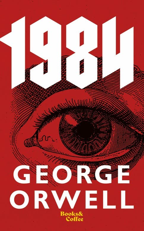
Take one of the most famous titles of the 20th century: 1984 by George Orwell, the great English political writer. When Orwell wrote the novel in 1948, its working title was The Last Man in Europe. His publisher found it a little too gloomy and uninspiring, suggested reversing the last two digits of the current year, and voilà: 1984 was born.

Not a bad decision. That “commercial” title went on to become a cultural landmark, and many ideas and expressions from the book are still part of today’s political vocabulary.

1984

As an author, I’ve often had to fight battles to prevent publishers from giving my books painfully dull — or downright silly — titles. One of my books, for example, was given the wonderfully imaginative title Optical Illusions by the publisher. A title so original it could probably hide in a crowd of a thousand other books.

And yet… this “masterpiece of originality” went on to win the Royal Society Young People’s Book Prize for the best science book for children.

Yes, yes. Sometimes even a boring title can carry a surprising little trick inside.

The Deceptive Oriental Fan

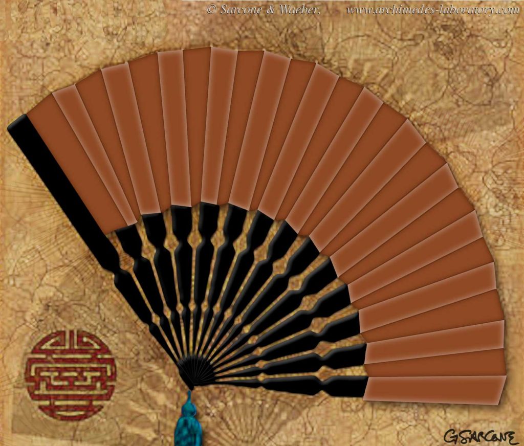
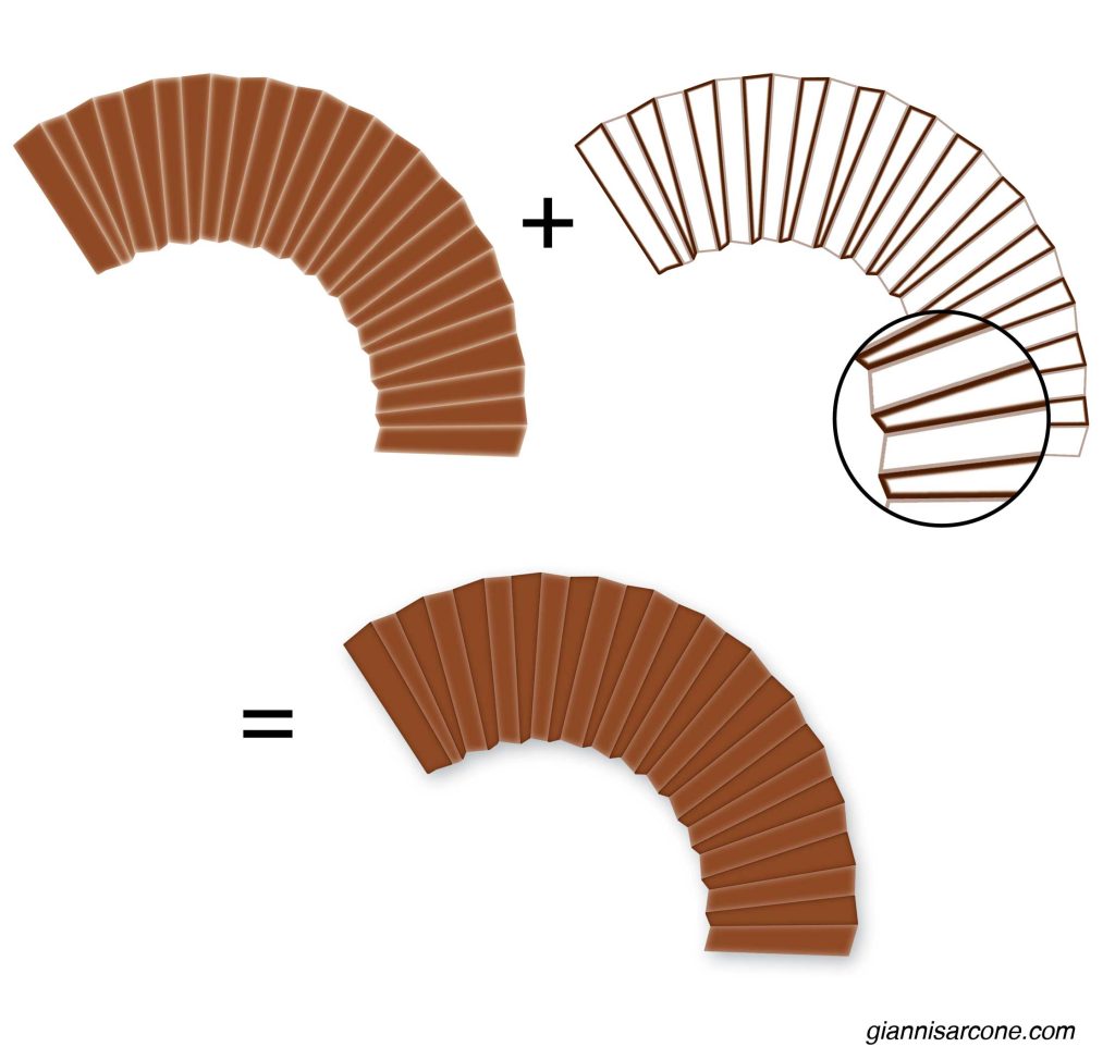
One of my earliest color illusions, created back in the 1990s, when I was immersed in exploring the physiology of color perception.

Do the pleated sections of the fan really have two different shades of brown?

They don’t. Every pleated “accordion” section is exactly the same brown. Only the thin light and dark bands bordering each fold differ. Those subtle edge contrasts trick your visual system into seeing alternating tones where none exist.

The color is perfectly uniform, but your brain interprets it differently depending on the surrounding contrast—a classic example of simultaneous brightness contrast.

Triple Klein Bottle

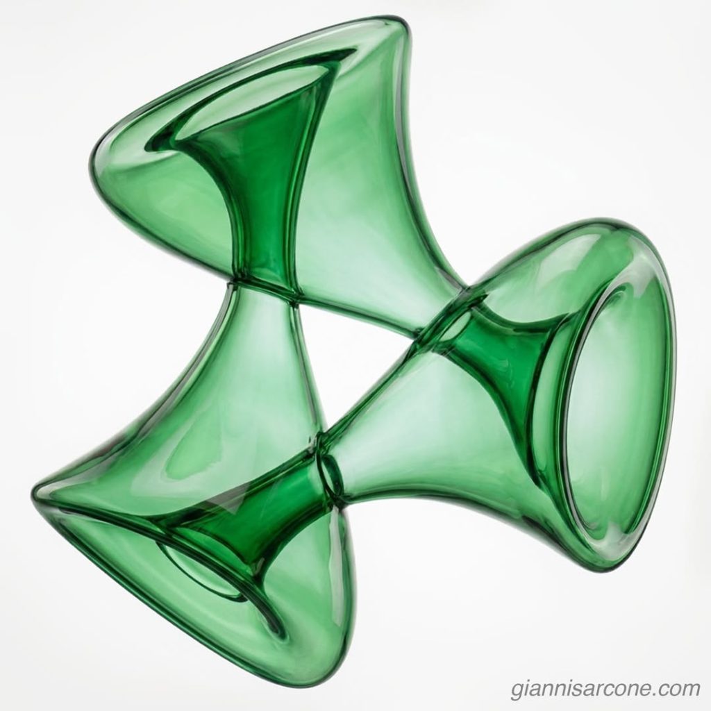
Τριαλάβαστρον (Trialábastron), a triple Klein bottle, is an artistic exploration of Klein bottle geometry. In topology, the Klein bottle is a non-orientable surface that cannot be embedded in three-dimensional Euclidean space without self-intersection, though it can be smoothly realized in four dimensions.

A close relative is the Möbius strip, another non-orientable surface in three-dimensional space. On such surfaces, a continuous path can return to its origin with reversed orientation, revealing how geometry can twist the notion of inside and outside.

a triple Klein bottle

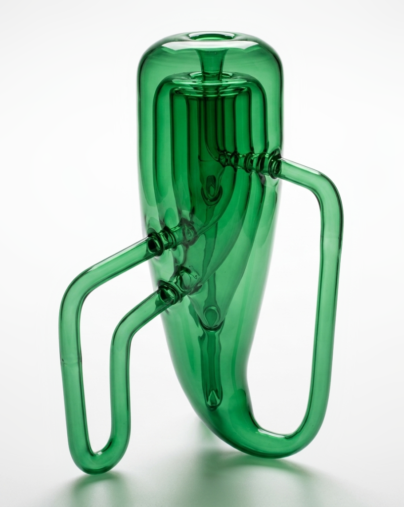
Here is another representation of a triple Klein bottle—UK sculptor Alan Bennett’s striking construction of three Klein bottles nested within one another. Of course, “inside” only applies in the sense of their embedding in physical space; from a topological standpoint, they remain entirely separate, non-interacting surfaces.

recursive Klein bottle

Why W Is Called “Double-U”

The letter W ultimately derives from the letter V, but its history is more layered than a simple invention after the Norman Conquest.

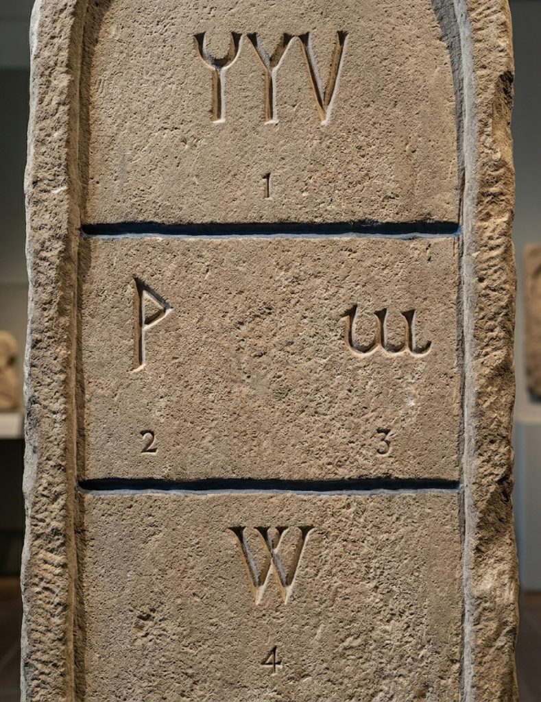
In classical Latin, inherited from the Greek and Phoenician alphabet traditions (Fig 1), the letter V served a dual function: it represented both the vowel /u/ and the consonantal sound /v/. There was no distinct symbol for /w/. In contrast, Old English (Anglo-Saxon) already had a need for this sound and used a separate rune, “wynn” (ƿ, Fig. 2), to represent it.

After the Norman Conquest of England in 1066, scribal practices shifted toward continental Latin conventions. The rune wynn gradually fell out of use, and scribes began representing the /w/ sound by writing a doubled form of U (or V, since the two were not yet fully distinguished, Figs. 3-4). This “double u” convention eventually evolved graphically: two V-shaped characters were written side by side, then gradually joined.

From this duplication comes the modern name “double U,” which preserves the historical origin even though the visual form is closer to two V’s than two U’s. The lowercase w developed directly from this doubled form, simplifying over time into a continuous script shape.

In short, W is not a direct Roman invention, but a medieval solution: a hybrid born from Latin writing habits adapting to a sound already present in Old English.

Your Brain vs. Geometry: Rooftop illusion

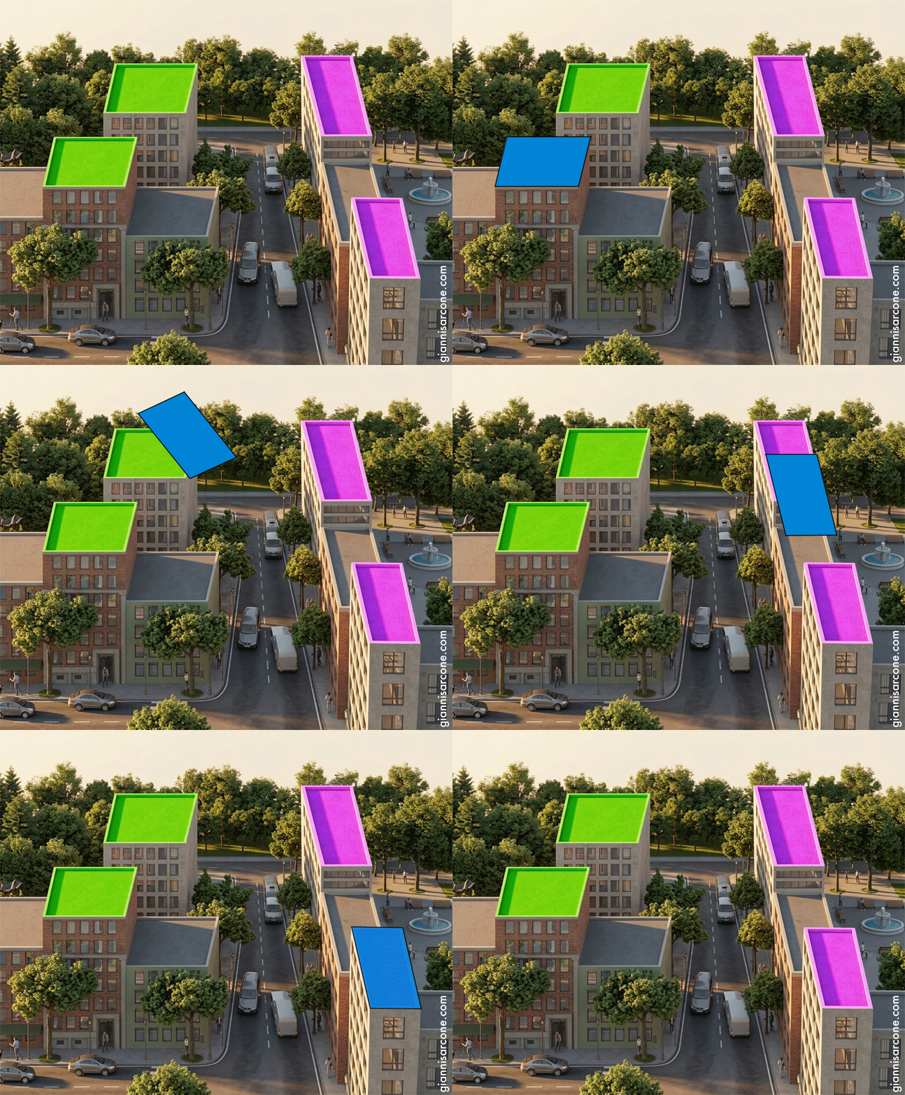
Believe it or not, the green and purple rooftops are congruent—identical in shape, size, and angles. What changes is not the geometry, but your perception of it. Perspective, orientation, and contextual cues lead your visual system to interpret the same form as two different structures.

rooftop illusion, related to shepard tables

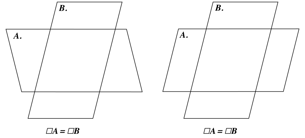
This effect is closely related to Shepard’s tabletop illusion and earlier studies in which identical parallelograms (A and B), when rotated (and superimposed), are perceived as different shapes, as the brain prioritizes interpretation over measurement.

Since some still insist these roofs are not congruent, I’ve put together a short animation that shows otherwise.

animated rooftop illusion

Bear-ly Seal

People often ask where my ideas come from. There is no single answer. They tend to surface quietly, shaped by places I’ve seen and cultures I’ve crossed.

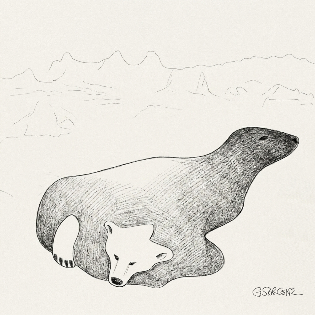
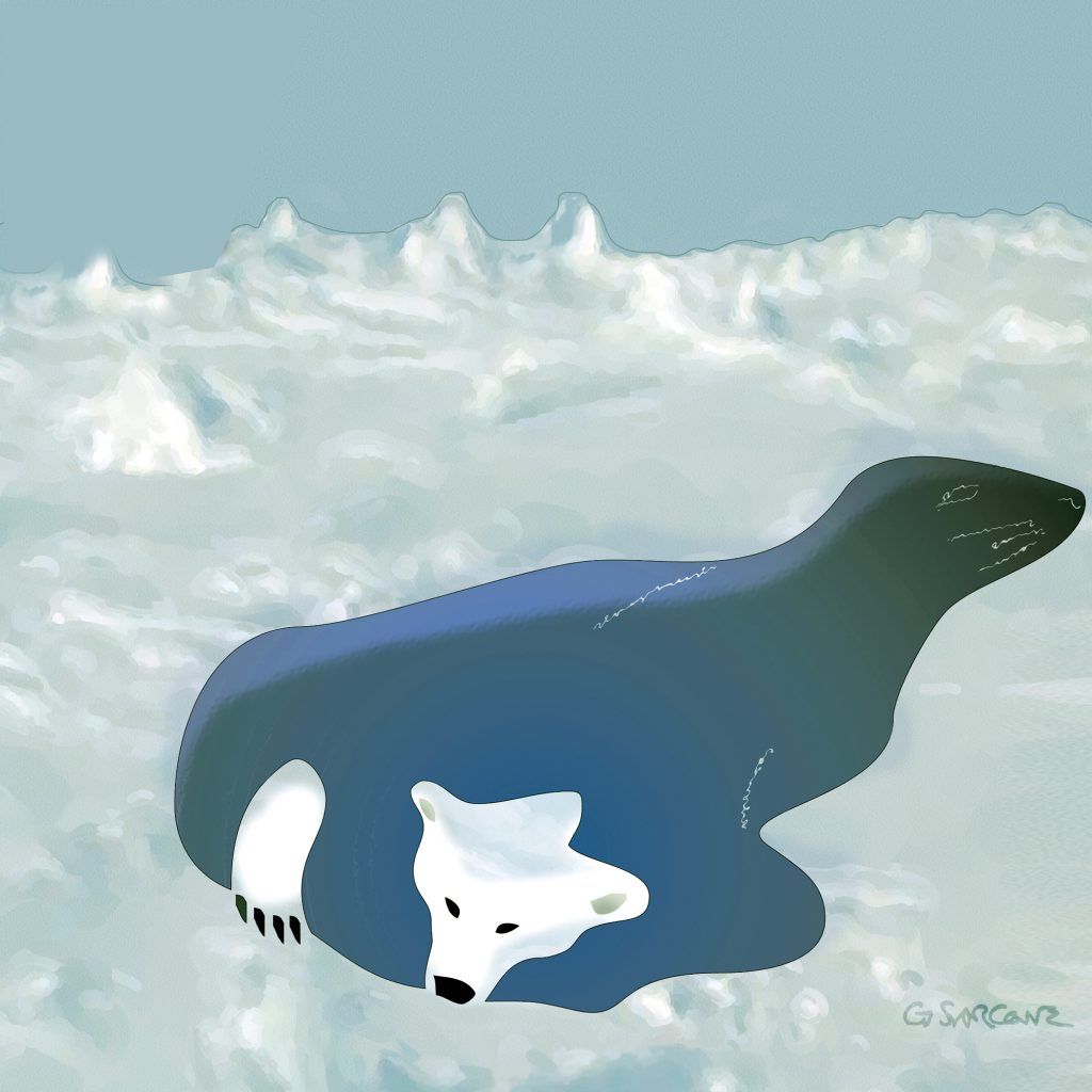
“Seal or Bear?” grew out of that kind of moment. An animal suspended in the vastness of a frozen world—emerging from an ice hole, yet refusing to settle into a single identity. Is it a polar bear? A seal? Or something that holds both readings at once?

Bear of seal?

The idea came to me while traveling through northern Canada, surrounded by the stillness of Arctic landscapes and the deep presence of Inuit traditions. That silence has a way of sharpening perception—of making ambiguity feel natural rather than puzzling.

First created in the 1990s, the illusion went on to become a reference point in visual perception studies and later found its way into textbooks.

More recently, the “Seal or Bear?” illusion will be featured by the NHK Educational Corporation as part of a 2026–2027 educational series on psychology and visual perception.