Sonne au comble de l'or
l'azur du jeune hiver
– Paul Valéry
For me, blue is air, wind, melancholy. It is like a Fellini film—always haunted by the whisper of the wind, the scent of things, and the fleeting moments of time we wish we could hold in an eternal present. Blue can carry regret; it is, in a way, a conservative principle. Blue has always held a strange duality: so immediate, yet once so elusive. Looking back to antiquity, it fascinates me that Homer never described the sea as blue, but as ‘wine-dark.’ In Greek, kyaneos evoked a dark, mineral depth, while glaukos hovered between gray, green, and blue. The Romans spoke of caeruleus, tied to the sky (caelum), and of lividus, the bruised, bluish tone of flesh. They never elevated blue; it was the color of outsiders, the hue of Celts painted in woad. Only the Egyptians seemed to truly revere it. They invented Egyptian blue, the first artificial pigment, and made it the shade of eternity and the divine.
In the Middle Ages, blue nearly vanished from prominence. Christian art turned to red, white, and black, leaving blue to the margins. Yet the word itself was evolving. The Germanic blāo—and its Vulgar Latin adoption, blavus—once meant something far less precise: shimmering, lustrous, dark, gray, even pale or yellowish. That ambiguity makes me realize how fluid color once was, before language fixed its boundaries. From blāo we inherited English blue and French bleu. Meanwhile, through Arabic lazaward came the words azure, azzurro, and azul, all born from lapis lazuli.
Then, in the 12th century, blue was transformed. Artists began clothing the Virgin Mary in ultramarine, ground from lapis lazuli more costly than gold. What had been humble became heavenly. Heraldry embraced azure as one of its noble tinctures, and kings like Louis IX made blue their emblem. A forgotten hue became a sacred, regal presence.
By the Renaissance, ultramarine shone as a color of prestige, truth, and constancy. Painters reserved it for the highest subjects, poets linked it to loyalty, and explorers carried its name across the seas as azul. Blue had finally claimed its place.
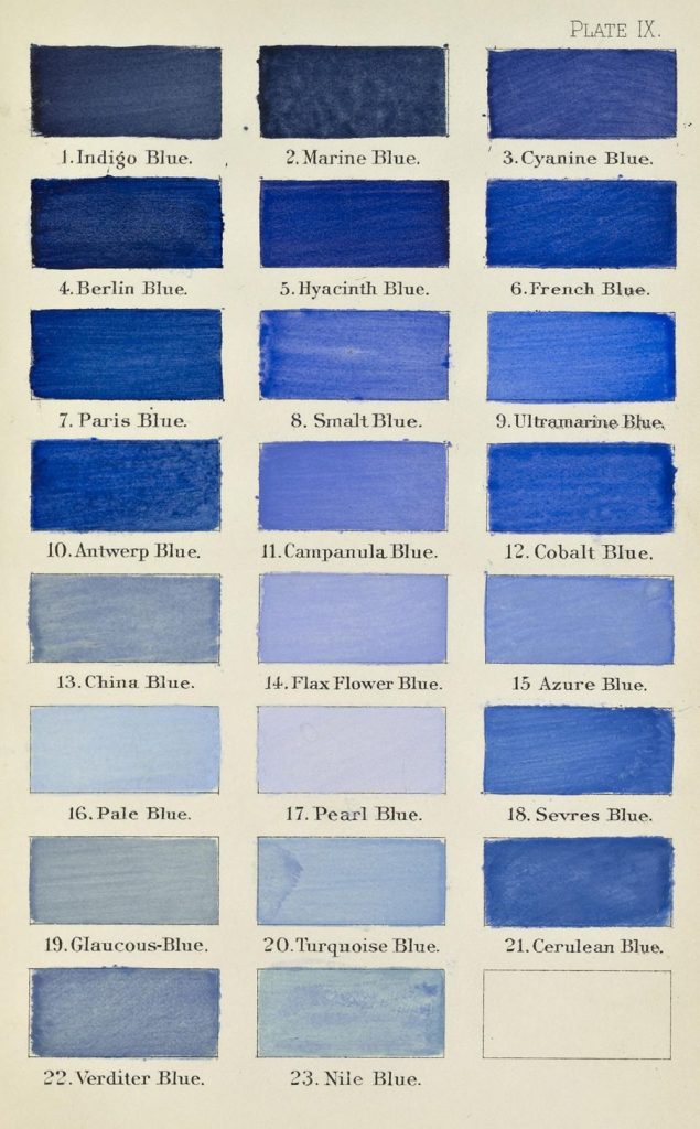
The modern era democratized it. Prussian blue appeared in 1704, followed by cobalt, cerulean, and synthetic ultramarine. Blue poured into uniforms, flags, and revolutions; it became the shade of liberty, of nations, of collective identity. Goethe called it spiritual, a color that retreats yet draws the soul inward.
In the 20th century, painters gave blue an entirely new destiny. The Expressionists used blue to conjure emotion, depth, and inner turbulence—think of Kandinsky, who saw blue as moving ‘toward the infinite,’ or Franz Marc, who painted blue animals to symbolize spirituality and hope. Even Van Gogh’s Starry Night swirls with blue, capturing both wonder and melancholy. Later, Picasso entered his Blue Period, transmuting sorrow into tone. Yves Klein went further still, reducing blue to its purest intensity with his International Klein Blue, turning it into an immaterial field of experience. For Klein, blue was not simply a color but ‘the most abstract color of all,’ a space in which one could lose oneself.
Today, I see blue everywhere. In the jeans that became the fabric of daily life. In corporate logos designed to inspire trust. In flags that mark belonging. Blue is calm, yet melancholy; humble, yet exalted. Once overlooked, it is now the world’s favorite color.
Blue is more than a hue. It is an idea shaped across centuries—etymologically born of caelum, blāo, and blavus; symbolically stretched between heaven and earth; culturally tied to faith, power, and identity. Its story mirrors our own: restless, mutable, and ever searching for meaning.
I’ll end with a little story from my own family. After World War II, my paternal grandfather, a house painter, bought a massive surplus of blue paint from the military. He had so much of it that whenever a client asked how he planned to paint their home, his answer was always the same, year after year: “All in blue, yes, all in blue…” (in our dialect, tutt’azzurr, tutt’azzurr).
That simple phrase stuck. Before long, the whole village started calling our family the Tuttazzurr family, and I myself became known as Giuan Tuttazzurr. Blue marked our home, but also my identity and my story—etched in memory and in name.