Illusive Pietà

Uncovering the subtle visual tricks Michelangelo wove into his masterpiece.

We’re not very good at judging the true size and positioning of objects just by looking. Take Michelangelo’s Pietà—it hides some subtle, conceptual “illusions”:

  • If they were standing, the Virgin Mary would actually be much taller than Christ, which may be surprising.
  • Her knees are slightly off-center, forming a kind of base or pedestal that supports Christ’s body.
  • And while logically the Virgin should look older, her face is almost childlike, creating a striking contrast with the mature, somber face of her son.

Michelangelo himself explained this choice:
“The mother had to be young—young enough to appear forever a virgin. Meanwhile, her son, who took on our human nature, must, in the stripping away of death, be a man like any other.”

Art is full of illusions designed to meet the visual expectations of viewers—and sometimes to correct what might seem off or unnatural to the eye. Because reality, at times, doesn’t always feel quite real or right to those who look at it.

And one last curious detail: Pietà is the only work Michelangelo ever signed. Stung by whispers that another sculptor had made it, he returned one night and boldly carved his name across Mary’s sash— “MICHAELA[N]GELVS BONAROTVS FLORENT[INVS] FACIEBAT” (Michelangelo Buonarroti, the Florentine, made this). A rare flash of pride from an artist who usually let his work speak for itself.)

Pietà by Michelangelo

Smelling the Color 9: When Numbers Take Shape and Color

In English, the expression to smell the color 9 describes something completely impossible…

And yet, some people have the unusual ability to mentally visualize colors or spatial patterns when thinking about units of time—or more broadly, numbers. This phenomenon, known as synesthesia (from the Greek syn, “together”, and aisthēsis, “sensation”), occurs when stimulation of one sense involuntarily triggers sensations in another. It’s not a figure of speech—these perceptions feel very real to those who experience them.

The first documented case in medical literature appeared in 1710. Dr. John Thomas Woolhouse (1650–1734), an ophthalmologist to King James II of England, reported a blind young man who claimed he could perceive colors induced by sounds.

Neuroscientist Vilayanur S. Ramachandran and his team at the University of California, San Diego, observed that the most common form of synesthesia links “graphemes“—letters or numbers—to specific colors. Since my work bridges art and mathematics, I’ll focus here on number-based synesthesia.

People who experience synesthesia in its pure form are relatively few. However, many report strikingly similar associations between numbers and colors or spatial layouts, suggesting these perceptions aren’t just products of imagination or attention-seeking. For example, number–form synesthesia may result from cross-activation between brain regions in the parietal lobe that handle numerical and spatial processing. In contrast, number–color synesthesia likely stems from an overabundance of connections between adjacent areas that interfere with each other when triggered (see fig. 1 below).

brain synesthesia

Figures 2 and 3 illustrate common synesthetic patterns—either as color associations (fig. 2) or spatial arrangements (fig. 3, based on observations by Sir Francis Galton). Statistically, people often associate the digits 0 or 1—and sometimes 8 or 9—with black or white. Yellow, red, and blue are typically linked to smaller digits like 2, 3, or 4, while brown, purple, and gray tend to be tied to larger ones like 6, 7, or 8. Curiously, it’s not the idea of the number but the visual form of the digit that seems to trigger the sensation. For instance, when the number 5 is shown as the Roman numeral V, many synesthetes report no color at all.

color number synesthesia

And you—do you see numbers in color or arranged in space? Feel free to share your synesthetic experiences with me.

Julio Le Parc – Nihil novi sub sole…

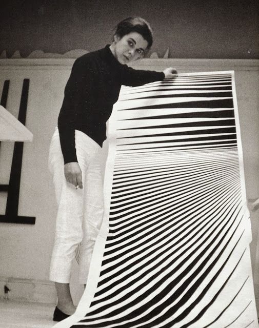
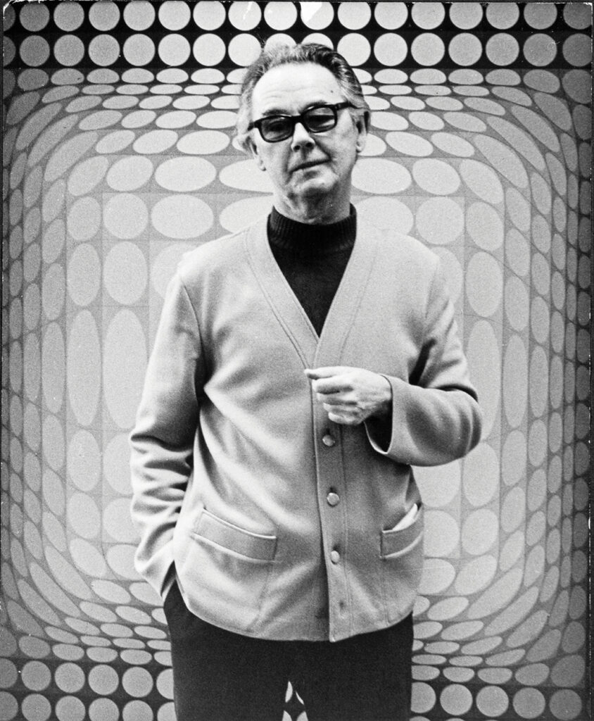
Although I’ve been working in the field of Op Art since the mid-1980s, it’s important to recognize that the movement itself has a deeper history. It began to take shape in the 1960s, led by pioneering figures such as Victor Vasarely and Bridget Riley.

However, the artists who truly captivate me—the ones who expanded the language of perception—are often the outsiders. One such figure is Julio Le Parc (b. September 23, 1928), an Argentine-born artist whose practice bridges Op Art and kinetic art. Le Parc studied at the School of Fine Arts in Argentina and went on to co-found the Groupe de Recherche d’Art Visuel (GRAV). His work, honored with numerous awards, holds a prominent place in Latin American modernism.

Le Parc’s recurring themes—color, light, and movement—have always resonated with me. During the ’60s and ’70s, he explored light not just as a visual element but as a living, dynamic material. Yet by the late ’70s, his presence in the art world had faded; his output became sporadic, and for decades his work slipped quietly out of the international spotlight.

 Fortunately, recent years have witnessed a renewed appreciation of his explorations in light and movement, bringing his contributions once again to the attention of a wider public.

Artist’s Website: http://www.julioleparc.org

Book: Catalog of the artist’s first solo exhibition, Paris, November–December 1966. Text in French by Frank Popper.

Misdirection → Illusion → Aha! Moment…

How misdirection, illusion, and wonder shape my creative process.

The path from misdirection to revelation is at the heart of how illusion and wonder spark insight. Misdirection steers our attention—often subtly—away from what truly matters. It disrupts our expectations, creating a gap between what we see and what is. Within that gap lies the illusion: a crafted discrepancy, a visual or cognitive sleight-of-hand that unsettles our perception.

But the magic doesn’t end there. When the illusion is cracked—when the mind shifts, recalibrates, and sees—the famous Aha! moment erupts. That flash of understanding isn’t just delightful; it’s deeply educational. It rewires how we interpret the world.

This sequence—misdirection, illusion, revelation—mirrors the creative process itself. It shows how confusion, when carefully designed, can be a gateway to clarity. In the right hands, illusion is not deception—it’s a tool to awaken curiosity, stretch perception, and provoke insight. Wonder, in this sense, becomes a powerful cognitive catalyst.

That’s why my art and, I believe, my writing, revolve around this sense of wonder—arguably the most direct and playful route to that pleasurable, often conflicting moment of insight: the sudden discovery of something previously unknown.

Hands-On Wonders: A Mathemagical Collection

Ever wondered what happens when math puts on a magician’s hat? These books are the distilled magic of my hands-on math workshops across Europe — from Paris to Palermo, Geneva to Ghent — where paper folded, minds twisted, and logic sparkled in English, French, and Italian!

Impossible Folding Puzzles

1) “Impossible Folding Puzzles and Other Mathematical Paradoxes” — a playful dive into mind-bending problems where nothing is quite what it seems. Can a puzzle have no solution… or too many? Dare to fold your brain.

Still available on Amazon.

2) “Pliages, découpages et magie : Manuel de prestidi-géométrie” — where math meets illusion to spark curiosity and creativity.
Perfect for teachers, students, and curious minds: touch, fold, cut… and let the magic unfold!
Available on Amazon.

2) “Pliages, découpages et magie : Manuel de prestidi-géométrie” — un livre où maths et illusion se rencontrent pour éveiller curiosité et créativité.
Pour enseignants, élèves et esprits joueurs : touchez, pliez, découpez… la magie opère!
Dispo sur Amazon.

Pliage decoupages

3) “MateMagica” —  They say there’s enough carbon in the human body to make 900 pencils… but just one is all you need for these clever puzzles!
Fun, surprising, and thought-provoking — because, as Martin Gardner put it, “Mathematics is just the solution of a puzzle.”
Now on Amazon.

3) “MateMagica” —  Si dice che nel corpo umano ci sia abbastanza carbonio per 900 matite… ma per questi rompicapi ne basta una!
Sorprendenti, divertenti e stimolanti — perché, come diceva Martin Gardner, “la matematica è nient’altro che la soluzione di un rompicapo.”
Disponibile su Amazon.

I write and illustrate my own books in five languages: English, French, Italian, German, and Spanish.
If you’re a publisher or literary agent seeking original, high-quality educational content that blends creativity with clarity, I’d be pleased to explore potential collaborations.

Umbrella Illusion

One of my illusions from the late ’90s. Take a look at the colorful umbrellas in Figures A and B of the table below—are they the same or different? About 80% of people will say that Umbrella A has jagged, zigzag edges, while Umbrella B has a smooth, wavy outline. But here’s the trick—you’ve been fooled by the brightness contrast of the rays inside the umbrellas. In reality, both umbrellas are identical in shape, perfectly congruent.

This illusion works even when only the lines of the shapes are emphasized. As demonstrated in the table below, the outline of Umbrella A appears jagged and zigzagged, while Umbrella B seems to have, once again, a smooth, wavy outline.

This illusion shows a phenomenon called curvature blindness, which was rediscovered in 2017 by Japanese psychologist Kohske Takahashi. He created a powerful variant and studied its impact on how we perceive shapes.

Read more

The Illusion of Color in Astrophysics


Study on Colors in Astrophysics – Ongoing Research

Under specific atmospheric conditions and with the technological tools employed, stars or planets may appear to emit green or blue light to some observers. However, as illustrated in the accompanying diagram, this is often nothing more than an optical illusion. The blue region seen in the diagram is actually a medium gray, entirely desaturated. You can verify this by using Photoshop’s color picker tool (or an analogous method) to check the true color values.

This phenomenon raises interesting questions about how color perception in astrophysics can be influenced by both atmospheric effects and the limitations of observational tools. How much of what we “see” in the cosmos is truly the color of the objects themselves, and how much is a product of the interaction between light, our atmosphere, and the instruments we use to detect it?

The Architecture of Light

Colors, though fundamentally phenomena of light, are not merely superficial aspects of perception. They play a structural role in organizing visual elements. For example, applying contrasting colors to a series of repetitive graphic patterns—while varying their distribution—can dramatically alter how they are perceived. This demonstrates how color is not just an embellishment but an active force in shaping visual reality.


As Goethe put it, “Colors are the deeds and sufferings of light.” More than a sensory experience, they influence our perception of space, depth, and meaning, revealing the intricate dialogue between vision and cognition.

🔍 Explore more about the illusion of colors.

Puzzling Colors: Red Between the Lines

Colors are not as fixed as they seem. The red you see might not be the same red someone else perceives. Your brain constantly interprets colors based on their surroundings, which can lead to surprising illusions.

Take this experiment inspired by the Munker-White effect: all the gray bars in the striped patterns are actually the same shade. Yet, next to blue lines, they appear bluish; beside mixed colors, they seem to shift tones. This is known as color assimilation—where a color takes on the influence of its neighbors.

The same illusion explains simultaneous brightness contrast. In the wine-pouring examples below, the liquid seems to change color in the glass. But actually, the red remains unchanged.

Here’s a simple animated variant of my project: Hard to believe, but the flow of wine stays the same shade of red all the way—from the bottle’s neck, through the pour, and even inside the glass. It’s only your perception that changes!

Even more striking—when cyan lines replace black ones, the liquid pouring from the bottle is actually gray from start to finish, yet it appears to turn into red wine in the glass. In reality, the red is just an illusion—your brain fills in the missing color where none exists.

🔴 See it for yourself! Fine art prints of my color experiments are available here:
👉 https://gianni-sarcone.pixels.com/featured/red-wine-gianni-sarcone.html

Copyright Notice: My artworks are protected. Any use must include proper credit and a link to the original source. Commercial use is strictly prohibited.

Apparition: The Face That Transforms

I’m pleased to announce that my work Apparition will be featured in the 6th volume of Taschen’s Library of Esoterica, set to release in early 2025.

This portrait, created by combining photographs of 50 different human faces, presents a ghostly image that endlessly shifts its features as you look at it. The effect is driven by the neural adaptation phenomenon, similar to Troxler fading, along with the brain’s face-recognition circuits, which complete the image.

You can explore this piece and more with prints available from my online gallery.

For a deeper dive, visit Spirit Worlds here to explore art, rituals, and myths from hidden realms.