In 1934, the Swedish artist Oscar Reutersvärd sketched a peculiar triangle made of small cubes, neatly aligned on an isometric grid. Everything looked geometrically sound—until the mind tried to assemble it in real space.
Soon after, Lionel Penrose and Roger Penrose published their famous Penrose Triangle—three beams joined by apparently right-angled joints—and M. C. Escher explored similar paradoxes in works such as Waterfall and Ascending and Descending.
This triangular paradox has distant echoes in ancient Greek geometry, but Reutersvärd gave it a clear visual form: the impossible figure.
That’s the charm of impossible figures: every part looks right, yet the whole quietly breaks reality.
I began exploring these paradoxical structures in the 1980s. My interest grew naturally from the meeting point of two inclinations: a mathematical curiosity about spatial logic and a visual fascination with form. Over time I produced many variations—sometimes rediscovering ideas that others had already touched upon, occasionally arriving at configurations that felt genuinely new. In geometry, complete novelty is rare; most discoveries emerge as unexpected turns within an existing landscape.
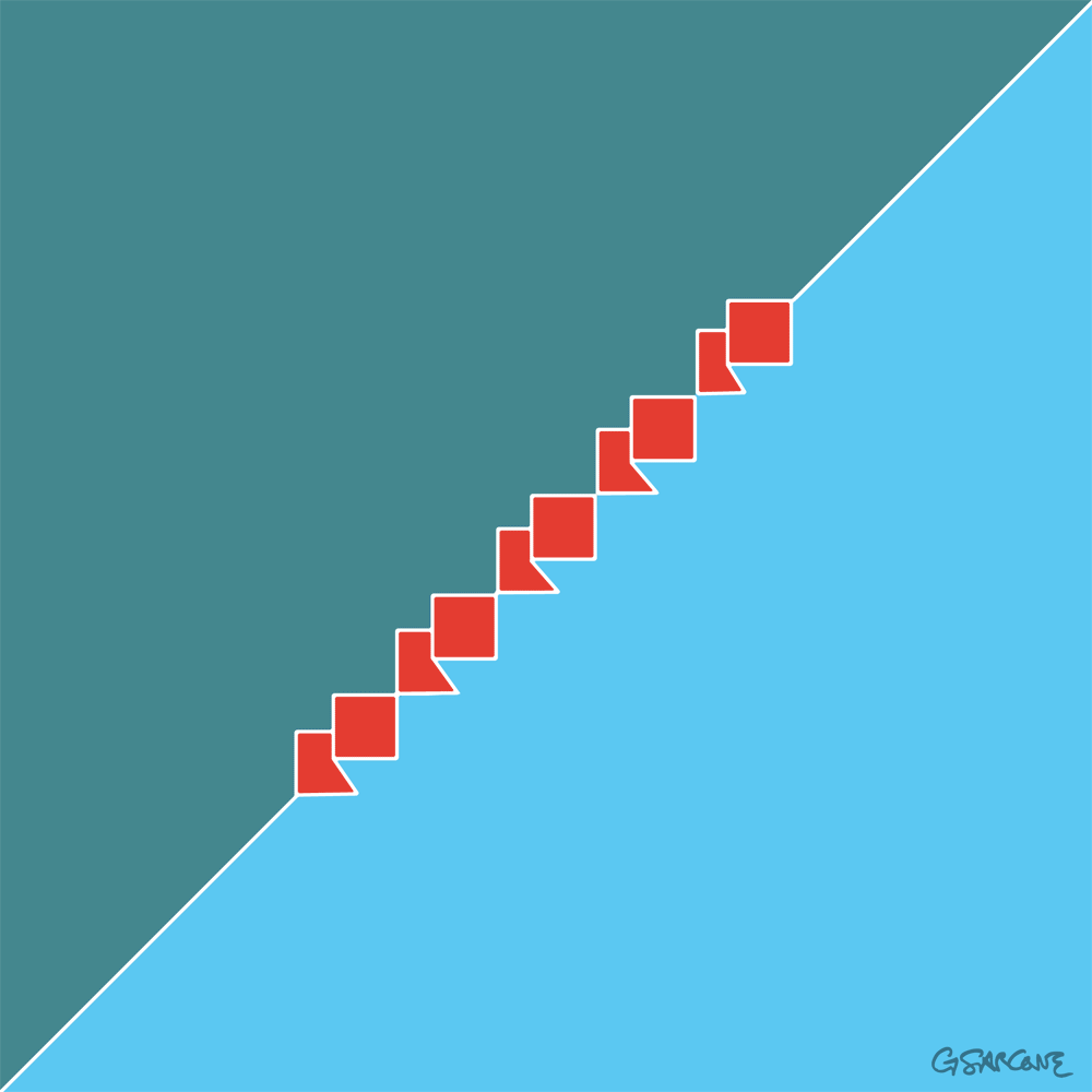
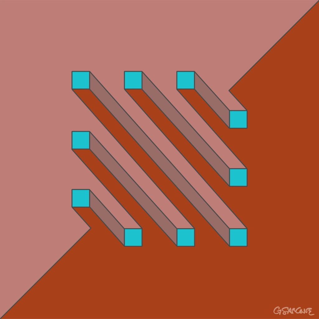
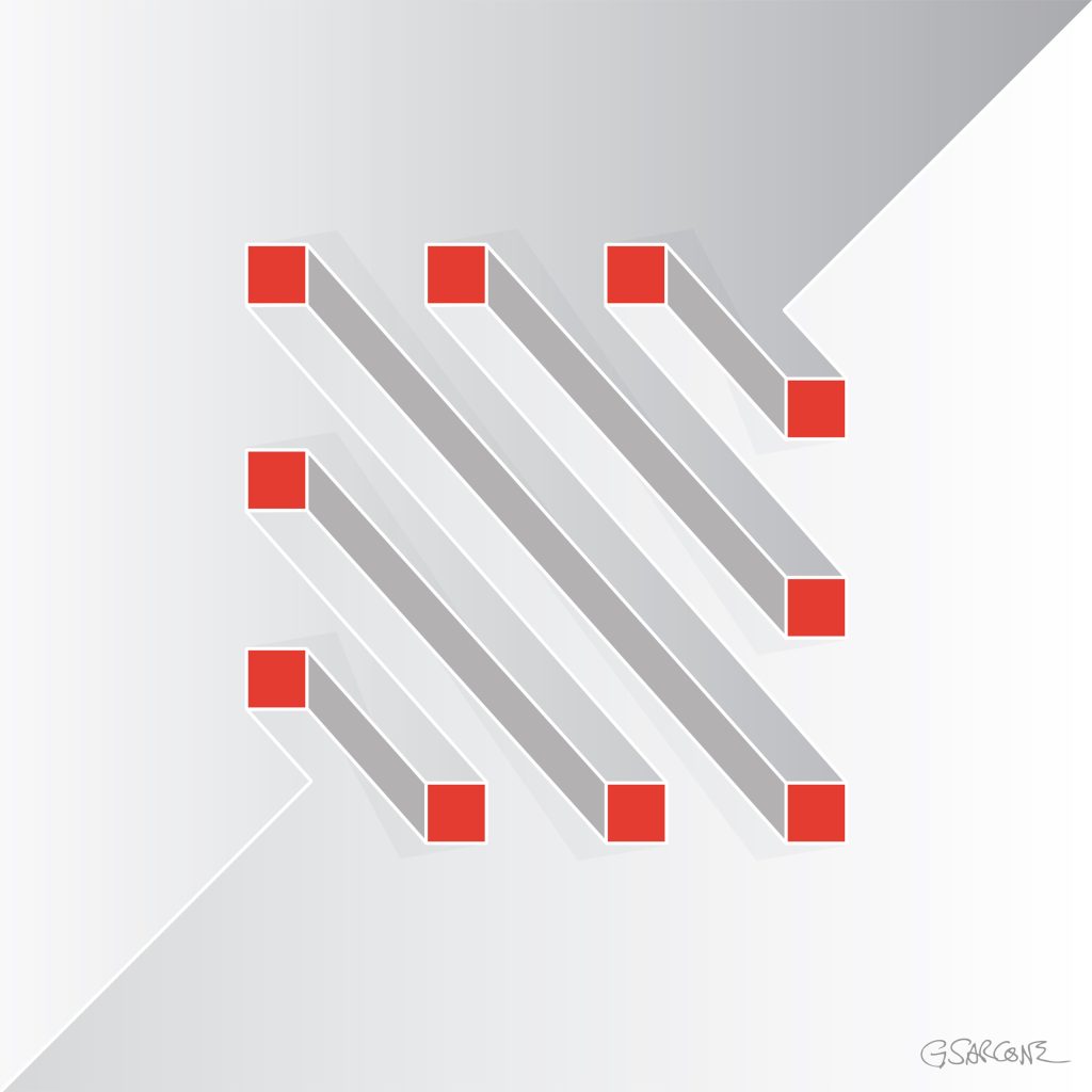
One example from that period is the study shown here, created in the late 1990s and titled Undecidable Bars.
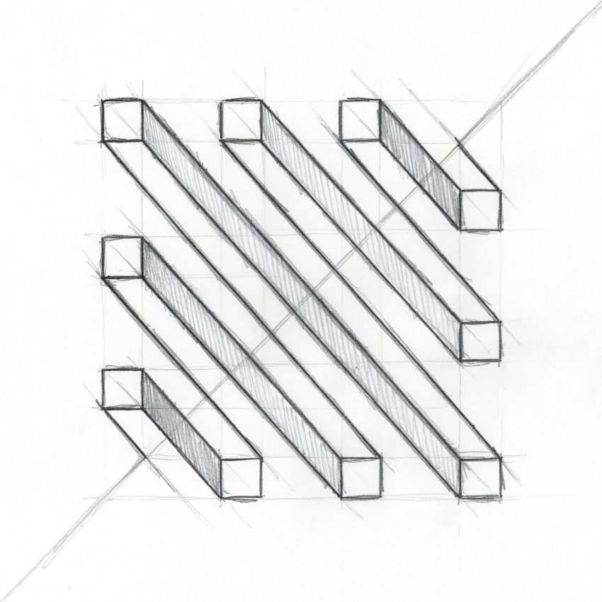
Parallel bars appear to run calmly side by side, yet their connections quietly sabotage the logic of space. Perspective slips from one segment to another, forcing the eye to accept incompatible viewpoints at the same time.
Each element seems perfectly normal.
Together, they form a structure that cannot exist.
Some bars appear to pass through others; some join where no joint should be possible. The geometry behaves as if the object were bending through space, while every line still respects the conventions of perspective drawing.
The result is an undecidable figure—a form the eye can follow effortlessly, but the mind cannot reconstruct.
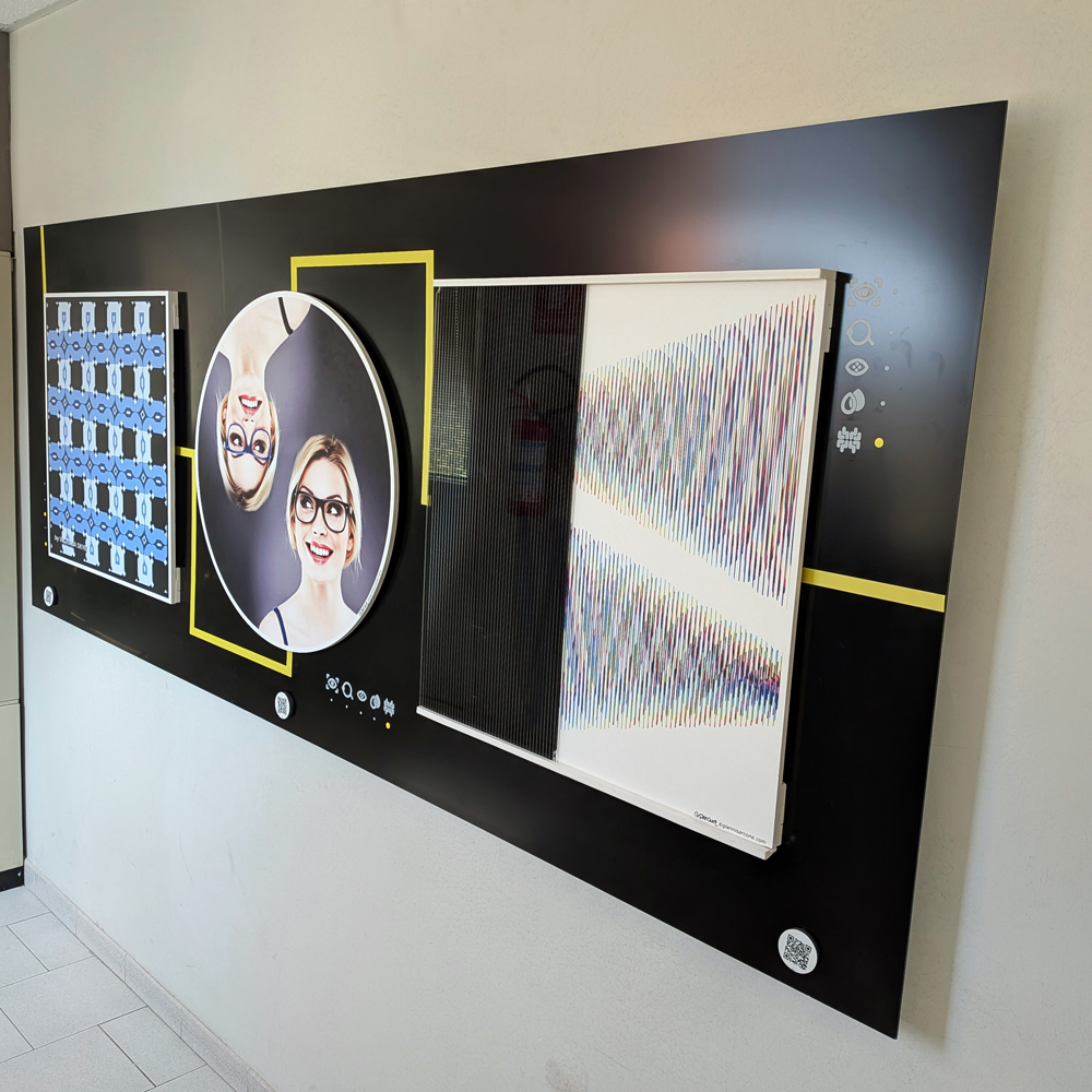
Over the years I have created hundreds of images built on similar principles, across different formats and media. If these works interest you for a book, exhibition, or monograph, feel free to contact me.
Here’s a simple 18-frame animation of my Op Art piece—work in progress.