The Cube That Lies

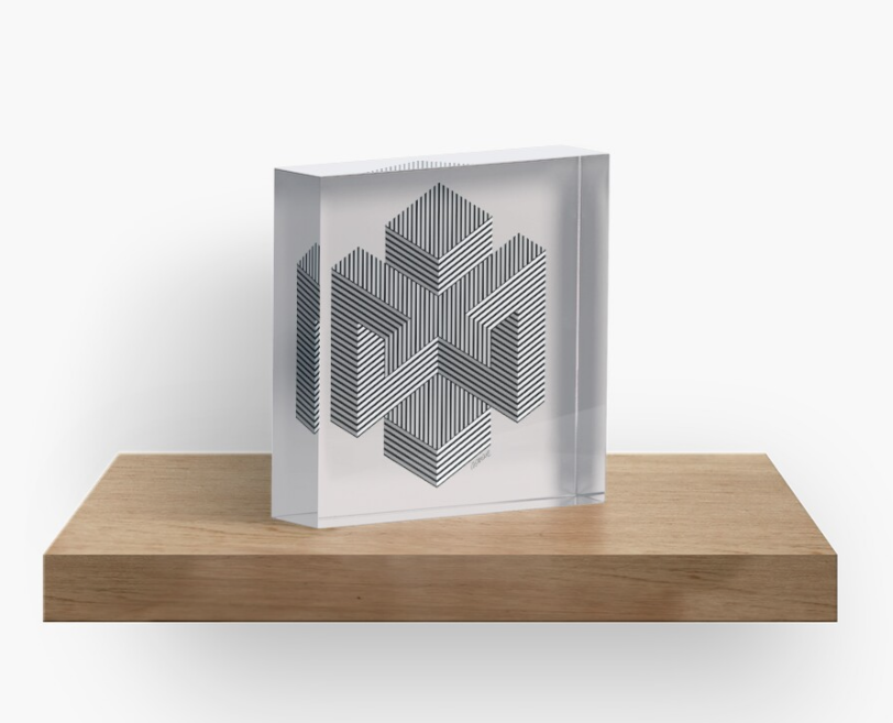
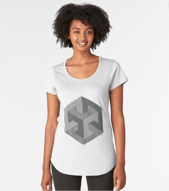
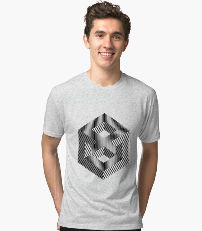
I’ve always been drawn to the architecture of geometry. The hexagon, with its quiet strength and symmetry, sits at the root of so many spatial illusions—it’s the seed of cubes, isometric grids, and 3D paradoxes. From this shape, I began exploring structures that bend logic and perception, eventually giving life to a trio of optical works: Enigma 1, Enigma 2, and Enigma 3.

enigma 1
Enigma 1Prints & T-shirts.
enigma 2
Enigma 2Prints & T-shirts.
enigma 2
Enigma 3Prints & T-shirts.

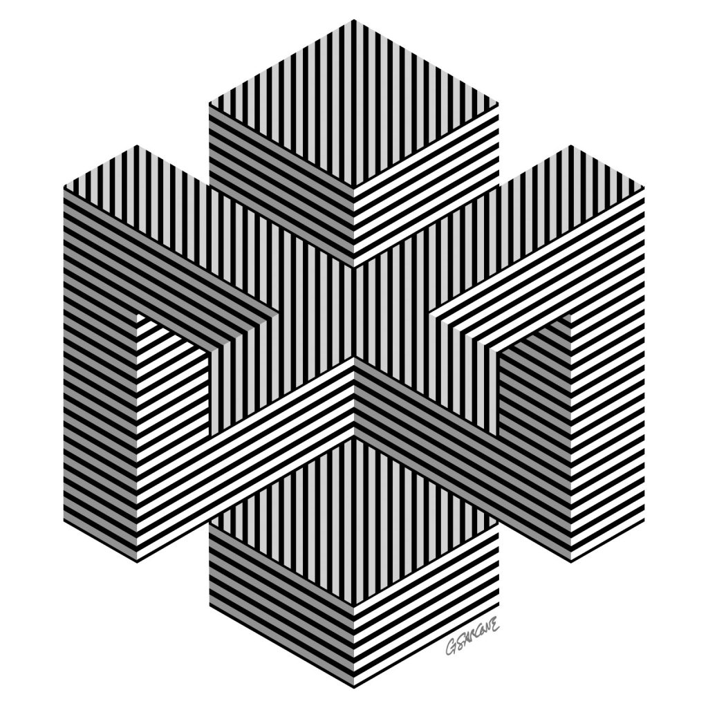
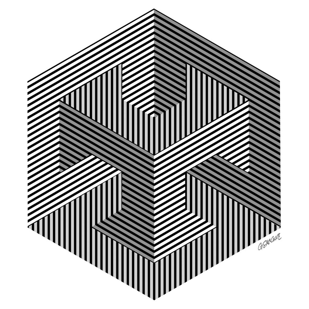
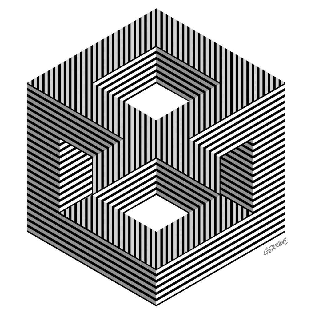
Each piece is built around the visual tension of the impossible cube, created by merging two tribars in perfect isometric perspective. The lines suggest solidity, yet the form escapes reality—what looks structurally sound unravels the moment the eye tries to make sense of it. That’s the game I love to play: where geometry behaves, but perception rebels.

These “Enigmas” are spatial riddles dressed in stripes and angles, each one twisting the viewer’s reading of depth, volume, and continuity in its own way.

Moonlight Reflections on the Waters

A memory from Japan, where I lived briefly in the 1980s. This piece recalls earthy colors, organic shapes, and fragments of that time. A circle emerges from a flowing field of triangles—like ripples of moonlight dancing on the sea near Kamakura.

Immersing yourself in my op art is an invitation into a world where opposing forces meet, attract, and interlock, creating a balance both precise and hypnotic. It is a silent yet unending dialogue between art, form, line, color, mathematical concepts, the science of perception, and, above all, symbols. The symbolic depth of my work reaches beyond surface appearance, engaging with archetypes and forgotten rites that still pulse within the collective unconscious.

This unique op art piece is available as fine art prints and canvases in my online gallery.

Rediscovering Flutex: Simple Glass, Complex Illusions

I’ve been toying with the idea of revisiting an old, low-key material for my art: Flutex.

If you haven’t heard of it, Flutex is a patterned industrial glass from the 1930s and ’40s, mostly used to give a bit of privacy in bathrooms and office partitions.

In the ’70s, Op artist Sydney Cash started playing with this glass and found that its ribbed surface works like a lenticular screen—showing different images depending on how you look at it. The effect? Hypnotic, shifting artworks that change as you move around them.

It’s just simple glass, but it tricks perception in a really cool way.

I’m seriously considering giving it a try myself—there’s something about that mix of humble material and complex visual play that feels worth exploring again.

Relative Size Illusions

Here are two relative size illusions I described back in 1997 and 2013.

The first, called Sarcone’s Crosses, challenges classic illusions like the Ebbinghaus illusion (Titchener Circles, 1898) and the Obonai square illusion (1954). It features a cross (the test shape) surrounded by squares of different sizes.

As shown in Fig. 1.a, 1.b, and 1.c, the three blue crosses are all the same size — yet the one on the left (Fig. 1.a) appears larger. Surprisingly, the illusion still works even when smaller squares completely cover the cross (Fig. 1.c).

So, the size of surrounding shapes doesn’t always dictate how we perceive the central one.

In the second illusion (Fig. 2.a and 2.b), due to assimilation, the red diagonal inside the larger ellipse seems longer — but the blue line is actually the longest.

Perception loves to play tricks on us.

sarcone's relative sizze illusions

You can explore more of my illusions and visual inventions on my official site: giannisarcone.com

Julio Le Parc – Nihil novi sub sole…

Although I’ve been working in the field of Op Art since the mid-1980s, it’s important to recognize that the movement itself has a deeper history. It began to take shape in the 1960s, led by pioneering figures such as Victor Vasarely and Bridget Riley.

However, the artists who truly captivate me—the ones who expanded the language of perception—are often the outsiders. One such figure is Julio Le Parc (b. September 23, 1928), an Argentine-born artist whose practice bridges Op Art and kinetic art. Le Parc studied at the School of Fine Arts in Argentina and went on to co-found the Groupe de Recherche d’Art Visuel (GRAV). His work, honored with numerous awards, holds a prominent place in Latin American modernism.

Le Parc’s recurring themes—color, light, and movement—have always resonated with me. During the ’60s and ’70s, he explored light not just as a visual element but as a living, dynamic material. Yet by the late ’70s, his presence in the art world had faded; his output became sporadic, and for decades his work slipped quietly out of the international spotlight.

 Fortunately, recent years have witnessed a renewed appreciation of his explorations in light and movement, bringing his contributions once again to the attention of a wider public.

Artist’s Website: http://www.julioleparc.org

Book: Catalog of the artist’s first solo exhibition, Paris, November–December 1966. Text in French by Frank Popper.

Trama – A Strategy Game with an Artistic Twist

trama boardgame 2

Back in the ’90s, my board game Trama made waves for its fresh take on strategy and design. Imagine the logic of chess, but with a twist: neutral pieces that both players can use. The board—plexiglass with screen-printed art—echoes the feel of an Op Art piece, while the Galalith tokens add tactile charm.

There are several design variants, with boards featuring different color schemes and patterns. Some versions include holes or extruded circular reliefs to securely hold marbles instead of tokens—offering a fresh, sensory-rich experience.

· Curious? The full rulebook (in French) is 👉 here.
· More about 👉 Trama.

If you’re a manufacturer interested in bringing Trama back to the table, feel free to reach out.

trama news

Misdirection → Illusion → Aha! Moment…

How misdirection, illusion, and wonder shape my creative process.

The path from misdirection to revelation is at the heart of how illusion and wonder spark insight. Misdirection steers our attention—often subtly—away from what truly matters. It disrupts our expectations, creating a gap between what we see and what is. Within that gap lies the illusion: a crafted discrepancy, a visual or cognitive sleight-of-hand that unsettles our perception.

But the magic doesn’t end there. When the illusion is cracked—when the mind shifts, recalibrates, and sees—the famous Aha! moment erupts. That flash of understanding isn’t just delightful; it’s deeply educational. It rewires how we interpret the world.

This sequence—misdirection, illusion, revelation—mirrors the creative process itself. It shows how confusion, when carefully designed, can be a gateway to clarity. In the right hands, illusion is not deception—it’s a tool to awaken curiosity, stretch perception, and provoke insight. Wonder, in this sense, becomes a powerful cognitive catalyst.

That’s why my art and, I believe, my writing, revolve around this sense of wonder—arguably the most direct and playful route to that pleasurable, often conflicting moment of insight: the sudden discovery of something previously unknown.

Umbrella Illusion

One of my illusions from the late ’90s. Take a look at the colorful umbrellas in Figures A and B of the table below—are they the same or different? About 80% of people will say that Umbrella A has jagged, zigzag edges, while Umbrella B has a smooth, wavy outline. But here’s the trick—you’ve been fooled by the brightness contrast of the rays inside the umbrellas. In reality, both umbrellas are identical in shape, perfectly congruent.

This illusion works even when only the lines of the shapes are emphasized. As demonstrated in the table below, the outline of Umbrella A appears jagged and zigzagged, while Umbrella B seems to have, once again, a smooth, wavy outline.

This illusion shows a phenomenon called curvature blindness, which was rediscovered in 2017 by Japanese psychologist Kohske Takahashi. He created a powerful variant and studied its impact on how we perceive shapes.

Read more

The Architecture of Light

Colors, though fundamentally phenomena of light, are not merely superficial aspects of perception. They play a structural role in organizing visual elements. For example, applying contrasting colors to a series of repetitive graphic patterns—while varying their distribution—can dramatically alter how they are perceived. This demonstrates how color is not just an embellishment but an active force in shaping visual reality.


As Goethe put it, “Colors are the deeds and sufferings of light.” More than a sensory experience, they influence our perception of space, depth, and meaning, revealing the intricate dialogue between vision and cognition.

🔍 Explore more about the illusion of colors.

Puzzling Colors: Red Between the Lines

Colors are not as fixed as they seem. The red you see might not be the same red someone else perceives. Your brain constantly interprets colors based on their surroundings, which can lead to surprising illusions.

Take this experiment inspired by the Munker-White effect: all the gray bars in the striped patterns are actually the same shade. Yet, next to blue lines, they appear bluish; beside mixed colors, they seem to shift tones. This is known as color assimilation—where a color takes on the influence of its neighbors.

The same illusion explains simultaneous brightness contrast. In the wine-pouring examples below, the liquid seems to change color in the glass. But actually, the red remains unchanged.

Here’s a simple animated variant of my project: Hard to believe, but the flow of wine stays the same shade of red all the way—from the bottle’s neck, through the pour, and even inside the glass. It’s only your perception that changes!

Even more striking—when cyan lines replace black ones, the liquid pouring from the bottle is actually gray from start to finish, yet it appears to turn into red wine in the glass. In reality, the red is just an illusion—your brain fills in the missing color where none exists.

🔴 See it for yourself! Fine art prints of my color experiments are available here:
👉 https://www.redbubble.com/shop/ap/166097393

Copyright Notice: My artworks are protected. Any use must include proper credit and a link to the original source. Commercial use is strictly prohibited.