The Story of Blue

Sonne au comble de l'or
l'azur du jeune hiv
er
– Paul Valéry

For me, blue is air, wind, melancholy. It is like a Fellini film—always haunted by the whisper of the wind, the scent of things, and the fleeting moments of time we wish we could hold in an eternal present. Blue can carry regret; it is, in a way, a conservative principle. Blue has always held a strange duality: so immediate, yet once so elusive. Looking back to antiquity, it fascinates me that Homer never described the sea as blue, but as ‘wine-dark.’ In Greek, kyaneos evoked a dark, mineral depth, while glaukos hovered between gray, green, and blue. The Romans spoke of caeruleus, tied to the sky (caelum), and of lividus, the bruised, bluish tone of flesh. They never elevated blue; it was the color of outsiders, the hue of Celts painted in woad. Only the Egyptians seemed to truly revere it. They invented Egyptian blue, the first artificial pigment, and made it the shade of eternity and the divine.

In the Middle Ages, blue nearly vanished from prominence. Christian art turned to red, white, and black, leaving blue to the margins. Yet the word itself was evolving. The Germanic blāo—and its Vulgar Latin adoption, blavus—once meant something far less precise: shimmering, lustrous, dark, gray, even pale or yellowish. That ambiguity makes me realize how fluid color once was, before language fixed its boundaries. From blāo we inherited English blue and French bleu. Meanwhile, through Arabic lazaward came the words azure, azzurro, and azul, all born from lapis lazuli.

Then, in the 12th century, blue was transformed. Artists began clothing the Virgin Mary in ultramarine, ground from lapis lazuli more costly than gold. What had been humble became heavenly. Heraldry embraced azure as one of its noble tinctures, and kings like Louis IX made blue their emblem. A forgotten hue became a sacred, regal presence.

By the Renaissance, ultramarine shone as a color of prestige, truth, and constancy. Painters reserved it for the highest subjects, poets linked it to loyalty, and explorers carried its name across the seas as azul. Blue had finally claimed its place.
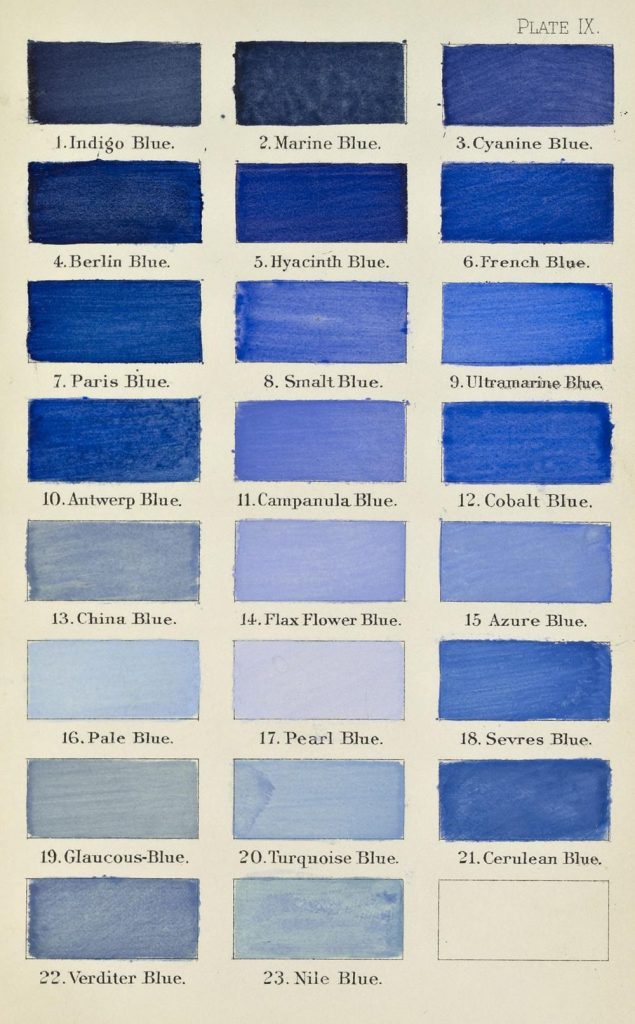
The modern era democratized it. Prussian blue appeared in 1704, followed by cobalt, cerulean, and synthetic ultramarine. Blue poured into uniforms, flags, and revolutions; it became the shade of liberty, of nations, of collective identity. Goethe called it spiritual, a color that retreats yet draws the soul inward.

In the 20th century, painters gave blue an entirely new destiny. The Expressionists used blue to conjure emotion, depth, and inner turbulence—think of Kandinsky, who saw blue as moving ‘toward the infinite,’ or Franz Marc, who painted blue animals to symbolize spirituality and hope. Even Van Gogh’s Starry Night swirls with blue, capturing both wonder and melancholy. Later, Picasso entered his Blue Period, transmuting sorrow into tone. Yves Klein went further still, reducing blue to its purest intensity with his International Klein Blue, turning it into an immaterial field of experience. For Klein, blue was not simply a color but ‘the most abstract color of all,’ a space in which one could lose oneself.

Today, I see blue everywhere. In the jeans that became the fabric of daily life. In corporate logos designed to inspire trust. In flags that mark belonging. Blue is calm, yet melancholy; humble, yet exalted. Once overlooked, it is now the world’s favorite color.

Blue is more than a hue. It is an idea shaped across centuries—etymologically born of caelum, blāo, and blavus; symbolically stretched between heaven and earth; culturally tied to faith, power, and identity. Its story mirrors our own: restless, mutable, and ever searching for meaning.

I’ll end with a little story from my own family. After World War II, my paternal grandfather, a house painter, bought a massive surplus of blue paint from the military. He had so much of it that whenever a client asked how he planned to paint their home, his answer was always the same, year after year: “All in blue, yes, all in blue…” (in our dialect, tutt’azzurr, tutt’azzurr).

That simple phrase stuck. Before long, the whole village started calling our family the Tuttazzurr family, and I myself became known as Giuan Tuttazzurr. Blue marked our home, but also my identity and my story—etched in memory and in name.

Moonlight Reflections on the Waters

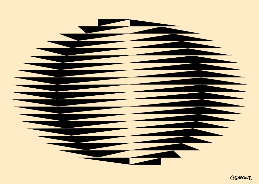
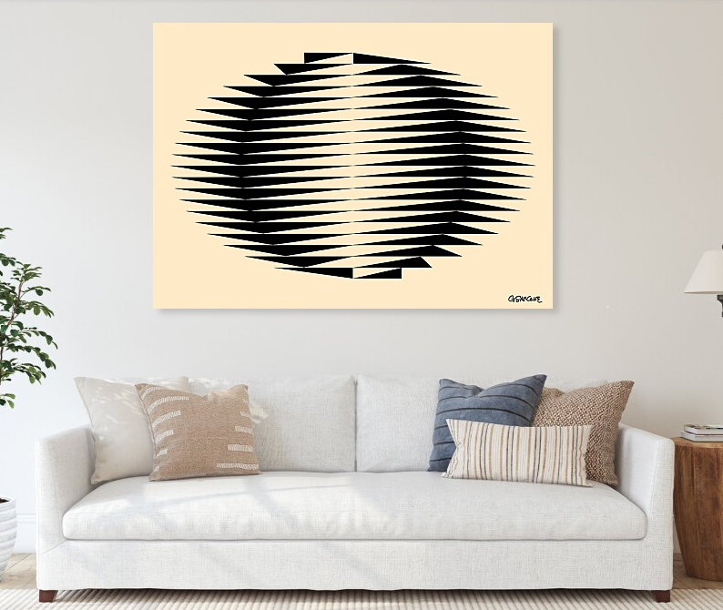
A memory from Japan, where I lived briefly in the 1980s. This piece recalls earthy colors, organic shapes, and fragments of that time. A circle emerges from a flowing field of triangles—like ripples of moonlight dancing on the sea near Kamakura.

Immersing yourself in my op art is an invitation into a world where opposing forces meet, attract, and interlock, creating a balance both precise and hypnotic. It is a silent yet unending dialogue between art, form, line, color, mathematical concepts, the science of perception, and, above all, symbols. The symbolic depth of my work reaches beyond surface appearance, engaging with archetypes and forgotten rites that still pulse within the collective unconscious.

This unique op art piece is available as fine art prints and canvases in my online gallery.

Smelling the Color 9: When Numbers Take Shape and Color

In English, the expression to smell the color 9 describes something completely impossible…

And yet, some people have the unusual ability to mentally visualize colors or spatial patterns when thinking about units of time—or more broadly, numbers. This phenomenon, known as synesthesia (from the Greek syn, “together”, and aisthēsis, “sensation”), occurs when stimulation of one sense involuntarily triggers sensations in another. It’s not a figure of speech—these perceptions feel very real to those who experience them.

The first documented case in medical literature appeared in 1710. Dr. John Thomas Woolhouse (1650–1734), an ophthalmologist to King James II of England, reported a blind young man who claimed he could perceive colors induced by sounds.

Neuroscientist Vilayanur S. Ramachandran and his team at the University of California, San Diego, observed that the most common form of synesthesia links “graphemes“—letters or numbers—to specific colors. Since my work bridges art and mathematics, I’ll focus here on number-based synesthesia.

People who experience synesthesia in its pure form are relatively few. However, many report strikingly similar associations between numbers and colors or spatial layouts, suggesting these perceptions aren’t just products of imagination or attention-seeking. For example, number–form synesthesia may result from cross-activation between brain regions in the parietal lobe that handle numerical and spatial processing. In contrast, number–color synesthesia likely stems from an overabundance of connections between adjacent areas that interfere with each other when triggered (see fig. 1 below).

brain synesthesia

Figures 2 and 3 illustrate common synesthetic patterns—either as color associations (fig. 2) or spatial arrangements (fig. 3, based on observations by Sir Francis Galton). Statistically, people often associate the digits 0 or 1—and sometimes 8 or 9—with black or white. Yellow, red, and blue are typically linked to smaller digits like 2, 3, or 4, while brown, purple, and gray tend to be tied to larger ones like 6, 7, or 8. Curiously, it’s not the idea of the number but the visual form of the digit that seems to trigger the sensation. For instance, when the number 5 is shown as the Roman numeral V, many synesthetes report no color at all.

color number synesthesia

And you—do you see numbers in color or arranged in space? Feel free to share your synesthetic experiences with me.

Julio Le Parc – Nihil novi sub sole…

Although I’ve been working in the field of Op Art since the mid-1980s, it’s important to recognize that the movement itself has a deeper history. It began to take shape in the 1960s, led by pioneering figures such as Victor Vasarely and Bridget Riley.

However, the artists who truly captivate me—the ones who expanded the language of perception—are often the outsiders. One such figure is Julio Le Parc (b. September 23, 1928), an Argentine-born artist whose practice bridges Op Art and kinetic art. Le Parc studied at the School of Fine Arts in Argentina and went on to co-found the Groupe de Recherche d’Art Visuel (GRAV). His work, honored with numerous awards, holds a prominent place in Latin American modernism.

Le Parc’s recurring themes—color, light, and movement—have always resonated with me. During the ’60s and ’70s, he explored light not just as a visual element but as a living, dynamic material. Yet by the late ’70s, his presence in the art world had faded; his output became sporadic, and for decades his work slipped quietly out of the international spotlight.

 Fortunately, recent years have witnessed a renewed appreciation of his explorations in light and movement, bringing his contributions once again to the attention of a wider public.

Artist’s Website: http://www.julioleparc.org

Book: Catalog of the artist’s first solo exhibition, Paris, November–December 1966. Text in French by Frank Popper.

Trama – A Strategy Game with an Artistic Twist

trama boardgame 2

Back in the ’90s, my board game Trama made waves for its fresh take on strategy and design. Imagine the logic of chess, but with a twist: neutral pieces that both players can use. The board—plexiglass with screen-printed art—echoes the feel of an Op Art piece, while the Galalith tokens add tactile charm.

There are several design variants, with boards featuring different color schemes and patterns. Some versions include holes or extruded circular reliefs to securely hold marbles instead of tokens—offering a fresh, sensory-rich experience.

· Curious? The full rulebook (in French) is 👉 here.
· More about 👉 Trama.

If you’re a manufacturer interested in bringing Trama back to the table, feel free to reach out.

trama news

Umbrella Illusion

One of my illusions from the late ’90s. Take a look at the colorful umbrellas in Figures A and B of the table below—are they the same or different? About 80% of people will say that Umbrella A has jagged, zigzag edges, while Umbrella B has a smooth, wavy outline. But here’s the trick—you’ve been fooled by the brightness contrast of the rays inside the umbrellas. In reality, both umbrellas are identical in shape, perfectly congruent.

This illusion works even when only the lines of the shapes are emphasized. As demonstrated in the table below, the outline of Umbrella A appears jagged and zigzagged, while Umbrella B seems to have, once again, a smooth, wavy outline.

This illusion shows a phenomenon called curvature blindness, which was rediscovered in 2017 by Japanese psychologist Kohske Takahashi. He created a powerful variant and studied its impact on how we perceive shapes.

Read more

The Illusion of Color in Astrophysics


Study on Colors in Astrophysics – Ongoing Research

Under specific atmospheric conditions and with the technological tools employed, stars or planets may appear to emit green or blue light to some observers. However, as illustrated in the accompanying diagram, this is often nothing more than an optical illusion. The blue region seen in the diagram is actually a medium gray, entirely desaturated. You can verify this by using Photoshop’s color picker tool (or an analogous method) to check the true color values.

This phenomenon raises interesting questions about how color perception in astrophysics can be influenced by both atmospheric effects and the limitations of observational tools. How much of what we “see” in the cosmos is truly the color of the objects themselves, and how much is a product of the interaction between light, our atmosphere, and the instruments we use to detect it?

The Architecture of Light

Colors, though fundamentally phenomena of light, are not merely superficial aspects of perception. They play a structural role in organizing visual elements. For example, applying contrasting colors to a series of repetitive graphic patterns—while varying their distribution—can dramatically alter how they are perceived. This demonstrates how color is not just an embellishment but an active force in shaping visual reality.


As Goethe put it, “Colors are the deeds and sufferings of light.” More than a sensory experience, they influence our perception of space, depth, and meaning, revealing the intricate dialogue between vision and cognition.

🔍 Explore more about the illusion of colors.

The Science of Light: From White to RGB

When a beam of white light, composed of three converging monochromatic sources—red, green, and blue—passes through a slit, it is decomposed into its constituent colors. This results in three distinct vertical bands—red, green, and blue—which are projected onto a screen.

If an obstacle, such as a vertical wooden rod, is placed before the slit, it partially blocks some of the light components. As a result, three vertical stripes—cyan, magenta, and yellow—appear at the location of the slit. These colors are the complements of the original light sources and emerge through subtractive color mixing:

  • Cyan appears where red is blocked.
  • Magenta appears where green is blocked.
  • Yellow appears where blue is blocked.

By moving the rod, one can control which complementary color passes through the slit. This complementary color then cancels out its corresponding primary color behind the slit. For example, if magenta passes through, it eliminates green from the screen.

The concept of additive color mixing can be confusing for those who aren’t familiar with artistic or design principles. This is because people are generally more accustomed to subtractive color mixing, which is how colors blend in the physical world, such as when mixing pigments like paints or inks. In contrast, the additive color model describes how light produces color.

Sphere of Influence of Our Ego

Imperialism is not limited to a group or a country. In fact, each of us is, in essence, an imperialist, striving—whether subtly or forcefully, skillfully or clumsily—to expand his / her sphere of influence in the world. The methods we employ vary from person to person: some are conciliators, while others are more combative.
When I was 25, I empirically explored how these spheres of influence, which I termed ECFs, interacted between two individuals. To make the concept understandable, I employed the metaphor of colors. This brief is discussed in my book, “Le Voile d’Iris” (French edition, see image below). Perhaps one day, I will revisit this study to develop it into something more rigorous.