
Looking back at my signatures and logos, from 1980 to the present day, I realize how much they reflect the different stages of my artistic journey. Four identities, four moments in time, each telling a little story about who I was and how my way of seeing and creating has evolved.
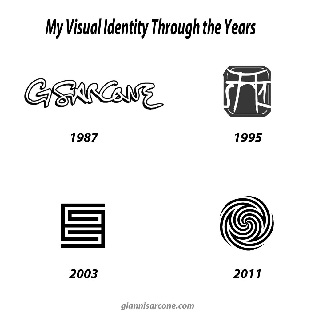
Back in 1987, when I was just starting out, I designed a simple logo inspired by the distinctive signatures of famous personalities from the 1960s and 1970s. I was young, experimenting, and looking for a visual identity of my own.
By 1995, I thought I had come up with something pretty cool. Today, I’m not so sure! Let’s say it’s a little so-so. But there was more to it than meets the eye: it was actually a visual rebus. Can you spot the capital S, a Japanese gate known as a torii (鳥居), and the number 1 (one)? Put them together and you get S-Arch-One, which sounds more or less like SARCONE. A little visual wordplay, perhaps a bit overcomplicated, but I still find the idea amusing!
The logos from 2003 and 2011 are, in my opinion, more successful. The very clean, minimalist design representing my initials, GS, was inspired by three rather different visual languages: microelectronic circuits (A), the diagrams of Genji-kō (B), and the hexagrams of the I Ching, or Book of Changes (C).
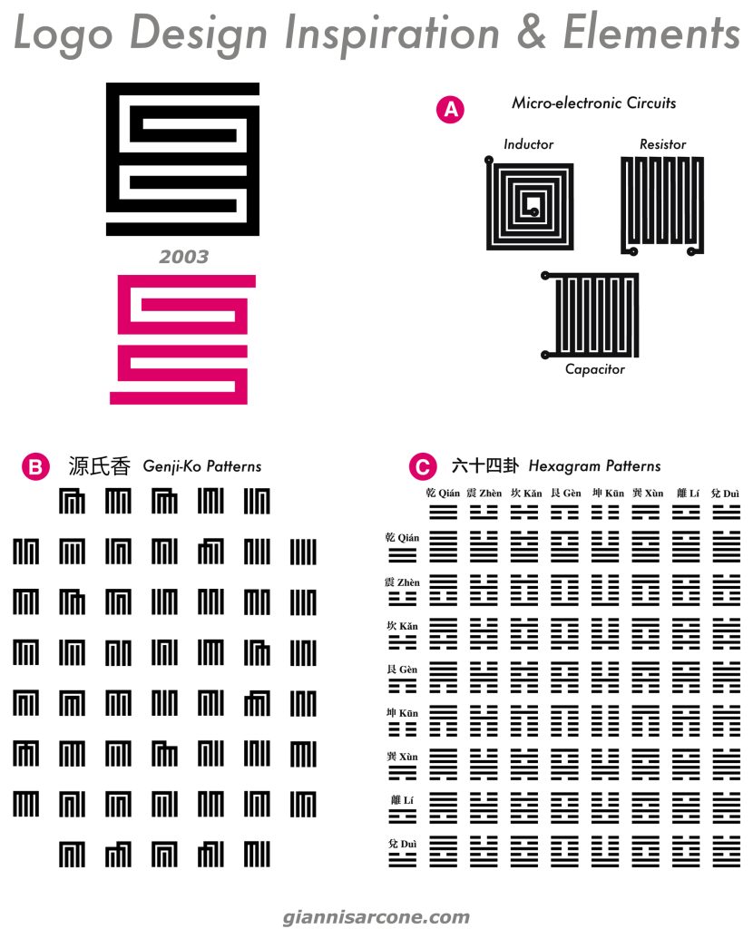
I have always been fascinated by Japanese and East Asian visual culture. Genji-kō diagrams are traditional geometric symbols used in a Japanese incense-comparison game, where different combinations of five incense scents are represented by patterns of lines. The I Ching hexagrams, on the other hand, are made of six broken or unbroken lines, forming 64 different combinations traditionally used for divination and philosophical reflection. Both systems turn simple lines into complex visual codes. Something I find endlessly fascinating.
Finally, the most recent logo reflects a significant shift in my artistic direction, beginning around 2010, when my work became increasingly focused on minimalism and Op Art. My interest turned toward exploring how simple geometric elements can generate complex perceptual experiences, playing with the illusion of movement, color, and form.
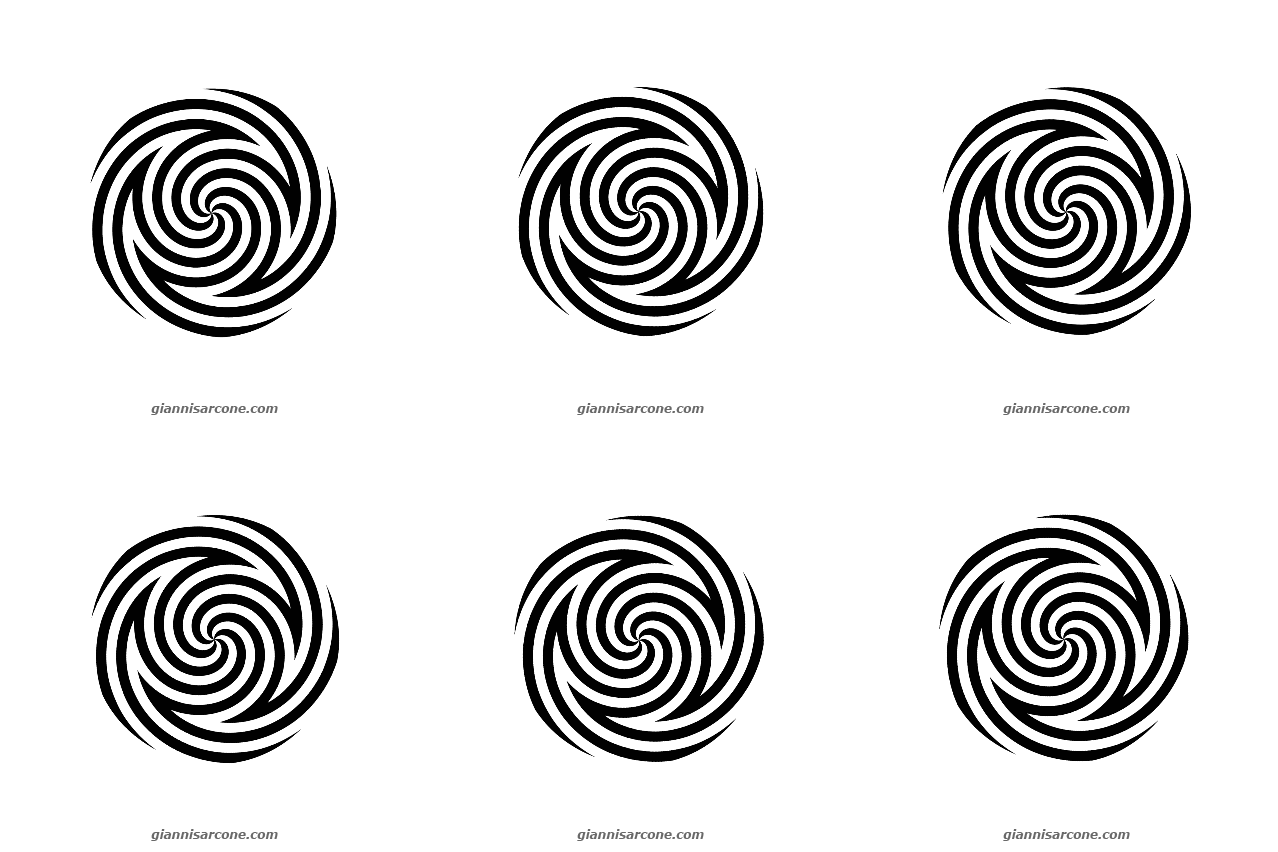
The design features a five-armed unidirectional spiral pattern, known as a pentaskelion, whose whorls cleverly conceal the two initials of my name, S and G, seamlessly integrated into the overall geometry.
The design features a dynamic, five-armed, unidirectional spiral pattern—a pentaskelion—whose sweeping, hooked whorls cleverly conceal the two initials of my name, S and G, seamlessly woven into the overall fluid geometry.
Why five spirals? The number five holds a particular personal significance in my own history, but it also has a long philosophical and symbolic tradition. In classical thought, five is associated with the idea of quintessence, literally the “fifth essence.” In Aristotelian cosmology, it referred to aether, a fifth element distinct from earth, air, fire, and water, and believed to constitute the celestial bodies.
The logo also has a kinetic dimension (see animated gif below). When rotated, it reveals two simultaneous, opposing movements: a centripetal motion drawing the eye toward the center, and a centrifugal motion radiating outward along the spiral’s outer edge. These contrasting forces create a visual tension between contraction and expansion, reflecting my artistic pursuit of challenging what we take for granted in vision: that appearances are not always what we expect, and that motion can reveal contradictions hidden within seemingly simple forms.
Over the years, my graphic style has evolved along with my artistic research, gradually moving toward greater simplicity and abstraction. Each logo reflects the ideas and visual interests that shaped my work at the time.
Now I’m curious: Which one is your favorite?