Human writing systems are built from strokes. I’ve always been fascinated by how a simple line or mark can alter the sound or meaning of a letter, pictogram, ideogram, hieroglyph, or sinogram. Exploring scripts across the world—even from countries far apart—revealed surprising connections, almost like hidden equivalences between them. The true marvel is how our eyes can sense meaning, even when tiny, seemingly insignificant changes are made to the original sign.
In some writing systems—especially those built on characters rather than alphabets—a subtle visual change can completely shift meaning, much like how English plays with homonyms and homographs. But here, it is the visual structure itself that carries the transformation.
Take the Chinese character 人, meaning “person.” In Chinese and Japanese, this simple shape often acts as a base or radical. By adding a stroke, adjusting placement, or combining it with another element, you get entirely new words and concepts. A single alteration can lead to a dramatic change in meaning.
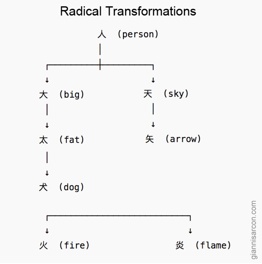
Here are a few examples showing how characters evolve from that shared visual root:
- 大 (dai, oo) — “big, large”
Looks like a person with arms extended. One stroke changes the meaning from “person” to “large.” - 太 (tai, futo) — “fat, thick”
Add a small dot below 大, and the concept shifts from “big” to “overly big” or “thick.” - 犬 (ken, inu) — “dog”
A short slanted stroke above the horizontal line of 大 turns the human figure into an animal. - 天 (ten, ama) — “heaven, sky”
By placing a stroke above the “big” shape, the idea rises upward—symbolically to the sky. - 矢 (shi, ya) — “arrow”
Adding a vertical stroke that meets the upper horizontal line of 天 turns it into a tool or weapon. - 火 (ka, hi) — “fire”
Here the strokes branch downward, evoking sparks or flames. - 炎 (en, honoo) — “flame”
Double the fire element and you intensify the meaning: from fire to blazing flame.

What’s striking is how these changes don’t require entirely new symbols—just minimal visual tweaks. Where English relies on spelling or pronunciation shifts (like lead the metal vs. lead as in to guide), character-based languages often rely on visual logic. A dot, a stroke, or a slight rearrangement can redirect the meaning toward something bigger, higher, brighter, or more intense.
It’s a compact, elegant way to build vocabulary: meaning evolves visibly, not phonetically.
